Mixing Colors – A Detailed Guide on Mixing Paint Colors
In order to create bright and beautiful artworks, you will need to know how to mix colors. Mixing colors is essential for any artist, and knowing how to do it will allow you to create any colors and shades that your creativity desires. Sure, mixing colors can be a bit daunting at first. However, with the right basic techniques and understanding of color theory, mixing colors is not all that difficult. We have put together a complete color-mixing guide to help you understand how to mix colors in order to open up a whole new world of artistic opportunity.
Table of Contents
- 1 Why You Should Be Mixing Your Own Colors
- 2 Color-Mixing Guide: Understanding Color Theory
- 3 Color-Mixing Guide: The Color Wheel
- 4 Mixing the Most Popular Color Tones
- 5 How to Mix Colors
- 6 How to Mix Colors – Top Tips for Mixed Colors
- 7 Frequently Asked Questions
- 7.1 Which Colors are Most Important for Mixing Paints?
- 7.2 Can Any Paints Be Used for Mixing Colors?
- 7.3 Does White Count as a Color?
- 7.4 What Colors Make Black?
- 7.5 What Colors Make Yellow?
- 7.6 What Colors Make Orange?
- 7.7 What Colors Make Purple?
- 7.8 What Colors Make Blue?
- 7.9 What Colors Make Green?
- 7.10 What Colors Make Red?
- 7.11 What is a Color-Mixing Chart?
Why You Should Be Mixing Your Own Colors
When painting, there are many different techniques and aspects that you will use. One of the important things to know is mixing paint colors. Mixed colors are necessary for being able to paint a wide range of images and shades.
Color is where the emotion is found in a painting, and it is what creates an impact in art.
If you have just started out with painting, your set will probably only include a few colors. This does not matter, however, as long as you have the three primary colors, as these will allow you to mix colors of absolutely any shade you want. The primary colors consist of blue, red, and yellow. Together, these colors make up all of the colors you see.
Often, when the paint is used directly from the tube it is not the exact color shade you want. Sometimes it needs to be subdued a bit or brightened up. This is where mixing colors comes to be useful. Mixing colors is also a great skill for saving money and time, as it allows you to avoid buying every single shade of paint and rather making your own when you need a small amount.
Color-Mixing Guide: Understanding Color Theory
The first thing to know about mixing colors is understanding the three primary colors. You will most likely know about primary colors already and their importance. However, let us go over the topic of color theory to make sure that you are up to date.
Primary Colors
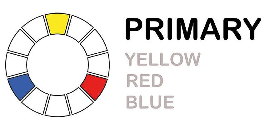
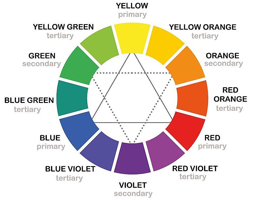
Red, blue, and yellow make up the three primary colors. Using combinations of these colors can result in a massive range of additional colors. You also need primary colors as you cannot mix them yourself. While this is pretty straightforward, there are many different shades of each primary color available.
When buying your first paint set, it is best to have two of each primary color – one in a warm tone and one in a cool tone. To access a perfect color-mixing chart, the following shades of paint are recommended:


When mixing secondary and tertiary colors, having two different shades of each primary color makes things easier. You can get the exact tone you want with less effort, and have more color options to play with. By having different shades of each primary color, you can also mix a wider range of colors. For example, you can use different yellows and blues to achieve different shades of green.
Secondary Colors
Once you have all your primary colors ready, you can use them to mix secondary colors. Two primary colors combined will create a secondary color. Orange, green, and purple make up the secondary colors. You can follow a color-mixing chart to achieve the exact tone you want, but below is a basic color-mixing guide for achieving the secondary colors.
| Primary Color 1 | Primary Color 2 | Secondary Color |
|---|---|---|
| Yellow | Blue | Green |
| Blue | Red | Purple |
| Yellow | Red | Orange |
Colors you Can Mix out of Secondary Colors


When mixing colors in this category, you can create a massive range of shades and tones. This can be adjusted depending on how much of each color you add, and which tones of primary colors you use. You can follow a color-mixing guide to get the exact shade you want, but really, the best thing to do is just experiment.
The more you play around with mixing colors, the more you will start to understand which combinations produce which results.

Tertiary Colors
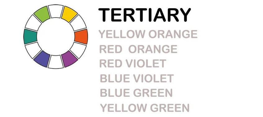
In a basic understanding, tertiary colors are really just variations of secondary colors. By mixing secondary colors with different ratios and shades, you can achieve a wider range of colors that we call tertiary colors. This can be done by mixing a secondary color with a primary color to create more variety. Tertiary colors are great for creating a more detailed color profile, and for transitioning from one color to the next.
| Primary Color 1 | Secondary Color 1 | Tertiary Color |
|---|---|---|
| Red | Orange | Red-Orange |
| Blue | Green | Blue-Green |
| Blue | Purple | Blue-Purple |
| Red | Purple | Red-Purple |
| Yellow | Orange | Yellow-Orange |
| Yellow | Green | Yellow-Green |
When learning how to mix colors, you can see that each color is related, and that they all stem from the same basic shades. When mixing paint colors, you really only need to start with three primary colors to reach a much wider range of tones.
Color-Mixing Guide: The Color Wheel
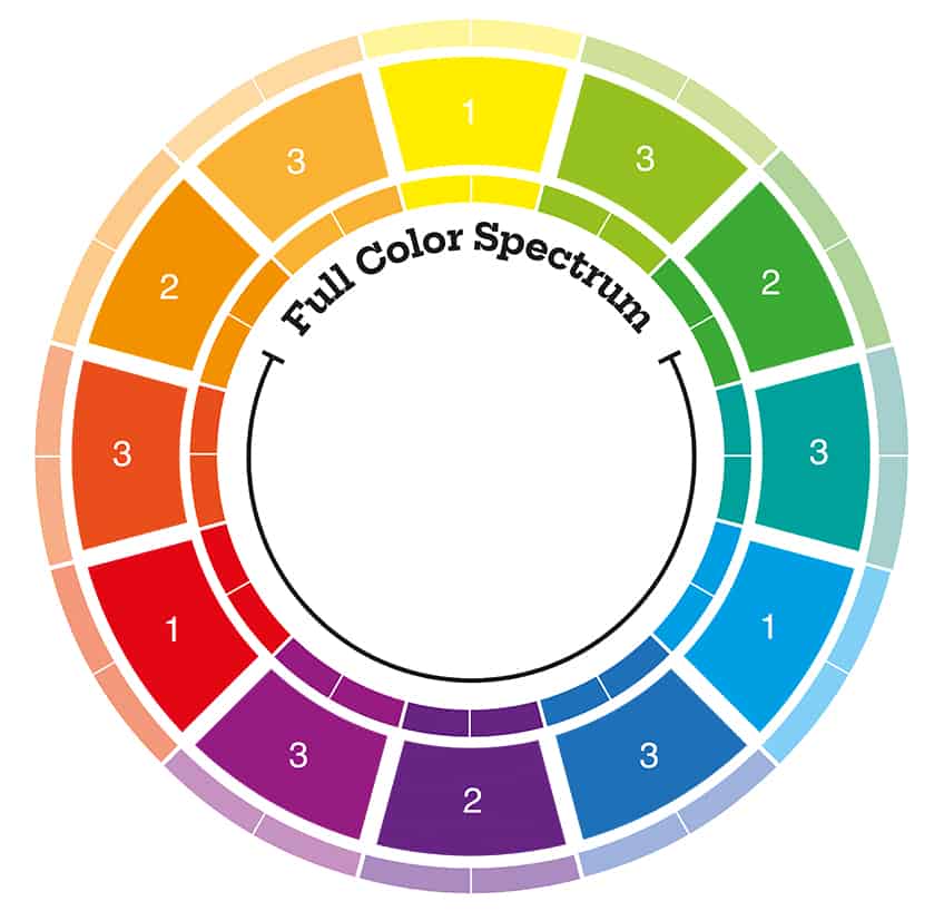
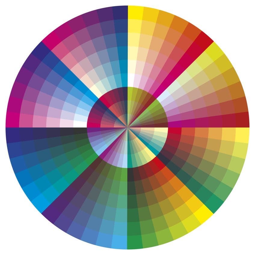
When you start mixing colors, you will be faced often with the color wheel. The color wheel is a type of definitive color-mixing chart that can help you to understand the different color relationships. Having a color wheel will allow you to easily determine which colors to use when mixing certain shades.
Complementary Colors
If you look at the color wheel, certain colors sit directly opposite each other. These are complementary colors. As the name suggests, these colors complement each other when used next to one another, providing a brighter effect.
When looking at complementary colors, yellow and purple pair together, blue and orange go together, and red and green complement each other. Then there are split-complementary colors. This is a similar idea, but it uses the colors directly surrounding one as opposed to the opposite color. This produces the same effect as complementary colors but provides more variety.
Analogous Colors
To get analogous colors, you just look at the three colors that are next to each other in the color wheel. Just point to any part of the color wheel, and the three colors in a row will be analogous to each other. These are colors that are closely related, so they work beautifully when placed together.
Triadic Colors
Triadic colors are any colors that are spaced out evenly when looking at the color wheel. When used together, you create a bold and exciting arrangement of color. For example, orange, green and purple are triadic colors and work well together for an eye-catching effect.
Mixing the Most Popular Color Tones
Some mixed colors are fairly easy to achieve, while others can be very difficult to get right. Two of the most difficult shades are brown and grey, which are compound tertiary colors. Compound tertiary colors are created by mixing together each of the primary colors. The different ratio of each color is what determines whether you get brown or grey. If you need some help, we have a free color mixer to help you achieve all your desired colors on the color palette.
Color Mixing Chart
| Color Sample | Color Name | Mixing Recipe |
|---|---|---|
| Pink | 2 parts Quinacridone Rose + 1 part Titanium White | |
| Teal | 1 part Phthalo Blue + 1 part Cadmium Yellow + 2 parts Titanium White | |
| Brown | 1 part Burnt Umber + 1 part Ultramarine Blue + 1 part Cadmium Red | |
| Black | 1 part Ultramarine Blue + 1 part Burnt Umber | |
| Gray | 1 part Ivory Black + 1 part Titanium White | |
| Crimson | 1 part Cadmium Red + 1 part Quinacridone Magenta | |
| Cobalt Blue | Cobalt Blue (standard pigment) | |
| Lemon Yellow | Lemon Yellow (standard pigment) | |
| Coral | 1 part Cadmium Red Light + 1 part Cadmium Yellow Light + 2 parts Titanium White | |
| Lavender | 2 parts Ultramarine Blue + 1 part Quinacridone Magenta + 2 parts Titanium White | |
| Mint Green | 2 parts Phthalo Green + 1 part Titanium White + Small amount of Lemon Yellow | |
| Maroon | 2 parts Alizarin Crimson + 1 part Ultramarine Blue | |
| Navy Blue | 2 parts Ultramarine Blue + 1 part Burnt Umber | |
| Mustard | 2 parts Yellow Ochre + 1 part Burnt Sienna | |
| Sky Blue | 2 parts Cerulean Blue + 1 part Titanium White | |
| Burgundy | 2 parts Alizarin Crimson + 1 part Phthalo Green | |
| Olive Green | 2 parts Yellow Ochre + 1 part Ultramarine Blue | |
| Turquoise | 2 parts Phthalo Blue + 1 part Phthalo Green + 1 part Titanium White | |
| Magenta | Quinacridone Magenta (standard pigment) | |
| Beige | 2 parts Yellow Ochre + 1 part Titanium White + Small amount of Burnt Umber | |
| Indigo | 2 parts Ultramarine Blue + 1 part Burnt Umber | |
| Gold | Yellow Ochre + Small amount of Burnt Sienna + Metallic Gold (optional) | |
| Chartreuse | 2 parts Lemon Yellow + 1 part Phthalo Green | |
| Aqua | 2 parts Phthalo Blue + 1 part Titanium White + Small amount of Lemon Yellow | |
| Fuchsia | 2 parts Quinacridone Magenta + 1 part Ultramarine Blue | |
| Taupe | 2 parts Burnt Umber + 1 part Titanium White | |
| Cerulean | Cerulean Blue (standard pigment) | |
| Amber | Yellow Ochre + Small amount of Burnt Sienna | |
| Rose | Quinacridone Magenta + Small amount of Titanium White | |
| Salmon | 2 parts Cadmium Red + 1 part Yellow Ochre + 2 parts Titanium White | |
| Peach | 2 parts Cadmium Orange + 1 part Titanium White | |
| Periwinkle | 2 parts Ultramarine Blue + 1 part Quinacridone Magenta + 3 parts Titanium White | |
| Slate Blue | 2 parts Ultramarine Blue + 1 part Burnt Umber + 2 parts Titanium White | |
| Emerald Green | 2 parts Phthalo Green + 1 part Lemon Yellow | |
| Coral Pink | 2 parts Cadmium Red Light + 1 part Titanium White + Small amount of Lemon Yellow | |
| Charcoal Gray | 1 part Ivory Black + 1 part Ultramarine Blue + 1 part Burnt Sienna | |
| Midnight Blue | 2 parts Ultramarine Blue + 1 part Ivory Black | |
| Raspberry | 2 parts Alizarin Crimson + 1 part Ultramarine Blue | |
| Seafoam Green | 2 parts Phthalo Green + 2 parts Titanium White + Small amount of Cadmium Yellow | |
| Burnt Orange | 2 parts Cadmium Red + 1 part Cadmium Yellow | |
| Plum | 2 parts Quinacridone Magenta + 1 part Ultramarine Blue | |
| Cyan | Phthalo Blue (standard pigment) | |
| Lime Green | 2 parts Lemon Yellow + 1 part Phthalo Green | |
| Dusty Rose | 2 parts Quinacridone Magenta + 1 part Titanium White + Small amount of Burnt Umber | |
| Sapphire | 2 parts Ultramarine Blue + 1 part Phthalo Blue | |
| Violet | 1 part Ultramarine Blue + 1 part Quinacridone Magenta | |
| Sunset Orange | 2 parts Cadmium Red + 1 part Cadmium Yellow + Small amount of Titanium White | |
| Forest Green | 1 part Phthalo Green + 1 part Burnt Umber | |
| Turmeric | 2 parts Yellow Ochre + 1 part Lemon Yellow | |
| Mauve | 2 parts Ultramarine Blue + 1 part Alizarin Crimson + 1 part Titanium White | |
| Electric Blue | 1 part Phthalo Blue + 1 part Titanium White | |
| Brick Red | 2 parts Cadmium Red + 1 part Burnt Sienna | |
| Ochre | Yellow Ochre (standard pigment) | |
| Ivory | 2 parts Titanium White + 1 part Yellow Ochre | |
| Copper | 2 parts Burnt Sienna + 1 part Raw Umber + Metallic Copper (optional) | |
| Khaki | 2 parts Yellow Ochre + 1 part Burnt Umber + 1 part Titanium White | |
| Denim Blue | 2 parts Ultramarine Blue + 1 part Phthalo Blue + 1 part Titanium White | |
| Jade Green | 2 parts Phthalo Green + 1 part Titanium White + Small amount of Lemon Yellow | |
| Garnet | 2 parts Alizarin Crimson + 1 part Burnt Umber | |
| Azure | 1 part Ultramarine Blue + 2 parts Titanium White | |
| Carmine | Carmine (standard pigment) | |
| Celadon | 2 parts Phthalo Green + 3 parts Titanium White + Small amount of Lemon Yellow | |
| Cerulean Frost | 2 parts Cerulean Blue + 1 part Titanium White + Small amount of Ultramarine Blue | |
| Chartreuse Yellow | 2 parts Lemon Yellow + 1 part Phthalo Green | |
| Cinnabar | Cinnabar (standard pigment) or 2 parts Cadmium Red + 1 part Cadmium Yellow | |
| Citrine | 2 parts Lemon Yellow + 1 part Burnt Sienna | |
| Claret | 2 parts Alizarin Crimson + 1 part Ultramarine Blue + Small amount of Titanium White | |
| Coral Red | 2 parts Cadmium Red Light + 1 part Titanium White + Small amount of Cadmium Yellow | |
| Cornflower Blue | 2 parts Ultramarine Blue + 1 part Titanium White + Small amount of Phthalo Blue | |
| Crimson Red | 1 part Alizarin Crimson + 1 part Cadmium Red | |
| Daffodil | 2 parts Lemon Yellow + 1 part Titanium White | |
| Dandelion | 2 parts Cadmium Yellow + 1 part Titanium White | |
| Eggshell | 2 parts Titanium White + Small amount of Yellow Ochre | |
| Electric Green | Phthalo Green + Small amount of Lemon Yellow | |
| Flax | 2 parts Yellow Ochre + 1 part Titanium White + Small amount of Burnt Sienna | |
| Heliotrope | 2 parts Quinacridone Magenta + 1 part Ultramarine Blue + 2 parts Titanium White | |
| Honeydew | 2 parts Titanium White + Small amount of Phthalo Green | |
| Iris | 2 parts Ultramarine Blue + 1 part Quinacridone Magenta + 1 part Titanium White | |
| Jonquil | 2 parts Cadmium Yellow + 1 part Titanium White | |
| Lapis Lazuli | Lapis Lazuli (standard pigment) or Ultramarine Blue mixed with small amount of Titanium White | |
| Lemon Chiffon | 3 parts Titanium White + 1 part Lemon Yellow | |
| Lilac | 2 parts Quinacridone Magenta + 1 part Ultramarine Blue + 2 parts Titanium White | |
| Linen | 4 parts Titanium White + 1 part Yellow Ochre + Small amount of Burnt Sienna | |
| Mint Cream | 3 parts Titanium White + 1 part Phthalo Green + Small amount of Lemon Yellow | |
| Orchid | 2 parts Quinacridone Magenta + 1 part Ultramarine Blue + 1 part Titanium White | |
| Persimmon | 2 parts Cadmium Red + 1 part Cadmium Yellow | |
| Rose Quartz | 2 parts Quinacridone Magenta + 3 parts Titanium White | |
| Saffron | 2 parts Cadmium Yellow + 1 part Cadmium Orange | |
| Aquamarine | 2 parts Phthalo Blue + 1 part Titanium White + Small amount of Lemon Yellow | |
| Tangerine | 2 parts Cadmium Orange + 1 part Cadmium Yellow | |
| Vermilion | 2 parts Cadmium Red + 1 part Cadmium Yellow | |
| Amethyst | 2 parts Quinacridone Magenta + 1 part Ultramarine Blue + 1 part Titanium White | |
| Sage | 2 parts Yellow Ochre + 1 part Phthalo Green + 2 parts Titanium White | |
| Burgundy | 2 parts Alizarin Crimson + 1 part Ultramarine Blue | |
| Cerulean | Cerulean Blue (standard pigment) | |
| Mahogany | 2 parts Burnt Umber + 1 part Cadmium Red | |
| Pewter | 2 parts Black + 1 part Titanium White + Small amount of Burnt Umber | |
| Sienna | 2 parts Burnt Sienna + 1 part Titanium White | |
| Sunflower Yellow | 2 parts Cadmium Yellow + 1 part Titanium White | |
| Steel Blue | 2 parts Phthalo Blue + 1 part Titanium White + Small amount of Burnt Sienna | |
| Ruby Red | 2 parts Alizarin Crimson + 1 part Cadmium Red | |
| Olive Drab | 2 parts Yellow Ochre + 1 part Ultramarine Blue | |
| Marigold | 2 parts Cadmium Yellow + 1 part Cadmium Orange | |
| Ice Blue | 2 parts Cerulean Blue + 1 part Titanium White + Small amount of Phthalo Blue | |
| Harvest Gold | 2 parts Yellow Ochre + 1 part Burnt Umber | |
| Gunmetal Grey | 2 parts Black + 1 part Titanium White + Small amount of Ultramarine Blue | |
| Cream | 3 parts Titanium White + 1 part Yellow Ochre | |
| Cadet Blue | 2 parts Ultramarine Blue + 1 part Titanium White + Small amount of Phthalo Green | |
| Buttercream | 3 parts Titanium White + 1 part Yellow Ochre | |
| Teal Green | 2 parts Phthalo Green + 1 part Phthalo Blue | |
| Raspberry Pink | 2 parts Quinacridone Magenta + 1 part Titanium White | |
| Smoke Grey | 2 parts Titanium White + 1 part Black + Small amount of Ultramarine Blue | |
| Chestnut | 2 parts Burnt Sienna + 1 part Cadmium Red | |
| Coral Orange | 2 parts Cadmium Orange + 1 part Titanium White | |
| Lagoon Blue | 2 parts Phthalo Blue + 1 part Phthalo Green + 1 part Titanium White | |
| Safflower Yellow | 2 parts Cadmium Yellow + Small amount of Titanium White | |
| Pine Green | 2 parts Phthalo Green + 1 part Ultramarine Blue | |
| Dove Grey | 2 parts Titanium White + 1 part Black |
What Colors Make Brown?
After going through all of the primary, secondary, and tertiary colors, you may ask, “What colors make brown?”. The exact proportions of colors that you use will determine the specific shade of brown. However, here are some good methods of mixing paint colors for different brown shades.
Warm Brown
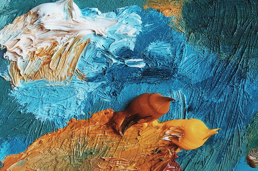
If you want to paint natural brown items, such as wood trees and bricks, then you will want to achieve a warm brown shade. For mixing this, you will need a warm green, which can be achieved by mixing a yellow that contains some red with a blue that has a touch of red in it. Mix this green with a warm red to achieve a beautiful brown shade.
More red makes the brown warmer, and adding blue tones it down. Try to play around and experiment a bit in order to achieve the right shade of brown.
Cool Brown
In comparison to a warm brown shade, you can also get a cool brown. Instead of using warmer tones, you will use cool primary colors. Red and green are used, but they must be made with a cooler shade to them. This can then be warmed up with red or cooled down further with blue. This kind of brown shade is great for painting things like dark hair or dramatic trees.
Dark Brown and Light Brown
Quite simply, white can be used to lighten up any shade of brown. Always start with a very small amount of white, and slowly add more until you reach the correct shade. Adding white is easy, but taking white out is difficult.
If you want the brown to be a bit darker, then either use red or blue to achieve this. Avoid using black as a color for darkening, as this will just cause a muddy effect. Whether you choose blue or red should depend on the warmth of the brown tone.
How to Mix Grey
Many think that grey is an easy color to mix, as it is just a combination of black and white. This is wrong. It is important to know what colors make black before making grey. Black is often made using a combination of every primary color. So adding white to this only creates a greenish or purple type of shade. So, first you will need to understand what colors make black before adding attempting to make grey.
For a perfect shade of grey, start with a lot of blue and a small amount of orange and white. This should be mixed together and experimented with until the right type of grey is achieved. Using more white and some red and green will achieve a softer, more delicate shade of grey. For a warmer grey tone, you can combine purple, yellow, and white. It is best to experiment with this and get your own feel for it.
How to Mix Colors
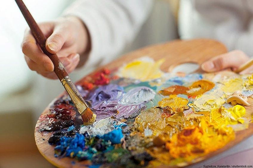
Although this has been said before, it is an essential piece of guidance: Practice and experimentation are the only way to really understand painting. When mixing colors, you will need to spend plenty of time trying different ratios and mixes before you gain a solid understanding of each shade. Once you have a good basis, mixing paint colors of any shade becomes easy.
In order to help get you to that perfect level of mixing colors, we have highlighted four great techniques to follow. These practice exercises will help you to gain a strong understanding of color theory and mixing colors.
Creating Color Gradations
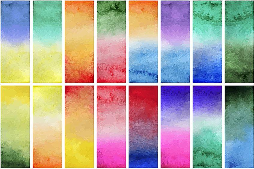
When you look at the color wheel, you will see saturated colors consisting of primary and secondary colors. Colors like brown, earth tones, and khaki are compound colors, meaning that they are a combination of the three primary colors. Creating color gradations is about moving from one complementary color to another one including all the compound colors in between.
To do this, draw a line that has seven squares. Place a red-orange shade in the far left square and a blue-green shade in the far right square. Work through the compound colors in order to get from the one shade to the next.
Make sure that you mix enough of the colors before beginning to paint through this exercise. You can start with the red-orange and darken it a bit each time to get the right gradient going. The colors should move from warm to cool, with the square in the center being neutral. This is not an easy exercise to get right, so it may require quite a few practice rounds.
Playing With Tones
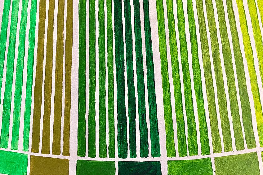
When referring to tones, this is the amount of light or dark in a certain color. When experimenting with color tones, draw a line with black on the one end and white on the other. Create the different tonal steps to get from each color to the next.
Once you get black and white down, start doing the same thing using any other color of your choice. Creating a tonal scale like this is pretty easy with watercolors, as they can be lightened easily with just water. Oil paints, acrylic paints, and gouache can be lightened with the addition of white.
The process of an exercise like this is similar to the color gradation one above. Use a line with seven squares to move from one shade to the next – adding a small amount of white each time you progress. Again, a perfect transition is not easy to achieve, so this will require some practice.
Color Matching
Learning the process of color matching can be very useful in art. Color matching as an exercise is fun, but not that easy. You do this by creating six or more squares cut out from different colors; using a magazine is a good idea. Stick these squares on paper, and draw an empty box alongside each one. Then try to create the exact same shade in the empty box as the color next to it. Continually doing this exercise will give you a great grasp of mixing colors in a wide variety.
Saturation and Contrast
Knowing how to use the colors for adding layers of depth and perspective to paintings are important. Start this exercise by creating a grid of squares. Use two complementary colors in various shades to add some kind of design. Through the use of warm colors and saturated colors, you can find the central feature of this design. Then you can add layers of depth and contrast through complementary colors. Tonal contrast through cooler colors is important for creating perception in a painting.
A good way to go about this is by choosing one complementary color as a dominant force in the design. The other colors can be used to add extra bursts of color and highlights or points of emphasis. Placing two bright complementary colors right next to each other draws attention quickly. Just have fun experimenting with this to get a good feel for using colors.
How to Mix Colors – Top Tips for Mixed Colors
Mixed colors are not always easy to get right, and so plenty of experience is required for mixing colors effectively. Here are some helpful tips and pointers to achieve the best results when mixing colors.
Darkening Colors is Easier
When darkening a color, less paint and effort is required compared to making a color lighter. For example, if you are making pink, only a tiny bit of red will darken it. To lighten pink, on the other hand, a great deal of white needs to be used.
Be Cautious of Drying Colors
While this varies with brands and paint types, you often get a slightly different finish between wet and dried paint. Dried paints are often lighter. This means that you might want to darken some colors before using them, as they will dry to a lighter shade. Before changing colors though, always test them out first and experiment a little.
Be Careful When Using Black
Black paint should typically only be used for one purpose: Painting black. You should not be tempted to mix black into your colors to darken them, as this will result in muddy effects that change the overall color scheme. Rather use dark tones like purple or blue to darken colors. Black is usually made up of many different pigments, so it can be difficult to get a shade that mixes into other paints easily.
Use Single-Pigment Colors to Mix
Paints that only consist of a single color pigment produce the best bold, bright colors. If the paint has various different pigments in it, you can get a range of muddy or mixed up colors when mixing, as the different pigments will react to whichever color you mix with the paint.
Try Not to Mix the Colors Fully
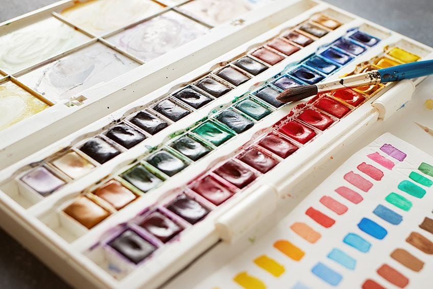
You can experiment with not mixing the final color too much. For a more natural painted effect, having a tiny bit of variation in the color is a good thing. This also helps to blend colors together better. Again, experiment with this before finding the right mixing technique.
Toning Strong Colors
You might end up with one color with more intensity than what you would like. This can be toned down through the addition of certain colors. You could add in some brown, or even a very small amount of the color’s complementary shade. For toning down colors, this technique really works.
Mixing colors is a really important skill for any painter to know. With enough practice, it is something that can be mastered with ease. Our comprehensive guide on color-mixing should have you fully prepared to start mixing and painting as many colors as you want!
Frequently Asked Questions
Which Colors are Most Important for Mixing Paints?
When mixing colors, you really only need the three primary colors and white. Together, these colors can create any shade possible.
Can Any Paints Be Used for Mixing Colors?
When mixing paint colors, using paints of the same brand is preferred. This is because you will get varying amounts of pigments in different brands, which can make mixing colors difficult.
Does White Count as a Color?
White combines all the different color tones on the light spectrum. Some consider this unique shade a color, while others see it as simply a shade for lightening other colors. Another theory is that white is the opposite, or absence, of color. White cannot be created by mixing colors together.
What Colors Make Black?
Black can be achieved by mixing together dark red and dark blue. It can also be made by mixing together all three primary colors. Some artists like to mix their own black while others would rather buy it ready-mixed.
What Colors Make Yellow?
Yellow is a primary color, so it cannot be mixed by other colors. Primary colors have to be bought as they are.
What Colors Make Orange?
Orange can be made with red and yellow. If you add more yellow, the orange gets lighter. To make the orange darker, add more red.
What Colors Make Purple?
You can make purple with a mixture of blue and red. As is always the case, the different ratio of these colors provides a different shade of purple.
What Colors Make Blue?
Blue cannot be mixed by other colors because it is a primary color. Adding white to blue can create a range of different shades, though.
What Colors Make Green?
Green can be achieved by combining yellow and blue. Using different shades of yellow and blue, as well as different ratios, will provide various shades of green.
What Colors Make Red?
Red is a primary color, so other colors cannot be mixed to create it. You can make red lighter by adding white.
What is a Color-Mixing Chart?
If you are a beginner or are still learning about color theory, then a color-mixing chart can help you a great deal. These are diagrams that show all the different colors, and reveal the combinations that you can use to mix them.
In 2005, Charlene completed her Wellness Diplomas in Therapeutic Aromatherapy and Reflexology from the International School of Reflexology and Meridian Therapy. She worked for a company offering corporate wellness programs for a couple of years, before opening up her own therapy practice. It was in 2015 that a friend, who was a digital marketer, asked her to join her company as a content creator, and this is where she found her excitement for writing.
Since joining the content writing world, she has gained a lot of experience over the years writing on a diverse selection of topics, from beauty, health, wellness, travel, and more. Due to various circumstances, she had to close her therapy practice and is now a full-time freelance writer. Being a creative person, she could not pass up the opportunity to contribute to the Art in Context team, where is was in her element, writing about a variety of art and craft topics. Contributing articles for over three years now, her knowledge in this area has grown, and she has gotten to explore her creativity and improve her research and writing skills.
Charlene Lewis has been working for artincontext.org since the relaunch in 2020. She is an experienced writer and mainly focuses on the topics of color theory, painting and drawing.
Learn more about Charlene Lewis and the Art in Context Team.
Cite this Article
Charlene, Lewis, “Mixing Colors – A Detailed Guide on Mixing Paint Colors.” Art in Context. December 29, 2020. URL: https://artincontext.org/mixing-colors/
Lewis, C. (2020, 29 December). Mixing Colors – A Detailed Guide on Mixing Paint Colors. Art in Context. https://artincontext.org/mixing-colors/
Lewis, Charlene. “Mixing Colors – A Detailed Guide on Mixing Paint Colors.” Art in Context, December 29, 2020. https://artincontext.org/mixing-colors/.


