What Is the Opposite of Purple? – A Look at Purple’s Complement
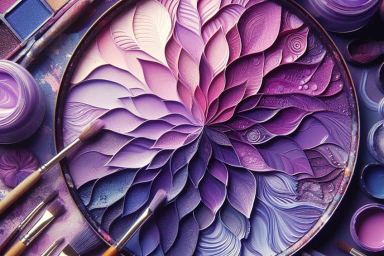
Purple, the regal hue of mystery and enchantment, dances on the color spectrum with a captivating allure. But what about its opposite, the rebellious rebel on the canvas of color? Buckle up for a chromatic adventure as we unravel the secrets of the opposite color of purple, diving into the vibrant world where opposites attract and create a symphony of visual delight. Get ready to explore the unexpected and discover how this contrasting color adds a splash of drama and excitement to the palette!
Table of Contents
Key Takeaways
- Purple’s opposite color on the standard color wheel is a specific shade of yellow.
- The complementary relationship between purple and yellow is grounded in color theory and enhances contrast.
- This contrast has practical applications in art, design, and other industries focused on visual composition.
Understanding Color Theory
In the world of colors and their interactions, the concept of complementary colors is both fascinating and practical. Purple, known for its rich, deep hue, occupies a distinct place on the color wheel. It is the result of blending red and blue, and as such, has an opposite color that complements it. This opposite, or complementary, color enhances the visual impact of purple when they’re placed side by side, thanks to the principles of color theory.
Basic Principles of Color Theory
The underpinning concept of color theory relies on the classification of colors into three core categories: primary colors, secondary colors, and tertiary colors.
- Primary colors: These are colors that cannot be made by mixing other colors. In the RYB color model, these are red, yellow, and blue.
- Secondary colors: Created by mixing two primary colors in equal parts. For instance, mixing red and blue yields purple, the central color of this section.
- Tertiary colors: These are formed by combining a primary color with a neighboring secondary color, giving us hues such as red-purple or blue-green.
A color model demonstrates how colors are represented and the logic of how different colors mix.
The RYB color model is often associated with art and design, while the RGB color wheel is used in digital screens where colors emerge from light.
The Color Wheel and Complementary Colors
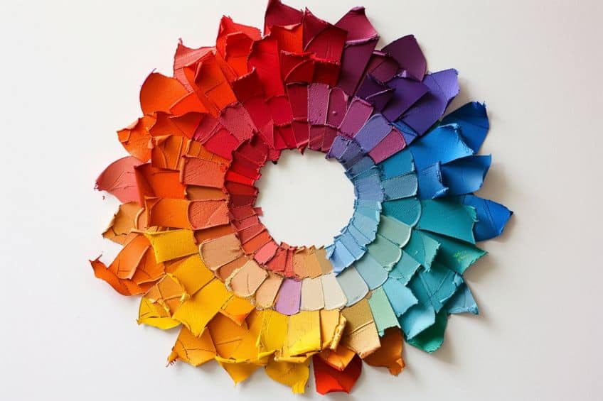
The color wheel is a circular diagram that organizes colors visually to demonstrate their relationships. The traditional wheel aligns with the RYB model, while digital formats often use the RGB color wheel.
- Complementary colors: They are positioned directly opposite each other on the color wheel, and when paired, they create a strong visual contrast.
- RGB: On the RGB color wheel, the complementary color for purple, which is a mix of red and blue light with more blue, is found to be a shade of yellow-green, often referred to as chartreuse.
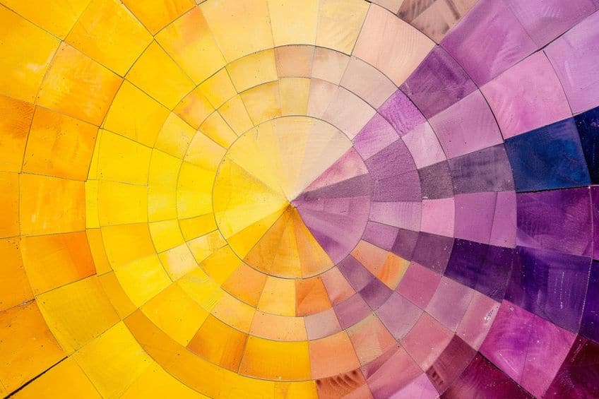
In terms of color mixing:
- RYB color model: The opposite of purple would be a color obtained by mixing the other two primary colors not involved in making purple, which leads to yellow.
- RGB color model: Using light instead of paint, the opposite of purple is its complementary color on the RGB color wheel, resulting in a yellowish-green hue.
This distinction highlights the relevance of the color model in question when determining complementary colors.
Purple and Its Place in the Spectrum
| Shade | Hex Code | CMYK Color Code (%) | RGB Color Code | Color |
| Purple | #916D9F | 9, 31, 0, 38 | 145, 109, 159 |
When seeking the opposite of purple, you land on a specific shade of yellow. This yellow contrasts with purple in a way that draws the eye and can create a vibrant look when used in art, design, or fashion.
Understanding the relationship between purple and its complementary color doesn’t only appeal to artists but also has practical implications in various industries such as interior design, where color contrast is key to creating aesthetic appeal.
The Significance of Purple in Art and Design
In the world of art and design, purple has long been a color of fascination. Artists and designers leverage its visual impact to evoke a sense of luxury, mystery, and sophistication. The use of purple in artwork and graphic design can convey a multitude of emotions and concepts, reinforcing its versatility and emotional depth. Interior design frequently utilizes shades of purple like mauve and lavender for their calming yet rich characteristics. Studies in visual arts have also shown how colors such as purple, violet, and magenta can influence mood and perception, making them powerful tools in a designer’s palette.
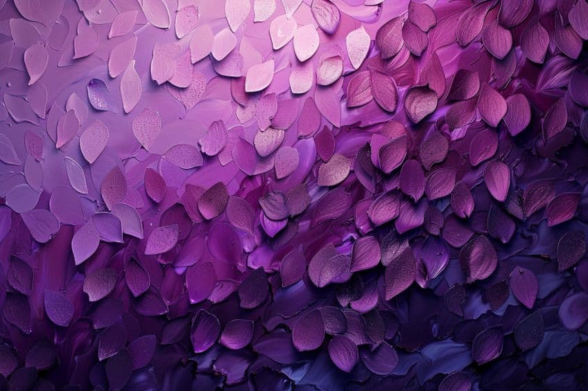
Shades and Tints of Purple
The shades of purple, ranging from the deep and luscious indigo to the more muted mauve, enrich artworks and designs with an air of complexity and visual appeal. Violet, as one of the pure shades, situates itself firmly in the cooler end of the spectrum, often used to denote elegance. On the other hand, tints of purple, which are created by adding white, introduce a softer and sometimes more feminine feel. Lavender, a popular tint, exudes a gentle and airy quality that translates into tranquil and serene design elements.
These varying shades and tints of purple ensure that there is a perfect hue for every tone and context within the artistic and design realms.
The Opposite of Purple: Exploring the Yellow Hue
| Shade | Hex Code | CMYK Color Code (%) | RGB Color Code | Color |
| Yellow | #FFFF00 | 0, 0, 100, 0 | 255, 255, 0 |
In the color spectrum, yellow stands as the direct contrast to purple, offering a vibrant complement that is fundamental to both color theory and practical application.
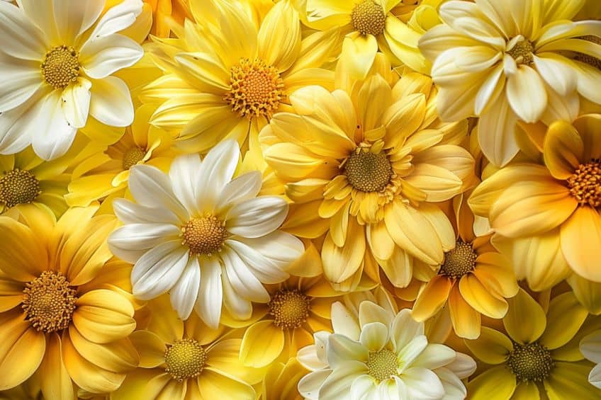
From Lemon to Golden: Yellow’s Range
Yellow boasts a broad spectrum, from the soft, pale shades of lemon to the deep, rich tones of gold. This hue range provides an extensive palette for various uses:
- Lemon yellow: Light and refreshing, often used in spring and summer designs to evoke a sense of brightness.
- Golden yellow: Resonates with opulence and often associated with luxury. Its presence can elevate designs with a sophisticated warmth.
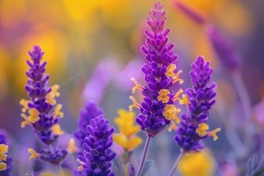
The various shades of yellow can deeply affect the mood of a composition and are critical when crafting visual contrasts, especially against purple hues in floral arrangements or sunset paintings.
It is here that the balance of warm and cool tones is vital.
Yellow in Color Psychology and Marketing
Yellow, as a warm color, is tied to emotions and creativity. Marketing materials utilize this hue to evoke specific psychological responses:
- Emotions: It is linked with happiness and positivity. Dark yellow shades, however, can suggest caution or decay.
- Creativity: Often encourages creativity and can stimulate mental processes.
- Mood: Known to uplift mood and create a sense of vibrancy.
In marketing material, yellow is employed strategically to attract attention and convey a message of energy and eagerness. This color’s applications are diverse, ranging from cautionary signals to emblems of cheerfulness, depending on its context and shade.
Different Color Models
Determining the opposite of purple varies based on the color model in use, since each employs a different approach to representing colors.
What Is the Opposite of Purple in RGB?
| Shade | Hex Code | CMYK Color Code (%) | RGB Color Code | Color |
| Purple | #916D9F | 9, 31, 0, 38 | 145, 109, 159 | |
| Yellow-Green | #9ACD32 | 28, 0, 100, 20 | 154, 205, 50 |
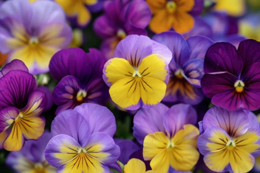
In the RGB (Red, Green, Blue) additive color model, which is common in digital displays, the opposite of purple is yellow-green. RGB uses light emissions to produce colors. Here, purple combines red and blue light.
Its opposite primarily features the remaining primary color, which is green, mixed with red to create yellow-green.
What Is the Opposite of Purple in CMY?
| Shade | Hex Code | CMYK Color Code (%) | RGB Color Code | Color |
| Purple | #916D9F | 9, 31, 0, 38 | 145, 109, 159 | |
| Yellow | #FFFF00 | 0, 0, 100, 0 | 255, 255, 0 |
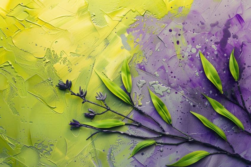
The CMY (Cyan, Magenta, Yellow) subtractive color model, often used in color printing, posits that the opposite of purple (a mix of magenta and blue in this model) is yellow. In CMY, colors result from the subtraction of light, with cyan, magenta, and yellow serving as the primary colors.
Purple absorbs green, hence the complement is yellow, which reflects green light.
What Is the Opposite of Purple in RYB?
| Shade | Hex Code | CMYK Color Code (%) | RGB Color Code | Color |
| Purple | #916D9F | 9, 31, 0, 38 | 145, 109, 159 | |
| Yellow | #FFFF00 | 0, 0, 100, 0 | 255, 255, 0 |
RYB (Red, Yellow, Blue) is an artistic color model, traditionally used in painting, where the opposite of purple is yellow. In this color wheel, purple lies between red and blue, and its complementary hue across the wheel is yellow, forming a high contrast pair.
The Dynamics of Color Contrast
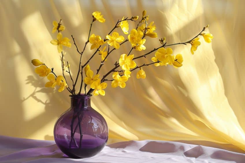
The interaction between colors, especially purple and its opposite, plays a crucial role in creating visual interest and guiding viewer perception through contrast, balance, and impact. When they select purple and its complementary color, yellow, creative professionals are engaging with a dynamic relationship. High contrast is achieved by placing these hues together, causing each color to appear more vivid.
Utilizing this principle, they often opt for a purple hue with a matching saturation level to its yellow counterpart, further enhancing the eye-catching effect of simultaneous contrast.
- Purple: A cool and often deep hue
- Yellow: A warm and typically vivid hue
Juxtaposed, these colors create a striking and dynamic visual experience, leading to compositions that can convey depth and energy.
Achieving Balance and Harmony
Balance and harmony arise from the thoughtful application of complementary colors. Designers achieve visual equilibrium by adjusting the saturation levels and proportions of purple and its opposite. A highly saturated purple may be balanced by a softer, less intense yellow, while a more muted purple could be paired with a bolder yellow to maintain visual harmony.
- Saturation: Carefully modulate to establish mood
- Proportion: Distribute colors to sustain equilibrium
The interplay of these elements ensures the viewer’s eye moves comfortably across the design without overwhelming them with intensity.

Color Pairings for Maximum Impact
To create maximum impact, one pairs purples and yellows mindful of their application context. In areas requiring immediate attention, a designer might use a bright purple beside an equally intense yellow. However, to add sophistication, one might prefer more subdued shades that still maintain the integrity of the complementary relationship.
- Bold pairings: Vivid purple with bright yellow
- Subdued pairings: Mauve with pale lemon
Such strategic pairings can evoke different responses, from energetic to elegant, proving the versatile nature of using color contrasts effectively.
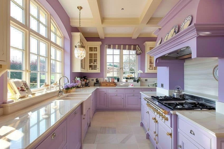
As we wrap up our colorful journey into the realm of opposites, it’s clear that the opposite color of purple isn’t just a mere contrast; it’s a vibrant accomplice in the grand symphony of hues. From the fiery passion of yellows to the tranquil coolness of greens, the opposite color of purple adds depth, balance, and a touch of whimsy to any artistic endeavor. So, next time you’re exploring the palette, don’t shy away from embracing the unexpected thrill of pairing purple with its daring counterpart—it’s a surefire way to make your colors pop and your creativity soar!
Frequently Asked Questions
How Do You Determine the Complementary Color of Purple?
In color theory, the complementary color of purple can be found directly opposite on the color wheel. For purple, this opposite color is yellow when using the Red-Yellow-Blue (RYB) color model, commonly used in art and design.
Which Paint Color Neutralizes Purple Tones?
To neutralize purple tones in paint, one would use its complementary color, which is yellow based on the RYB color model. Mixing the appropriate amount of yellow paint with purple will mute the purple’s intensity.
What Is the Contrasting Shade for Dark Purple?
For dark purple shades, a contrasting color that stands out against it is a lighter yellow-green or chartreuse. This contrast is because dark purple sits closer to the blue end of the spectrum, whereas chartreuse skew towards yellow, offering a stark contrast in hue and value.
Isabella studied at the University of Cape Town in South Africa and graduated with a Bachelor of Arts majoring in English Literature & Language and Psychology. Throughout her undergraduate years, she took Art History as an additional subject and absolutely loved it. Building on from her art history knowledge that began in high school, art has always been a particular area of fascination for her. From learning about artworks previously unknown to her, or sharpening her existing understanding of specific works, the ability to continue learning within this interesting sphere excites her greatly.
Her focal points of interest in art history encompass profiling specific artists and art movements, as it is these areas where she is able to really dig deep into the rich narrative of the art world. Additionally, she particularly enjoys exploring the different artistic styles of the 20th century, as well as the important impact that female artists have had on the development of art history.
Learn more about Isabella Meyer and the Art in Context Team.
Cite this Article
Isabella, Meyer, “What Is the Opposite of Purple? – A Look at Purple’s Complement.” Art in Context. April 16, 2024. URL: https://artincontext.org/what-is-the-opposite-of-purple/
Meyer, I. (2024, 16 April). What Is the Opposite of Purple? – A Look at Purple’s Complement. Art in Context. https://artincontext.org/what-is-the-opposite-of-purple/
Meyer, Isabella. “What Is the Opposite of Purple? – A Look at Purple’s Complement.” Art in Context, April 16, 2024. https://artincontext.org/what-is-the-opposite-of-purple/.

