Opposite of Brown – The Counterbalance to Brown
Welcome to the colorful world of opposites! Today, we’re diving into the intriguing realm of the opposite color to brown. While brown is often associated with warmth, earthiness, and comfort, its opposite on the color wheel introduces a vibrant and striking contrast. Get ready to explore the dynamic interplay between these contrasting hues and uncover the surprising effects they can create in art, design, and everyday life. Whether you’re a color enthusiast or just curious about the magic of color theory, buckle up for a fascinating journey into the world of opposites!
Table of Contents
Key Takeaways
- Brown’s opposite color is generally in the blue or blue-grey spectrum, varying with the specific brown hue.
- The complementary color can shift toward dark blue-green or dark violet for browns with different tints.
- Determining brown’s opposite is integral for creating visually appealing and contrasting color schemes.
Understanding Color Theory
| Shade | Hex Code | CMYK Color Code (%) | RGB Color Code | Color |
| Brown | #A52A2A | 0, 60, 60, 65 | 165, 42, 42 |
The concept of opposite colors is rooted in the dynamics of color theory, which defines the visual spectrum in terms of relationships between colors. When addressing the opposite or complementary color to brown, it’s not as straightforward as with primary colors. This is because brown itself is a complex color—a mixture of primary and secondary colors—which means its opposite on the color wheel can vary.
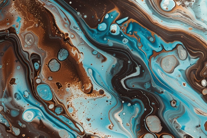
Typically, the contrasting color to brown falls into the blue or blue-grey range, providing the maximum contrast due to their positions on the color wheel.
Understanding the opposite color of brown involves recognizing the nuances of brown’s hue. The exact opposite can change depending on whether the brown has a redder, yellower, or greener tint, which is often the case given how versatile and varied brown shades can be. In certain contexts, the contrasting color to a specific brown could lean toward dark violet or dark blue-green.

Keeping these principles in mind, one can harness the power of complementary colors to create striking and harmonious color combinations in various design applications. In color theory, colors are positioned on a color wheel for easy visualization of their relationships. Primary colors are fundamental, serving as the building blocks for creating a broad spectrum of other hues through color mixing.
Primary Colors and Their Importance
Primary colors are red, yellow, and blue. They are called primary because they cannot be created by mixing other colors together. These three hues are the cornerstone of color theory. In the context of color mixing, combining primary colors yields secondary colors—green, orange, and purple. Tertiary colors are formed when a primary color is mixed with its adjacent secondary color. Tertiary colors add depth and variety to the color wheel, making the transition from primary to secondary colors more nuanced.
The color wheel is a visual representation of colors arranged according to their chromatic relationship.
Primary, secondary, and tertiary colors occupy specific positions on the wheel. One can identify complementary colors, which are directly across from each other on the color wheel, and are important for understanding the opposite of a given color. Hue is a term that refers to the dominant wavelength of color and is often used interchangeably with the word ‘color’.

Saturation measures the intensity or purity of a color, whereas brightness relates to the lightness or darkness of a color, influenced by adding white or black, known as tints and shades, respectively. Color theory delves into how these elements interact and influence one another. It is foundational for anyone working with colors to comprehend and apply these concepts effectively in design, art, and visual communication.
Complementary Colors Explained
Complementary colors are pairs on the color wheel that, when combined in design, provide a high contrast and vibrant look while canceling each other’s hue when mixed together.
Identifying Complementary Colors
Complementary colors lie directly opposite each other on the color wheel. This relationship means they create the strongest contrast and also balance each other. Identifying the complementary color to any given hue can be done using a basic tool known as the color wheel.

In the case of brown, which is a complex tertiary color made from combining primary and secondary colors, one can determine its complementary color by considering the color wheel dynamics or by looking at brown’s constituent colors.
Complementary Colors in Design
Complementary colors are a foundational element in various design fields, including graphic design, interior design, and fashion. Designers utilize these opposing hues to create eye-catching contrasts and visual interest. Key points include:
- Contrast: The high contrast of complementary colors makes elements stand out.
- Balance: Strategically combining complementary colors can create a visually harmonious balance.
- Attention: In marketing and branding, complementary colors can be used to draw attention to a call to action or important content.
When it comes to the opposite color of brown, designers must consider brown’s base colors to find an adequate complementary match, which often results in a bluish or teal tone, providing a vibrant contrast suitable for various applications.
Different Color Models
In color theory, the opposite or complementary color of brown varies depending on the color model being used. These models define colors in different ways and therefore give us different complementary colors for brown.

What Is the Opposite of Brown in RGB?
| Shade | Hex Code | CMYK Color Code (%) | RGB Color Code | Color |
| Brown | #A52A2A | 0, 60, 60, 65 | 165, 42, 42 | |
| Cyan Blue | #00FFFF | 100, 0, 0, 0 | 0, 255, 255 | |
| Dark Azure | #008B8B | 100, 0, 0, 45 | 0, 139, 139 |
In the RGB (Red, Green, Blue) color model, which is an additive color model primarily used in electronic displays, opposites are defined by the subtractive primaries. Brown typically has components of all three RGB colors, and the exact opposite would thus involve a color that, when combined with brown, results in white.
The opposite of brown in the RGB model is often a dark cyan-blue or dark azure
What Is the Opposite of Brown in CMY?
| Shade | Hex Code | CMYK Color Code (%) | RGB Color Code | Color |
| Brown | #A52A2A | 0, 60, 60, 65 | 165, 42, 42 | |
| Light Cyan | #E0FFFF | 5, 0, 0, 0 | 224, 255, 255 | |
| Aqua | #00FFFF | 100, 0, 0, 0 | 0, 255, 255 |
For the CMY (Cyan, Magenta, Yellow) color model, which is a subtractive color model used in color printing, brown’s opposite is found by looking at what brown lacks. In CMY, brown usually contains more magenta and yellow and less cyan. Therefore, to find its opposite, one would increase cyan and decrease the other two colors, typically resulting in a shade of light cyan or aqua as the complementary color.

What Is the Opposite of Brown in RYB?
| Shade | Hex Code | CMYK Color Code (%) | RGB Color Code | Color |
| Brown | #A52A2A | 0, 60, 60, 65 | 165, 42, 42 | |
| Dark Blue | #00008B | 100, 100, 0, 45 | 0, 0, 139 | |
| Dark Violet | #9400D3 | 75, 100, 0, 13 | 148, 0, 211 |
In the RYB (Red, Yellow, Blue) color model, traditionally used in art and design education, brown is made by mixing red, yellow, and a small amount of blue. Its complementary color often involves the addition of what brown lacks, thus requiring more blue in the mix.
In RYB, the opposite of brown may tend towards a dark blue or dark violet, depending on the specific shade of brown.
How to Use Browns and Their Opposite Colors
When incorporating brown and its opposite colors in design, one should understand their complementary nature. Brown is a versatile color often associated with stability and reliability. Its opposite colors typically fall into the blue or bluish-grey spectrum on the color wheel, offering high contrast and visual interest. Assessing the shade of brown is key to finding its perfect opposite on the color wheel. Identify if the brown leans towards red, yellow, or green undertones. For brown with red undertones, a cooler blue-grey is the ideal opposite choice. If the brown has yellow undertones, opt for a purer blue to create a striking contrast.

For brown with green undertones, a more vivid bluish-grey can work wonders, adding depth and intrigue to your color scheme. To mix the opposite of a specific brown, blend it with a blue or blue-grey shade until the desired contrast is achieved. This mix will neutralize the brown, thus revealing its complementary color.
Design applications include:
- Interior design: Pair brown furniture with blue accents or vice versa for a grounded and yet dynamic space.
- Graphic design: Use browns and blues to create stand-out visuals that draw the eye due to their contrast.
- Fashion: Complement brown clothing with blue accessories to create a sophisticated outfit.
Using the Opposite Colors to Brown
When exploring the opposite of brown in color theory, various applications across multiple fields come into play. These include visual arts, fashion, design, brand identity, and cultural significance, with each benefiting from the concept of opposite colors to create visual interest and harmonious color combinations.
Visual Arts
In visual arts, artists often apply the concept of color contrast to enhance the visual appeal of their work. The opposite of brown, which tends to be blue or bluish-grey, can add depth and focus. For instance, a painter might use a brown foreground to ground the subject matter, while a backdrop of blue can recede, drawing the viewer’s eye toward the central theme.

Fashion
Fashion designers integrate opposite colors to brown to craft outfits that stand out. A garment in shades of #8a3324 (burnt umber) might be paired with blue accessories to create a look that’s both sophisticated and eye-catching.
This use of color contrast can give an ensemble a dynamic yet balanced look.
Design
Graphic designers employ the opposite of brown to achieve creative and visually attractive designs. In logo creation, for instance, a design might incorporate brown for its earthy, dependable connotations, using blue accents for a pop of complementary color. This can make the logo more memorable and effectively convey a brand’s message.

Brand Identity
A brand’s identity greatly benefits from intelligent color use. Companies might choose brown for its association with ruggedness and reliability, while implementing its opposite to highlight key messages. This strategic color placement can significantly impact customer perception and brand recognition.
Cultural Significance
The opposite colors to brown hold varying cultural significances. In specific cultures, brown may represent the Earth, while its opposite could symbolize water or sky, promoting a sense of balance. Harnessing these cultural connotations can enrich the storytelling and depth of an artistic or commercial project.

As we wrap up our colorful adventure, we’ve discovered the captivating world of opposites to brown. From the energetic pop of blues and greens to the dramatic allure of purples and oranges, exploring the opposite colors to brown opens up a spectrum of creative possibilities. Whether you’re crafting a cozy interior palette or designing eye-catching artwork, understanding the power of opposites can elevate your color compositions to new heights. So go ahead, embrace the excitement of contrasting hues, and let your imagination paint with the vibrant magic of color theory!
Frequently Asked Questions
What Is the Complementary Color for Brown Hair?
The complementary color for brown hair typically is a hue that can enhance the natural tones of the hair. For warm brown hair with red or yellow undertones, a color with blue or teal undertones often acts as a complement. For cooler brown hair with ashy undertones, a warmer hue like orange or red can provide contrast.
How Can I Determine the Contrasting Color for Brown Paint?
To determine the contrasting color for brown paint, one should consult a color wheel and look for the color directly across from the specific shade of brown. Brown is a composite color, made by combining red, yellow, and blue, and its complementary color often falls within the blue or bluish-grey spectrum.
What Color Is Directly Across from Dark Brown on the Color Wheel?
Directly across from dark brown on the color wheel, one often finds hues of blue or blue-grey. These colors contrast with dark brown and can provide a striking visual when paired together, due to their relative positions as complementary colors.
Isabella studied at the University of Cape Town in South Africa and graduated with a Bachelor of Arts majoring in English Literature & Language and Psychology. Throughout her undergraduate years, she took Art History as an additional subject and absolutely loved it. Building on from her art history knowledge that began in high school, art has always been a particular area of fascination for her. From learning about artworks previously unknown to her, or sharpening her existing understanding of specific works, the ability to continue learning within this interesting sphere excites her greatly.
Her focal points of interest in art history encompass profiling specific artists and art movements, as it is these areas where she is able to really dig deep into the rich narrative of the art world. Additionally, she particularly enjoys exploring the different artistic styles of the 20th century, as well as the important impact that female artists have had on the development of art history.
Learn more about Isabella Meyer and the Art in Context Team.
Cite this Article
Isabella, Meyer, “Opposite of Brown – The Counterbalance to Brown.” Art in Context. March 19, 2024. URL: https://artincontext.org/opposite-of-brown/
Meyer, I. (2024, 19 March). Opposite of Brown – The Counterbalance to Brown. Art in Context. https://artincontext.org/opposite-of-brown/
Meyer, Isabella. “Opposite of Brown – The Counterbalance to Brown.” Art in Context, March 19, 2024. https://artincontext.org/opposite-of-brown/.


