Opposite of Pink – The Contrast to Pink Explored
Welcome to the vibrant world of color theory, where hues dance and opposites attract! In this colorful journey, we’re diving into the enchanting realm of pink’s perfect foil, its dynamic counterpart that adds zest and balance to every palette. Get ready to explore the mesmerizing world of the opposite color to pink, where contrasts collide and harmony emerges in a symphony of hues.
Table of Contents
Key Takeaways
- Complementary colors are defined by their position on the color wheel, offering high contrast and visual balance.
- Pink’s opposite can vary, commonly being a shade of green or cyan, depending on the color model and pink hue.
- Using pink with its complementary color can enhance aesthetics and project different psychological effects.
Understanding Color Theory
| Shade | Hex Code | CMYK Color Code (%) | RGB Color Code | Color |
| Pink | #FFC0CB | 0, 24, 15, 0 | 255, 192, 203 |
In the realm of color theory, every hue on the color wheel has a complementary color that sits directly opposite to it. These pairs are chosen because they offer the greatest contrast and balance to one another. For the color pink, identifying its complementary color can be slightly more complex due to its position as a tint of red and its varying shades.

The opposite of pink can change based on the context and specific pink hue in question. Color theory is essential for determining relationships between colors. It explains how human perception responds to color combinations and informs decisions in design and art.
Color Wheel Fundamentals
The color wheel is a circular diagram that represents the spectrum of colors and their relationships. Primary colors (red, yellow, blue in the RYB model; red, green, blue in the RGB model; and cyan, magenta, yellow in the CMYK model) are the basis of all other colors in the wheel. Secondary colors are created by mixing two primary colors: red and yellow make orange, yellow and blue make green, blue and red make purple. Tertiary colors result from the mixing of secondary and primary colors to create six additional hues.
- Primary colors: RYB (Red, Yellow, Blue), RGB (Red, Green, Blue), and CMYK (Cyan, Magenta, Yellow)
- Secondary colors: Green, Orange, Purple
- Tertiary colors: Yellow-orange, Red-orange, Red-purple, Blue-purple, Blue-green, Yellow-green
The RYB color model is traditionally used by artists, while the RGB model applies to light, such as in digital screens, and the CMY/CMYK model applies to color printing.
Complementary and Opposite Colors
Complementary colors lie directly across from each other on the color wheel, offering high contrast and vibrant visual perception when placed side by side. In the RYB color model, the complement of red is green, blue complements orange, and yellow complements purple. The RGB and CMY color models also have their complementary pairs, which result from the subtractive or additive color mixing processes. In the RGB additive color model, used for light and screen displays, the complementary pair of pink (a tint of red) would be a form of green.
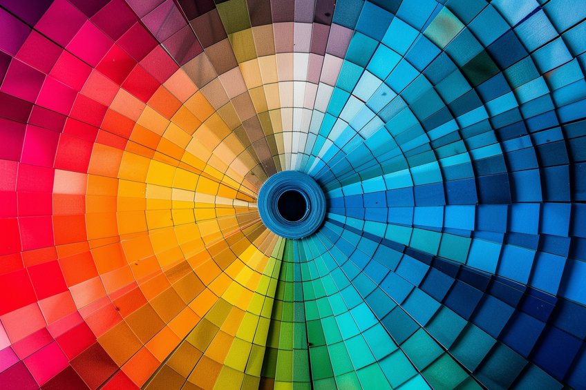
Because pink values are made by adding white to red, determining its complement involves considering the effects of light and contrast. Color psychology plays a role in how these colors are perceived and the associations they may evoke. For example, pink often suggests femininity, playfulness, and love, while its complement might evoke contrasting feelings, reinforcing the impact of each color through association and visual perception.
Pink’s Complementary Color
The complementary color for pink can be understood through different color models such as the RGB (Red, Green, Blue) additive color model or the CMY (Cyan, Magenta, Yellow) subtractive color model. These models approach color mixing differently, and as a result, pink’s opposite on the color wheel can range from a variation of green to a bright cyan or teal. Understanding how to use pink and its complementary colors effectively can enhance design projects, art, and even influence psychological responses. In the exploration of color theory, the concept of complementary colors is fundamental.
The hue directly across the color wheel from pink is identified as its complement, creating a high-contrast and visually engaging combination.
Identifying the Opposite of Pink
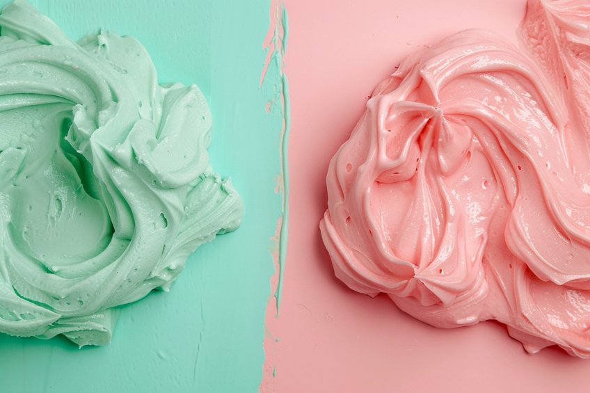
The opposite of pink on the RGB color wheel is a hue known as mint green, which can be represented by the hexadecimal code #C0FFF4. Mint green is considered pink’s complementary color because it sits directly across the RGB color wheel from pink. This relationship is rooted in the principles of color theory, where complementary colors, when paired, enhance each other’s visual intensity. Such pairs are widely used to create striking contrasts in various forms of art and design.
Applications in Art and Design
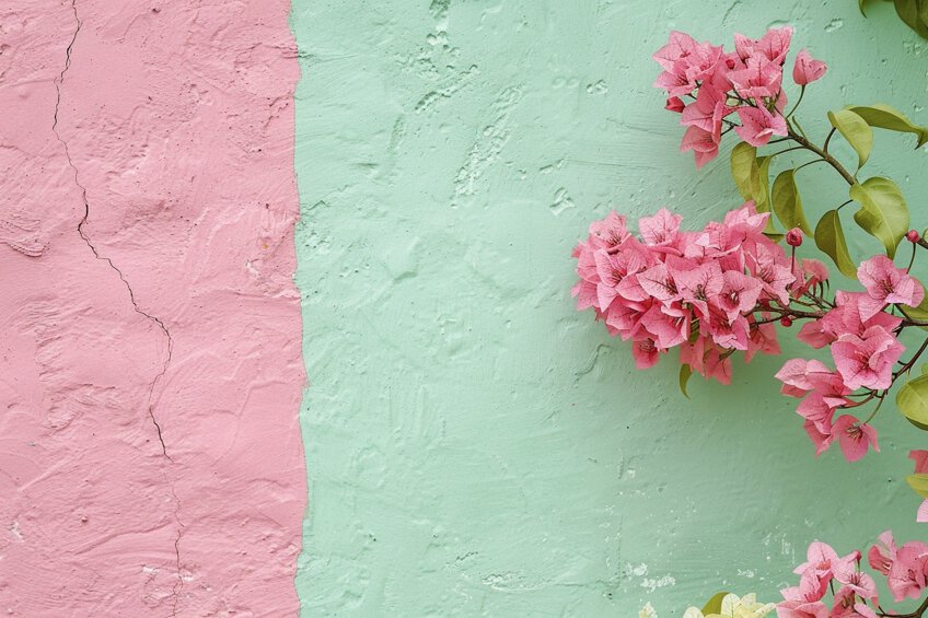
In art, complementary colors are utilized by artists to bring vibrancy and emphasis to their artwork. A painter might use mint green in the background to make a pink subject stand out. In interior design, these opposing hues can breathe life into a space, with mint green elements complementing pink decor for a fresh and trendy look.
Fashion designers often incorporate complementary colors to create bold statement pieces that capture the eye. Pink and mint green can be seen in clothing lines to keep up with color trends.
The branding industry uses the dynamics of complementary colors like pink and green to craft logos and packaging that stand out. Effective use of color opposites can influence purchasing decisions and brand recognition. In essence, the thoughtful application of pink’s complement, mint green, can enhance an aesthetic experience, whether it’s in a painted scene or the latest autumn collection.
Different Color Models
Identifying the opposite of pink varies depending on the color model in question, as each color model operates on different principles of color mixing and perception.
What Is the Opposite of Pink in RGB?
| Shade | Hex Code | CMYK Color Code (%) | RGB Color Code | Color |
| Pink | #FFC0CB | 0, 24, 13, 0 | 255, 192, 203 | |
| Light Green | #90EE90 | 25, 0, 40, 0 | 144, 238, 144 |
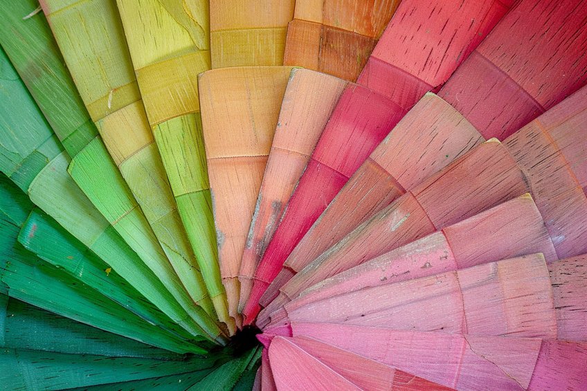
In the RGB (Red, Green, Blue) color model, utilized primarily for digital screens and light-based displays, the opposite of a color is its complementary color. Pink is created by mixing red and blue light with less green. Thus, its complement is a greenish color, typically a form of light green that can neutralize pink when combined in the right proportions.
What Is the Opposite of Pink in CMY?
| Shade | Hex Code | CMYK Color Code (%) | RGB Color Code | Color |
| Pink | #FFC0CB | 0, 24, 13, 0 | 255, 192, 203 | |
| Light Green | #90EE90 | 25, 0, 40, 0 | 144, 238, 144 |
In the CMY (Cyan, Magenta, Yellow) color model, which is a subtractive color model predominantly used in color printing, the opposite of pink is a color that would counteract it when overlaid. Given that pink can be seen as a tint of red, which is made by removing green and blue, its opposite in the CMY model is a shade of light green.
What Is the Opposite of Pink in RYB?
| Shade | Hex Code | CMYK Color Code (%) | RGB Color Code | Color |
| Pink | #FFC0CB | 0, 24, 13, 0 | 255, 192, 203 | |
| Green | #008000 | 100, 0, 100, 50 | 0, 128, 0 |
Within the RYB (Red, Yellow, Blue) color model, which is historically traditional and commonly used in art and design education, finding the opposite of pink involves combining red with white to lighten it, and then identifying the most contrasting color.
Since pink contains red, which contrasts with green in this model, the opposite would be a light green or yellow-green shade.
How to Use Pinks and Their Opposite Colors
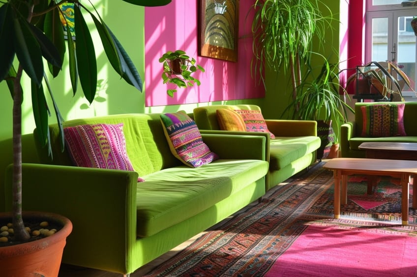
In the world of color theory, pink and its complementary colors are used to create vibrant and dynamic designs. The opposite colors of pink on the color wheel are essentially shades of green. These contrasting hues can be paired to produce visually appealing and harmonious combinations. Key pairings include:
- Teal and pink: Teal provides a cool counterpoint to the warmth of pink. Together, they balance each other beautifully, making them a popular choice.
- Mint and pink: For a softer contrast, mint green paired with light pink yields a delicate and inviting palette.
Practical applications include:
- Fashion: Pair a teal outfit with pink accessories for a lively, eye-catching look.
- Interior design: Mint accents in a room with pink decor can evoke a warm yet refreshing atmosphere.
In graphic design, one could use these complementary colors to draw attention and guide the viewer’s eye. Bold pink can pop against a darker green backdrop, whereas a pastel pink might be paired with a lighter green for a more subdued effect. For events, consider the place settings: blush pink napkins on a sage green tablecloth can set a sophisticated and inviting table.
Remember that the intensity and saturation of the pink will dictate the best shade of green to complement it; a bright pink calls for a deeper green, and a softer pink pairs well with a lighter green.
Cultural and Psychological Implications
This section explores the nuanced role that pink plays in society, examining its association with emotions and its impact on branding and fashion. It underscores how color psychology shapes our understanding of pink in different contexts, from art to apparel.
Color Symbolism and Emotion
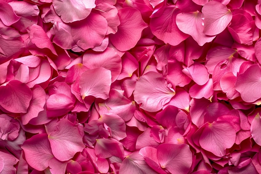
The color pink often conveys love, kindness, and a calming effect, associations deeply ingrained in cultural and psychological contexts. In artwork and design, it’s employed for its ability to evoke feelings of romance, tranquility, and femininity.
- Color psychology: Pink’s gentle nature is seen as soothing, fostering a sense of safety and compassion.
- Cultural meanings: While pink is traditionally linked with femininity in many Western cultures, it’s considered masculine and a symbol of youth in others, such as Japan.
Color in Branding and Fashion
In the realms of fashion and branding, pink is a dynamic player, aligning with changing color trends and psychological associations.
- Fashion trends: Pink is versatile, periodically reinvented to align with cultural shifts, from soft pastels symbolizing youthful innocence to bold neon shades exuding confidence.
- Branding: Companies utilize pink to communicate kindness and approachability, often targeting female demographics, but recent trends show a shift towards gender-neutral appeal.
- Clothing: Pink in clothing can signify self-care and positive self-image, and brands decode these associations to cater to consumer emotions and societal trends.
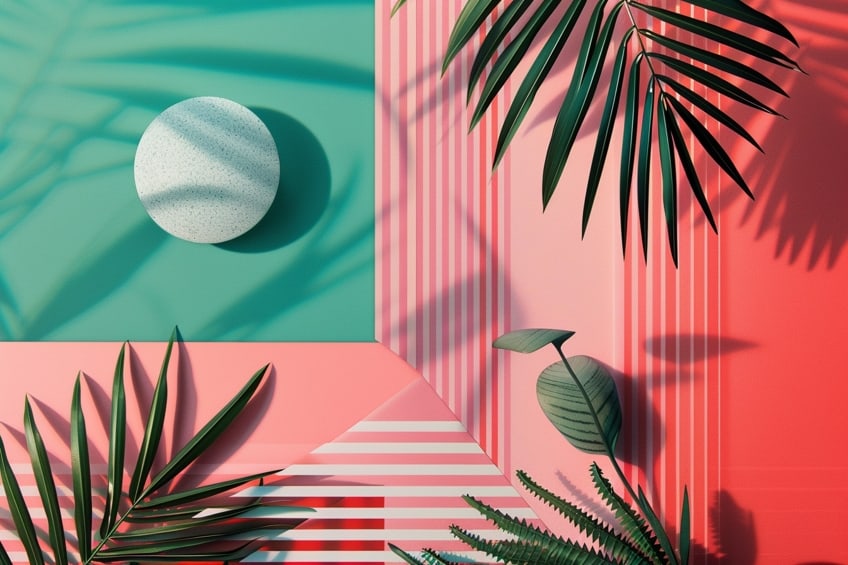
As we conclude our colorful expedition, we’ve uncovered the magic of pink’s opposite color, a captivating force that brings depth and intrigue to every artistic creation. Remember, in the realm of color theory, opposites not only attract but also inspire endless possibilities. So whether you’re painting a masterpiece, designing a fashion line, or simply adding flair to your living space, embrace the power of opposites and let your creativity shine in a kaleidoscope of hues!
Frequently Asked Questions
What Color Contrasts With Pink in Color Theory?
In color theory, the color that contrasts with pink is green. This complementary contrast is due to pink being a tint of red, and green sitting opposite red on the color wheel. The specific shade of green that contrasts with pink can vary depending on the pink’s tone.
Which Color Does Not Pair Well With Pink?
While color preferences can be subjective, colors that do not pair well with pink are typically those that clash or create an unpleasing combination due to their similarities in tone and saturation. Muddy browns or overly bright oranges may not complement pink effectively.
How Can One Determine the Opposite Color on the Color Wheel?
To determine the opposite color on the color wheel, one should locate the color in question on the wheel and then find the hue directly across from it. This opposing hue is considered the complementary color. For pink, a light red, the opposite would be a shade of green.
Isabella studied at the University of Cape Town in South Africa and graduated with a Bachelor of Arts majoring in English Literature & Language and Psychology. Throughout her undergraduate years, she took Art History as an additional subject and absolutely loved it. Building on from her art history knowledge that began in high school, art has always been a particular area of fascination for her. From learning about artworks previously unknown to her, or sharpening her existing understanding of specific works, the ability to continue learning within this interesting sphere excites her greatly.
Her focal points of interest in art history encompass profiling specific artists and art movements, as it is these areas where she is able to really dig deep into the rich narrative of the art world. Additionally, she particularly enjoys exploring the different artistic styles of the 20th century, as well as the important impact that female artists have had on the development of art history.
Learn more about Isabella Meyer and the Art in Context Team.
Cite this Article
Isabella, Meyer, “Opposite of Pink – The Contrast to Pink Explored.” Art in Context. March 19, 2024. URL: https://artincontext.org/opposite-of-pink/
Meyer, I. (2024, 19 March). Opposite of Pink – The Contrast to Pink Explored. Art in Context. https://artincontext.org/opposite-of-pink/
Meyer, Isabella. “Opposite of Pink – The Contrast to Pink Explored.” Art in Context, March 19, 2024. https://artincontext.org/opposite-of-pink/.


