Opposite of Yellow – Inverting the Hue
Welcome to the vibrant world of color exploration! Today, we embark on an exhilarating journey to uncover the captivating counterpart to the sunny hue of yellow. As we delve into the realm of color theory, we’ll unveil the enigmatic allure of its opposite. Prepare to be dazzled as we unravel the mysteries and discover the perfect foil to yellow’s radiant charm. Join me as we delve into the dynamic interplay of hues and reveal the secrets of this intriguing chromatic duo!
Table of Contents
Key Takeaways
- Complementary colors such as yellow and violet provide high contrast and visual intensity.
- The correct opposite color to yellow may vary depending on the color model being referenced.
- Utilizing yellow’s complementary color can enhance artistic and design projects through contrast and balance.
Exploring Complementary Colors
| Shade | Hex Code | CMYK Color Code (%) | RGB Color Code | Color |
| Yellow | #FFFF00 | 0, 0, 100, 0 | 255, 255, 0 |
In the realm of color theory, complementary colors sit opposite each other on the color wheel, offering high contrast and vibrant interplay when combined. This section uncovers the relationship between yellow and purple, and how their contrast can be applied across various design fields.

Color Theory Fundamentals
Color theory is a cornerstone of visual arts and design, involving an understanding of how colors interact, their visual impacts, and the messages they convey. Primary colors (red, blue, and yellow) form the basis of the color wheel and, when mixed, create secondary colors.
Complementary colors are opposite each other on the wheel, and they achieve maximum contrast and color vibrancy when paired.
The Yellow-Purple Dichotomy
Yellow and purple sit directly across from one another on the color wheel, making them complementary. Yellow, a primary color, is often associated with brightness and energy, while purple, a secondary color resulting from the combination of red and blue, is viewed as luxurious and sophisticated. The stark contrast between these hues can create dynamic and visually appealing results in any composition.
- Contrast: Yellow/purple
- Harmony: Achieved when paired
- Result: Visual interest and emphasis

Applying Complementary Colors
Complementary colors are strategically leveraged in various creative fields such as art, design, fashion, and interior design to create visual interest and harmony. When yellow and purple are paired, they enhance the intensity of each other, making the yellow appear brighter and the purple more profound. This principle is often utilized to draw attention to a particular element within a piece of artwork or to create a sense of balance in a design layout.
- Art and design: For heightened contrast and focal points
- Fashion: To make bold, vibrant statements
- Interior design: To introduce energy and depth in spaces
By understanding and applying the principles of complementary colors, artists and designers can exploit the vibrant relationship between shades like yellow and purple to elevate their creative works.
Different Color Models
In the world of color theory, every hue has a counterpart that sits directly across from it on the color wheel, known as its complementary color. When paired together, these colors provide the highest contrast and the greatest visual intensity. The opposite color of yellow, according to the standard color wheel, is violet or purple. This relationship is not just a theoretical concept but has practical applications in various fields such as art, design, and digital media.

Complementary colors play a crucial role in visual arts, where they can be used to create striking compositions, emphasize elements, and balance the overall feel of the artwork. Understanding how to find the correct complementary color is quintessential for artists, designers, and anyone looking to enhance visual aesthetics. While in the RGB color model used for digital screens, yellow pairs with a shade akin to deep blue or cyan; in the traditional RYB color model more common to painting and print, yellow’s opposite is violet.
What Is the Opposite of Yellow in RGB?
| Shade | Hex Code | CMYK Color Code (%) | RGB Color Code | Color |
| Yellow | #FFFF00 | 0, 0, 100, 0 | 255, 255, 0 | |
| Purple | #916D9F | 9, 31, 0, 38 | 145, 109, 159 |
In the RGB (Red, Green, Blue) color model, which is additive and based on light, the opposite of yellow is purple. This particular model finds application in digital screens, wherein hues are generated through the amalgamation of light. When red and green light combine, they produce yellow.
Therefore, the absence of both red and green, which implies blue light, completes the complementary pair.
What Is the Opposite of Yellow in CMY?
| Shade | Hex Code | CMYK Color Code (%) | RGB Color Code | Color |
| Yellow | #FFFF00 | 0, 0, 100, 0 | 255, 255, 0 | |
| Blue | #0000FF | 100, 100, 0, 0 | 0, 0, 255 |
For the CMY (Cyan, Magenta, Yellow) color model, a subtractive model dealing with reflected light, the opposite of yellow is blue. This model is frequently employed in color printing where the inks absorb some wavelengths of light and reflect others. Yellow absorbs the blue light and reflects red and green, so its complement is the color that absorbs red and green, which is blue.

What Is the Opposite of Yellow in RYB?
| Shade | Hex Code | CMYK Color Code (%) | RGB Color Code | Color |
| Yellow | #FFFF00 | 0, 0, 100, 0 | 255, 255, 0 | |
| Purple | #916D9F | 9, 31, 0, 38 | 145, 109, 159 |
Within the RYB (Red, Yellow, Blue) color model, a traditional subtractive model used in art and painting, yellow’s direct opposite is purple. This model considers red, yellow, and blue as the primary colors and combines them to achieve secondary colors.
Yellow paired with purple sits directly across it on the RYB color wheel, which artists have used for centuries to understand color relationships.
How to Find the Correct Opposite to Yellow
When searching for the correct opposite, or complementary, color to yellow, it is important to refer to the color wheel as a reliable guide. On the standard RGB (Red-Green-Blue) color wheel, which is typically used for digital graphics and design, yellow’s complement is purple. However, within the RYB (Red-Yellow-Blue) color model, often used in traditional art and for mixing paints, the complementary color to yellow is identified as violet or purple. The complementary color is positioned directly across from yellow on the color wheel, providing the maximum contrast and vibrancy when placed next to each other.
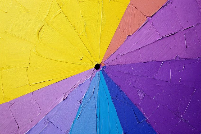
These colors are used together to create a stark visual impact and dynamic designs. In digital color codes, the complement of yellow (hexadecimal color #FFFF00) is typically represented by blue (hexadecimal color #0000FF). Artists and designers use this knowledge to balance visual interest in their works, ensuring that the colors chosen are deliberate and serve the composition’s desired effect.
The use of complementary colors often reflects an understanding of color theory and its practical application in various artistic and design contexts.
How to Use Yellows and Their Opposite Colors
When one incorporates yellow into a design, utilizing its opposite color can create a vibrant and harmonious contrast. The opposite of yellow on the standard color wheel is purple. This pairing is based on the principles of color theory, where complementary colors are directly across from each other on the wheel.
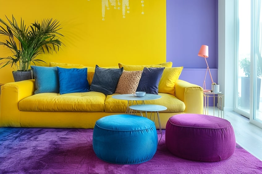
In practical applications, designers may choose blue-purple to contrast with yellow. Blue-purple enhances the visual appeal when paired with yellow because it provides a stark contrast without overwhelming the senses. To employ these opposites effectively, consider the following strategies:
- Accent: Use purple as an accent color to make elements in yellow stand out. This can be particularly effective in graphic design, where a splash of purple can draw the eye to a yellow backdrop.
- Balance: Maintain a balanced color scheme by using these opposites in equal measure. For instance, in interior design, one could use yellow cushions on a purple sofa.
- Harmony: For a harmonious look, introduce tints and shades of purple. Lighter purples (lavender) can soften the contrast, while darker purples (eggplant) can add depth.
Remember to consider other elements such as lighting, texture, and the presence of neutral colors, which can affect the perception of color opposition and harmony.
Practical Applications and Effects
In the multifaceted realm of color usage, the opposite color of yellow, which is purple, plays a significant role across various fields. From enhancing visual appeal in art and design to affecting mood and perception in psychology, purple’s implementation carries practical and emotional weight.
Design and Art
In art and design, purple commands attention when paired with yellow due to the stark contrast between these complementary colors. This contrast is not merely a visual stimulant but a strategic tool. Artists leverage this interplay to guide the viewer’s eye, while designers use it to create dynamic logos and brand identities. In abstract and pop art, the purple-yellow combination is favored for its vibrant aesthetic, often evoking a sense of energy and creativity.

Psychology and Color Perceptions
Color psychology delves into the emotional and psychological responses elicited by colors. Yellow typically evokes feelings of happiness and energy, while purple can represent luxury and creativity. When used together, these colors can influence mood and perception, often utilized in marketing and product design to invoke specific consumer emotions.
Color Models and Digital Applications
Digitally, colors are often represented using the RGB color model, where colors are created through an additive process combining red, green, and blue light. Purple can be achieved with a mix of red and blue, while yellow results from combining red and green. The CMYK model, crucial for color printing, presents purple as a secondary color and yellow as a primary, providing a vast spectrum of colors used in digital media and web design.

Color Dynamics in Nature and Fashion
Within nature and fashion, the yellow-purple dichotomy is widespread and impactful. In the natural world, these opposite colors often occur together, lending to visually compelling scenes—think of a sunset’s purple hues contrasting a field of yellow flowers.
In fashion, stylists may pair purple accessories with yellow garments to evoke a sense of contrast and harmony, playing with shades and tones to produce outfits that stand out.
Historical Perspectives and Science
Historically, the study of color relationships dates back to theories by Isaac Newton, who introduced the color circle. Over time, this evolved into today’s color wheel, a crucial reference in both art and science, underlining the fundamental spectrum of colors in terms of wavelength and human vision. Understanding the opposite colors has not only cultural significance but also practical applications in fields such as optics and color science.
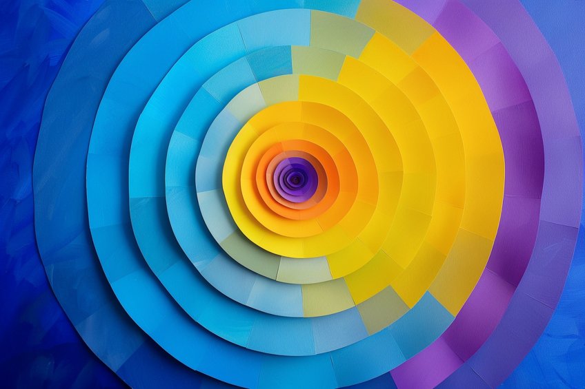
As we draw the curtains on our colorful expedition, we find ourselves enlightened by the fascinating world of opposites in the realm of color. From the cheerful radiance of yellow to its dynamic counterpart, we’ve explored the harmonious dance between hues. Remember, in the canvas of life, it’s the contrasts that add depth and richness to our experiences. So, whether you’re basking in the golden glow of sunshine or embracing the cool embrace of its opposite, let the vibrant spectrum of colors ignite your imagination and infuse your world with boundless joy and creativity.
Frequently Asked Questions
What Is the Complementary Color to Yellow on the Color Wheel?
The complementary color to yellow on the color wheel is purple. This relationship is grounded in color theory, where colors opposite each other on the wheel create the highest contrast.
How Can I Determine the Contrasting Color for Yellow?
To determine the contrasting color for yellow, one can refer to a standard color wheel and look directly across from yellow to find its opposite, which is purple. This opposite color is called the complementary color and is used to create visual interest and contrast.
What Hue Is Considered the Negative of Yellow in Color Theory?
In color theory, the hue considered the negative of yellow is violet. Violet or purple sits directly across from yellow on the color wheel, providing the maximum contrast to yellow’s shade.
Isabella studied at the University of Cape Town in South Africa and graduated with a Bachelor of Arts majoring in English Literature & Language and Psychology. Throughout her undergraduate years, she took Art History as an additional subject and absolutely loved it. Building on from her art history knowledge that began in high school, art has always been a particular area of fascination for her. From learning about artworks previously unknown to her, or sharpening her existing understanding of specific works, the ability to continue learning within this interesting sphere excites her greatly.
Her focal points of interest in art history encompass profiling specific artists and art movements, as it is these areas where she is able to really dig deep into the rich narrative of the art world. Additionally, she particularly enjoys exploring the different artistic styles of the 20th century, as well as the important impact that female artists have had on the development of art history.
Learn more about Isabella Meyer and the Art in Context Team.
Cite this Article
Isabella, Meyer, “Opposite of Yellow – Inverting the Hue.” Art in Context. March 18, 2024. URL: https://artincontext.org/opposite-of-yellow/
Meyer, I. (2024, 18 March). Opposite of Yellow – Inverting the Hue. Art in Context. https://artincontext.org/opposite-of-yellow/
Meyer, Isabella. “Opposite of Yellow – Inverting the Hue.” Art in Context, March 18, 2024. https://artincontext.org/opposite-of-yellow/.

