Opposite of Orange – Color Wheel Reversal
Welcome to the vibrant world of color where hues dance, blend, and harmonize! Today, we’re embarking on a journey to uncover the dynamic counterpart to the fiery and energetic orange. Like yin to yang, every color has its opposite, and orange is no exception. So, open your imagination and let’s explore the fascinating realm of its contrasting hue. Get ready to meet its complementary counterpart, the color that adds a dash of intrigue and balance to the palette. Are you prepared to discover the cool, calm, and captivating opposite of orange? Let’s dive in!
Table of Contents
Key Takeaways
- Complementary colors are directly across from each other on the color wheel, with orange being opposite to a form of blue.
- The specific opposite color of orange varies between RGB and RYB color models.
- Identifying the correct complementary color for an orange hue involves examining its color properties.
Understanding Color Theory
| Shade | Hex Code | CMYK Color Code (%) | RGB Color Code | Color |
| Orange | #FFA500 | 0, 35, 100, 0 | 255, 165, 0 |
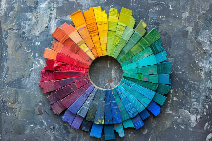
Color theory is a fundamental area of study for artists and designers, explaining how colors interact, mix, and contrast with one another. At its core is the color wheel, a visual representation of colors arranged according to their chromatic relationship. Primary colors, consisting of red, yellow, and blue, form the basis of the color wheel in the RYB color model, traditionally used in art and design for subtractive color mixing. Complementary colors are pairs of colors that are on opposite sides of the color wheel, creating high contrast and vibrant looks when paired together. For example, blue is the complement of orange.
In the context of color theory, the complementary of orange is usually a variant of blue, specifically, a blue-green known as cyan or azure in the RGB color model, which is used for additive color mixing like in digital media.
Contrast is a significant aspect that color theory caters to, providing artists the ability to manipulate visual interest and dynamic compositions. Complementary colors naturally offer a strong contrast—red contrasts with green, yellow with purple, and orange with blue. Hues refer to the pure spectrum shades as represented on the color wheel. When working with color, understanding the hue means understanding the pure, unadulterated version of the color, prior to the addition of tint (white), shade (black), or saturation (gray).
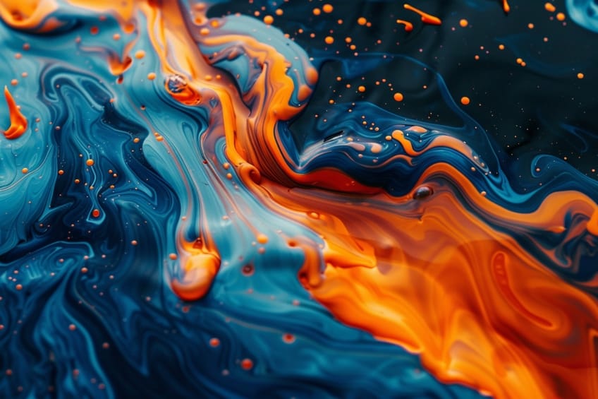
Artists leverage these fundamentals of color theory to create artwork that is visually appealing and compositionally balanced. The contrast of warm and cool colors, such as red versus green, also plays into how a piece of art is perceived in terms of spatial dynamics and focal points. Knowledge and application of these principles are critical for effective visual creation.
Different Color Models
In the realm of color theory, each hue on the color wheel has a corresponding opposite, known as its complementary color. Complementary colors, when paired, enhance the visual intensity of one another and create a striking contrast. Orange, a warm and vibrant color, is no exception. Its opposite is found by looking across the color wheel. The exact opposite color of orange can differ based on the color model being used.
In the RGB (red, green, blue) model used for digital screens, orange’s complementary color leans towards azure or cyan, which is a blend of blue and green tones.
Meanwhile, in the traditional RYB (red, yellow, blue) model that is often used in painting, the direct opposite of orange is a shade of blue. The specific hue of blue can vary, which means finding the precise opposite color for a particular orange hue requires understanding its underlying color properties.
What Is the Opposite of Orange in RGB?
| Shade | Hex Code | CMYK Color Code (%) | RGB Color Code | Color |
| Orange | #FFA500 | 0, 35, 100, 0 | 255, 165, 0 | |
| Cyan | #00FFFF | 100, 0, 0, 0 | 0, 255, 255 | |
| Azure | #F0FFFF | 6, 0, 0, 0 | 240, 255, 255 |
In the RGB color model, which is utilized for digital screens, the opposite of orange is a color that combines blue and green. Specifically, azure or a cyan-blue shade sits across from orange on the RGB color wheel.
What Is the Opposite of Orange in CMY?
| Shade | Hex Code | CMYK Color Code (%) | RGB Color Code | Color |
| Orange | #FFA500 | 0, 35, 100, 0 | 255, 165, 0 | |
| Cyan | #00FFFF | 100, 0, 0, 0 | 0, 255, 255 |
For the CMY color model used in printing, the complementary color to orange is made from subtracting orange from white light. Here, the opposite is a light blue color that leans towards cyan.
What Is the Opposite of Orange in RYB?
| Shade | Hex Code | CMYK Color Code (%) | RGB Color Code | Color |
| Orange | #FFA500 | 0, 50, 100, 0 | 255, 165, 0 | |
| Blue | #0000FF | 100, 100, 0, 0 | 0, 0, 255 |
The RYB color model, traditional to artists and designers, positions blue as the primary color opposite yellow and orange. In this model, the complement to orange is blue, which creates a high contrast when paired together.

What Is the Opposite of Different Orange Hues?
Orange is a vibrant color that can have several different hues. On the color wheel, each orange hue has a corresponding complementary color, which is directly opposite to it. These complementary colors create high contrast when paired with their respective orange hue.
- Bright orange: The opposite is a cool sky blue. This blue is tinged with a hint of green, making it more of a cyan or azure.
- Neon orange: A more electrifying hue like neon orange pairs with a deeper turquoise blue to create a strong contrast.
- Burnt orange: This muted, earthy shade of orange is best complemented by a rich blue-green color, introducing a subtle contrast.
- Peach orange: A lighter orange hue such as peach stands opposite a soft teal.
- Amber orange: With its golden undertones, amber orange is complemented by deep aquamarine.
These opposite colors can be used by artists and designers to make elements pop out in their work, utilizing the principle of simultaneous contrast to draw attention and achieve visual balance. It’s important to remember that variations in hue will slightly alter the complementary color, which can be adjusted based on the specific shade of orange used.
How Do You Find the Exact Opposite of an Orange Hue?
To pinpoint the exact opposite of an orange hue, one would consult the RGB color wheel. Orange is a secondary color that lives between red and yellow on this wheel. The opposite of any color is directly across from it on the wheel, generally referred to as the complementary color.
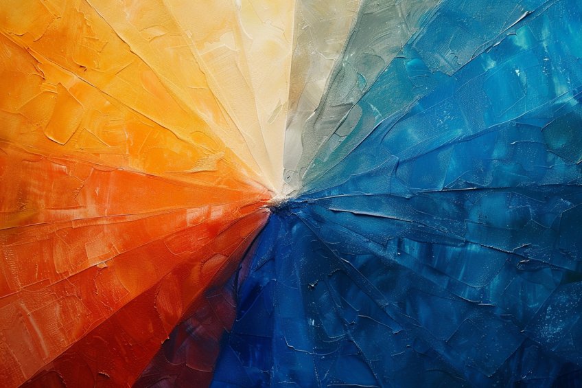
For orange, the complementary color is a blend of blue and green wavelengths, primarily leaning towards cyan. It’s important to note that this color is not a pure hue but a variation closer to azure or cyan-blue. The relationship is based on color theory’s additive principles, which involve the mixing of light, as opposed to subtractive mixing, like that of paints or pigments. A simplified approach to finding orange’s complementary color is:
- Identify orange’s position: Know that orange is a mix of red and yellow.
- Locate on the RGB wheel: Find orange on the wheel to understand its relationships.
- Directly across: Draw a line across the wheel from orange to find its opposite.
Common Uses of Oranges and Their Opposite Colors
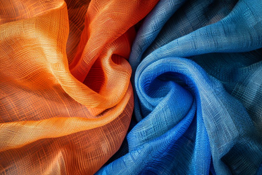
Oranges evoke warmth and excitement, frequently appearing in design and art due to their vibrant nature. Their high visibility makes them an ideal choice for attention-grabbing elements in advertising and safety equipment. In interiors, orange can infuse a space with a sense of energy and creativity. The opposite of orange on the color wheel is blue, a complementary hue that provides a stark contrast. This pairing is favored in various forms of visual art to create dynamic tension and visual interest.
When these opposing colors are used together, they intensify each other, making the orange appear more vibrant and the blue richer.
Applications of orange and blue combinations include:
- Graphic design: Calls-to-action, logos, and website elements pop out with blue and orange contrasts.
- Fashion: Clothing designers may create outfits where orange pieces are accentuated by blue accessories.
- Home decor: Interior decorators recommend blue and orange accents for a lively and inviting atmosphere.
Practical Application of Opposite Colors
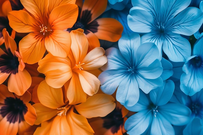
Understanding the opposite colors, or complementary colors, such as orange and its opposite blue, is essential in various fields ranging from painting to design. These color relationships, grounded in modern color theory, can enhance visual impact through contrast and harmony.
Mixing Colors in Art and Design
In art and design, mixing colors is fundamental. Orange, a secondary color in the RGB color model, can be obtained by combining red and green light. Its opposite, blue, is also a primary color within this model. Artists often utilize the CMY subtractive color model for paints and pigments, where orange is a mixture of red and yellow and its complement is blue.
Vincent van Gogh skillfully used these complementary colors to create vibrant, lively scenes.
Color mixing in design can manipulate perception through tones, tints, and shades. When orange is mixed with its opposite, blue, the result is a neutral color on the grayscale. This technique is used not just in painting but also in interior design, to achieve a balanced and harmonious aesthetic by contrasting warm colors with cool ones.
Influence on Perception and Effects
Complementary colors have significant effects on visual perception. When orange, a warm and inviting hue, is paired with blue, it creates simultaneous contrast, making orange appear brighter. This principle is often applied to create shadows and highlights in artwork, relying on more than just black ink or grayscale tones.

The concept of afterimage also plays a role; staring at an orange object and then looking away may result in a temporary blue afterimage. Designers can harness this phenomenon through color inversion to make certain elements stand out. The use of opposite colors, hence, moves beyond aesthetics, tapping into the psychological effects colors have on an individual’s perception and emotions.
As we bid adieu to this colorful expedition, we’ve delved deep into the vibrant world of color theory, discovering the magnetic allure of orange and its contrasting counterpart. From the fiery zest of orange to the cool tranquility of its opposite, our journey has been a kaleidoscope of hues and emotions. Remember, in the palette of life, it’s the interplay of opposites that creates harmony and intrigue. So, whether you’re basking in the warmth of orange or seeking solace in its opposite, let your creativity soar and your world be painted in the beautiful spectrum of colors that surround us.
Frequently Asked Questions
What Is the Complementary Color for Orange on the Color Wheel?
The complementary color to orange on the RGB color wheel is azure, also known as cyan-blue. This color is a combination of blue and green, providing the highest contrast to orange.
What Is the Best Contrasting Color to Pair With an Orange Dress?
To achieve a high-contrast look that stands out, pairing an orange dress with a cyan-blue accessory or garment would be the best choice. This complementary color pairing is vibrant and visually appealing.
How Can One Neutralize Orange Tones in a Color Scheme?
To neutralize orange tones in a color scheme, one should incorporate blue or gray hues. These colors are on the opposite side of the color wheel and can tone down the intensity of orange effectively.
Isabella studied at the University of Cape Town in South Africa and graduated with a Bachelor of Arts majoring in English Literature & Language and Psychology. Throughout her undergraduate years, she took Art History as an additional subject and absolutely loved it. Building on from her art history knowledge that began in high school, art has always been a particular area of fascination for her. From learning about artworks previously unknown to her, or sharpening her existing understanding of specific works, the ability to continue learning within this interesting sphere excites her greatly.
Her focal points of interest in art history encompass profiling specific artists and art movements, as it is these areas where she is able to really dig deep into the rich narrative of the art world. Additionally, she particularly enjoys exploring the different artistic styles of the 20th century, as well as the important impact that female artists have had on the development of art history.
Learn more about Isabella Meyer and the Art in Context Team.
Cite this Article
Isabella, Meyer, “Opposite of Orange – Color Wheel Reversal.” Art in Context. March 18, 2024. URL: https://artincontext.org/opposite-of-orange/
Meyer, I. (2024, 18 March). Opposite of Orange – Color Wheel Reversal. Art in Context. https://artincontext.org/opposite-of-orange/
Meyer, Isabella. “Opposite of Orange – Color Wheel Reversal.” Art in Context, March 18, 2024. https://artincontext.org/opposite-of-orange/.


