Pink and Black Make What Color? – Gothic Glam
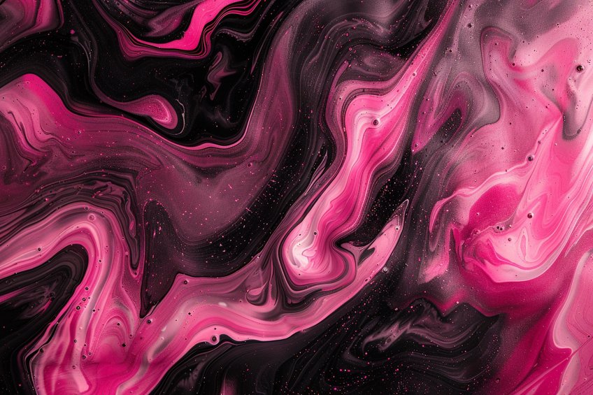
Welcome to the delightful world of color mixing! If you’ve ever pondered the magical possibilities of pigments, you might have found yourself asking the intriguing question: pink and black make what color? It’s a query that tickles the curiosity and beckons the creative mind into the vibrant realm where hues collide and concoct new shades. Join me as we unravel the captivating mysteries behind this unlikely duo and discover the mesmerizing color that emerges when pink and black dance together on the canvas of imagination. Let’s dive into the chromatic adventure awaiting us!
Table of Contents
Key Takeaways
- Mixing pink with black produces a darker shade of pink.
- The resulting dark pink can vary from dusky to purplish depending on the mix.
- Dark pink is used for its symbolism and versatility in art and design.

Fundamentals of Color Theory
Color theory provides a scientific approach to understanding how colors mix and the impact of adding different colors, such as black or white, to a base hue, thereby elucidating principles of contrast, harmony, and visual perception in art and design.
Color Mixing Basics
In color theory, the starting point is the three primary colors: red, blue, and yellow. These colors cannot be made by mixing other colors. Mixing primary colors in various combinations yields the secondary colors: green, orange, and purple. For instance, combining blue and yellow produces green.
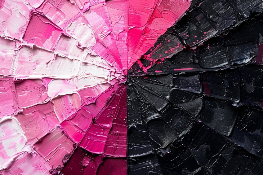
Further mixing of primary and secondary colors generates tertiary colors, which include hues like magenta and chartreuse. A color wheel serves as a visual representation of colors arranged according to their chromatic relationship. Colors opposite each other on the wheel are considered complementary and can make a shade appear neutral when mixed together in the right proportions.
Properties of Color
Understanding the properties of color is fundamental to exploring its dynamic interplay. Hue, the essence of pure color, distinguishes among the 12 vibrant tones encircling the color wheel. Saturation denotes the intensity or purity of a hue, while value elucidates its inherent lightness or darkness. With tint, we infuse lightness by blending white into a color, while shade brings depth by mingling black, thereby reducing lightness. Tone, achieved by adding gray, delicately modulates saturation, offering a nuanced spectrum ripe for artistic exploration.
Together, these properties form the cornerstone of color theory, guiding our perception and expression of the kaleidoscopic world around us.
The Role of Black in Color Mixing
Adding black to a color creates a shade, which can be imagined as a shadowed version of the original hue. This addition diminishes the color’s brightness and can greatly alter the value, making the color appear darker. In the visible spectrum, black is the absence of light, so when it is mixed with another color, like pink, the result is a darker pink which is less vibrant due to the reduction in light reflecting back to the eye.

When black is added to red, the outcome is a deep hue like burgundy. This illustrates how the presence of black influences the color’s appearance by affecting its wavelength within the visible spectrum and thereby diminishing the brightness. The strategic use of black in color mixing allows artists and designers to create an extensive palette and convey different moods and stylistic atmospheres.
What Color Does Pink and Black Make?
Mixing colors is an essential part of understanding the fundamentals of color theory, which is used in various fields including art, design, and fashion. The combination of pink and black is a particularly interesting example because the resulting color can be quite variable. When pink, a lighter shade of red, is mixed with black, the effect is to create a shade; this is inherently a darker variant of pink.
Depending on the proportions of pink and black used, the hue can range from a dusky pink to a deep purple-like color.
The use of dark pink, which results from the mixture, has its place in art and design, offering a richer and more sophisticated tone that can convey a variety of moods and themes. The symbolism of pink shades is culturally significant and widely recognized, with dark pink often associated with elegance, maturity, and a sense of mystique. Understanding how to create and use this color can open up opportunities for nuanced expression in creative work.
Understanding Pink
| Shade | Hex Code | CMYK Color Code (%) | RGB Color Code | Color |
| Pink | #FFC0CB | 0, 25, 15, 0 | 255, 192, 203 |
Pink is a tint that is made by adding white to red. It is a lighter version of red and has many different shades, ranging from soft blush to vibrant hot pink. Since it is a tint, it inherently possesses a high value, meaning it is relatively light in terms of color theory. Pink is a color that evokes a myriad of emotions and associations, often symbolizing sweetness, romance, and tenderness. Derived from the blend of red and white, pink encompasses a wide range of shades, from soft pastels to vibrant hues.

Its presence can create a sense of warmth and affection, making it a popular choice in expressions of love and compassion. Pink is also culturally significant, representing notions of femininity in many societies while challenging traditional gender associations in others. In design and aesthetics, pink is versatile, capable of conveying both playful whimsy and sophisticated elegance depending on its context and accompanying colors.
Its delicate yet impactful presence in various forms of art, fashion, and branding makes pink a captivating and influential hue in the spectrum of color.
Understanding Black
| Shade | Hex Code | CMYK Color Code (%) | RGB Color Code | Color |
| Black | #000000 | 0, 0, 0, 100 | 0, 0, 0 |
Black is the absence of light and, in pigment terms, it is a color that absorbs all colors of the visible spectrum and reflects none. When black is added to another color, it creates a shade of that color, effectively darkening it. In terms of painting and pigment, black is a powerful color that can quickly dominate other colors if used excessively. Black, the absence of color, holds a profound significance in color theory and human perception. Symbolizing power, mystery, elegance, and sophistication, black carries a timeless allure across cultures and contexts.

Its deep, opaque nature suggests the unknown and the enigmatic, while also embodying strength and authority. In art and design, black serves as a versatile tool, capable of both grounding and contrasting other colors, enhancing their vibrancy or lending depth to compositions. In fashion, black is a symbol of classic style and versatility, offering a sense of refinement and understated luxury. Its presence can evoke a range of emotions, from solemnity and introspection to a sense of formality and professionalism.
Black’s inherent neutrality allows it to adapt to a multitude of expressions, making it an indispensable element in the visual language of aesthetics and design.
The Dark Pink Color
| Shade | Hex Code | CMYK Color Code (%) | RGB Color Code | Color |
| Dark Pink | #E75480 | 0, 67, 34, 11 | 231, 84, 128 |
Dark pink, a nuanced shade within the spectrum of pink, possesses a rich and captivating depth that sets it apart. Combining the vibrancy of pink with the intensity of deeper hues, dark pink exudes a sense of confidence, passion, and sophistication. Its robust presence infuses warmth and vitality into artistic compositions and design palettes, offering a balance between the subtlety of lighter pinks and the commanding presence of darker tones.

Dark pink is often associated with traits such as romance, strength, and individuality, making it a versatile choice for conveying complex emotions and narratives in both visual and emotional contexts. Its dynamic interplay with light and shadow lends it a captivating allure, while its ability to evoke a sense of drama and depth adds depth and dimension to creative endeavors across various mediums and applications. When mixed with pink, black produces a variation of dark pink. The exact hue depends on the ratio of pink to black:
- More pink: A lighter and brighter version of dark pink, still retaining much of the original pink’s characteristics.
- Equal mixture: A balanced dark pink that would have a noticeable shift from the original pink towards a more muted shade.
- More black: The pink becomes increasingly subdued, leaning towards a purplish or even grayish tint, losing most of its original brightness.
By managing the proportions of pink and black, one has control over the resulting color, allowing for a range of dark pinks from dusky rose to nearly violet or gray tones.
Dark Pink in Art and Design
Dark pink, a toned shade created by mixing pink with black, holds a unique place in art and design. It encompasses various hues, tints, and shades that provide warmth and playfulness with an edge of sophistication.

Interior Design
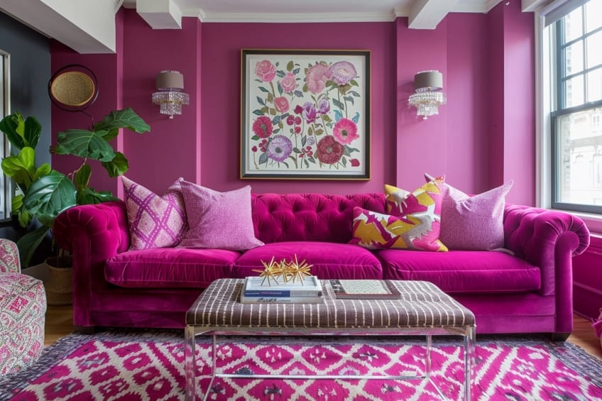
In the realm of interior design, dark pink injects rooms with a blend of romance and comfort. Designers might introduce dark pink through paints and art supplies to create an accent wall, which can add a dramatic backdrop for neutral-colored furniture.
It finds a harmonious balance with neutral colors, such as whites or light grays, forming a color palette that can make a space feel cozy yet refined. Example color combinations in interior design:
- Dark pink and cream: A classic and inviting look.
- Dark pink and charcoal gray: For a modern, dramatic contrast.
Digital Design
In digital design, dark pink takes on a versatile role, operating within RGB and LAB color spectrums. It often appears in web design for buttons or graphics, imparting a sense of playfulness or femininity without overwhelm. Digital artists and web designers use color pickers to integrate this warm color into their artwork and interfaces, ensuring color harmony and comfort for the user’s eyes. Utilizing dark pink in a digital palette involves adjusting the red and blue values with a hint of green for the RGB composition, with a commonly used dark pink shade identified by the Hex code #E75480.
The Symbolism of Dark Pink
Dark pink symbolizes a blend of passion and purity. It represents a matured version of its lighter counterpart, often associated with deeper affection and harmony.
Psychological Effects
Dark pink exerts a strong psychological influence. It often represents nurturing and caring behavior, even more so than lighter pinks. Predominantly, the color is linked to compassion and understanding, making it a common choice in areas requiring empathy.

Emotional Impact
The emotional impact of dark pink is significant. It derives from the warmth of red and the softness of lighter pink to evoke feelings of mild stimulation combined with comfort. This color can help create a sense of reassurance and help alleviate feelings of anger or resentment.
Cultural Significance
In cultural contexts, dark pink often denotes femininity and romance. It holds various meanings in different cultures, from representing joy and celebration in some societies to marking a sophisticated and refined aesthetic in others. However, across many cultures, dark pink signifies a coming of age, as it is seen as more mature than pastel pinks.
As we conclude our colorful journey into the realm of pink and black, we find ourselves enlightened by the enchanting fusion of hues. While the answer may surprise some and intrigue others, it’s the exploration of possibilities that truly ignites our creative spirit. Remember, in the world of color, there are endless combinations waiting to be discovered and cherished. So, whether you’re painting a masterpiece, designing a room, or simply pondering the wonders of the palette, let the harmonious blend of pink and black remind you of the boundless magic that lies within the spectrum of our imagination. Embrace the beauty of color, and may your artistic endeavors always be as vibrant as the hues that inspire them.
Frequently Asked Questions
What Color Do You Get When You Mix Pink With Black?
When pink is mixed with black, one typically obtains a shade of gray. The specific hue can range from a dull gray to a dusky gray-brown, which depends on the ratio of pink to black used in the mix. More pink yields a lighter gray, while more black leads to a darker result.
What Is the Significance of a Black and Pink Color Scheme?
A black and pink color scheme is often associated with modernity and style. This combination can convey elegance and sophistication, with the contrast between black’s depth and pink’s vibrancy creating a striking visual statement. Designers may leverage this scheme to add a chic, contemporary flair to various creative projects.
In 2005, Charlene completed her Wellness Diplomas in Therapeutic Aromatherapy and Reflexology from the International School of Reflexology and Meridian Therapy. She worked for a company offering corporate wellness programs for a couple of years, before opening up her own therapy practice. It was in 2015 that a friend, who was a digital marketer, asked her to join her company as a content creator, and this is where she found her excitement for writing.
Since joining the content writing world, she has gained a lot of experience over the years writing on a diverse selection of topics, from beauty, health, wellness, travel, and more. Due to various circumstances, she had to close her therapy practice and is now a full-time freelance writer. Being a creative person, she could not pass up the opportunity to contribute to the Art in Context team, where is was in her element, writing about a variety of art and craft topics. Contributing articles for over three years now, her knowledge in this area has grown, and she has gotten to explore her creativity and improve her research and writing skills.
Charlene Lewis has been working for artincontext.org since the relaunch in 2020. She is an experienced writer and mainly focuses on the topics of color theory, painting and drawing.
Learn more about Charlene Lewis and the Art in Context Team.
Cite this Article
Charlene, Lewis, “Pink and Black Make What Color? – Gothic Glam.” Art in Context. March 4, 2024. URL: https://artincontext.org/pink-and-black-make-what-color/
Lewis, C. (2024, 4 March). Pink and Black Make What Color? – Gothic Glam. Art in Context. https://artincontext.org/pink-and-black-make-what-color/
Lewis, Charlene. “Pink and Black Make What Color? – Gothic Glam.” Art in Context, March 4, 2024. https://artincontext.org/pink-and-black-make-what-color/.


