How to Draw a River – An Easy and Natural Drawing Tutorial
A river drawing is often contextualized within a landscape and can serve as a beautiful focal point in a natural scene. Water is always a versatile addition to a landscape and has an enriching visual quality that contrasts well with its surroundings. Learning how to draw a river is also a fun exercise that challenges us to capture the unique qualities of water. We will also find that the process of drawing a river requires us to understand how to draw the environment that surrounds and forms the river. In this tutorial on how to draw a river, we will learn how to incorporate a river into a beautiful natural setting, teaching us not only how to draw a river, but various other features as well!
Table of Contents
- 1 An Easy Guide to Drawing Rivers
- 1.1 Step 1: Sketching Features in the Background
- 1.2 Step 2: Adding Details to the Features in the Background
- 1.3 Step 3: Working on the Midground Features
- 1.4 Step 4: Adding Details to the Features in the Midground
- 1.5 Step 5: Adding Reflections in the River
- 1.6 Step 6: Adding Distortions and Ripples to the Water
- 1.7 Step 7: Adding Final Details
- 2 Key Concepts to Consider
- 3 Frequently Asked Questions
An Easy Guide to Drawing Rivers
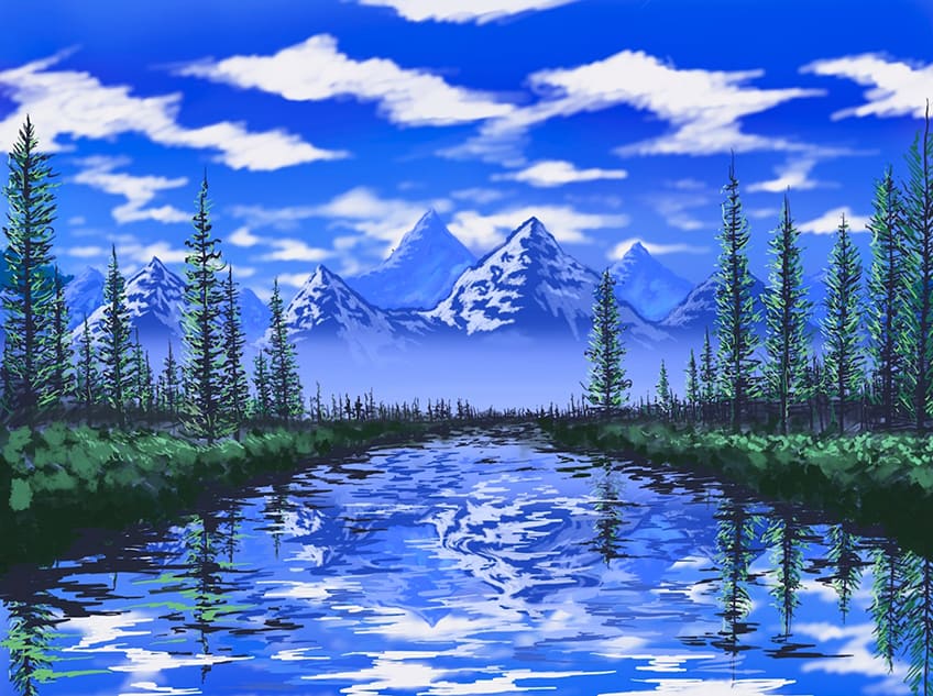
There are so many ways to explore river drawings as a feature within your landscapes due to their visual versatility. In this tutorial, we will learn how to establish a specific mountainous setting, with pine trees and a river as a central focal point. We will find that we will work on the surrounding environment to contextualize the river in a way that seems natural. We will explore how to build up the landscape through tonal values and scale to establish a background, midground, and foreground that seem realistic. Through that process we will see how our river starts to unfold and works with the surrounding environment. and then lastly, we will work on the water-like qualities in our river to enhance it further.
Step 1: Sketching Features in the Background
We want to start by adding some blue to our page to develop the color of the sky. This is going to set up their backdrop over which we will add features.

From there you want to establish a horizon line, sticking with a blue color palette, where you establish a horizon line. On that horizon line, you can start to incorporate background features, in this case, we are adding some mountains.

We can play around with filling in our mountains, but as we do so, we can also add some darker mountains that sit in front of the lighter ones. Remember, the closer a feature, the darker and more vivid it will seem.

Make sure you create a set of peaks within your mountain range, this way they have a more realistic representation of how a mountain normally has two faces. We want to make sure we define

Step 2: Adding Details to the Features in the Background
Once we have established our mountains, we can start to integrate some highlights to suggest a distinction between the illuminated and shadowed faces of the mountains.

When structures are in the distance they will be less distinct and clear in the features. This gives us a lot of freedom to make more abstract strokes and marks along the side of the mountains to suggest a lighter and illuminated face of the mountain.

The idea is to keep these strokes quite jagged, moving in these zig-zag-like formations, by doing so we create the sharp edges that define the quality of rock from a distance.

You can continue to add in more mountain peaks in the distance, however, you want to make sure that whatever lies within the background will be light in tonal value.

As you continue to integrate these highlights into the sides of the various peaks, you want to make sure that they are all consistently on the same side within each peak.

Keeping all the highlights on the same side of each mountain peak will create a more realistic interaction with a light source and how it comes from a single side. Make sure to make these qualities lighter for the mountains furthest away.

By keeping the details and features of the structures fainter as they get further away, we will create this realistic quality of depth within our river drawing.

Again, a river drawing is not just about the river itself, but all the surrounding contextualizing features that enhance it. We want to give time to all the features and not just the stream of water.

As you work on the background features first, you are setting up the tonal values and scale needed for the features that will be drawn within the midground and foreground.

Step 3: Working on the Midground Features
As we come to the features in the midground, we want to create a distinction between the midground and the foreground that seems natural. We can do this by adding some light shading or brushwork that establishes a quality of mist at the base of the mountains.

From there, we want to start working with a darker medium or tool, to start to develop the features that will form around the river. Integrating trees is a great visual quality and a strategic way to emphasize depth.

The idea is that we want to keep a space open in the center of the page that will define the river. We want to make sure that we are adding features along the center to establish distance in the river drawing.

We can start to work in some vague darker marks along the horizon to suggest a density within our trees or forest. Again, trees are a great way to help form the river but also to further emphasize the quality of scale and depth.

We can keep our line work and marks quite loose along each tree to suggest this quality of foliage. Features such as trees, tend to be quite vague from a distance, so we can’t keep them quite abstract within our sketch of a river.

We will find that as long as we keep the marks in a horizontal zig-zag motion that becomes narrow as we move along the trunk of each tree, it will result in a realistic representation of a tree’s features.
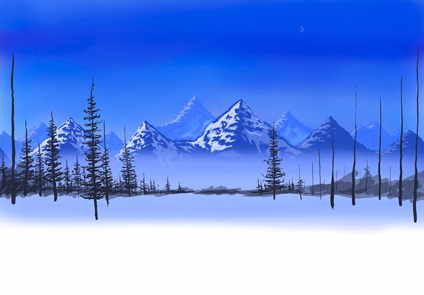
You want to continue doing this, slowly enlarging the trees as they shift toward the foreground. You can also start to draw the trees more along the side of the page to widen the river as it moves into the foreground.

You also want to make sure that you are working in little vertical and horizontal lines into the trees that sit in the background. Again, those small details will further emphasize the quality of depth in your sketch of a river.

Again, the more time you spend on these details and work on them, the more you will end up with a cohesive and realistic representation of the features surrounding your river.

The more we add details to the surrounding features, work on the tonal values and represent the scale accurately, the more realistic the reflective qualities will be in our river section.

Step 4: Adding Details to the Features in the Midground
You can also build up tonal values in the features placed in the Midground, we can do this by building up shades of green. Eventually, we can add very light tonal values to create highlights in the features.

Again, we want to make sure we maintain that the highlights remain on the same side as the features that sit in the background, by doing this, we keep consistency in the various features and their interactions with the light source.

Continue with this process of working on the midground features, making sure you keep moving toward the outer edges of your page. This is slowly establishing the shape of the river as it moves from the background into the foreground.

You can also start to build up banks of foliage and bushes that start to define the actual form of the river beds. We can do this by integrating brushwork or drawing marks that are rounded and represent bush-like shapes.
Step 5: Adding Reflections in the River
If you are working with traditional tools, the intention is to now represent the features in a mirrored fashion. That forms within the river section. We want to keep all features identically mirrored in an upside-down fashion.

Once you have done that, you can then start to work in some distortions, by integrating some zig-zagged line work that flows along a horizontal plane. We want to work with various colors that represent the features that are reflected on the water’s surface.

Step 6: Adding Distortions and Ripples to the Water
The idea is to now start working in these horizontal marks that start to give the water a little more movement. We can integrate various horizontal lines that reflect the same coloration as that of the surrounding features.
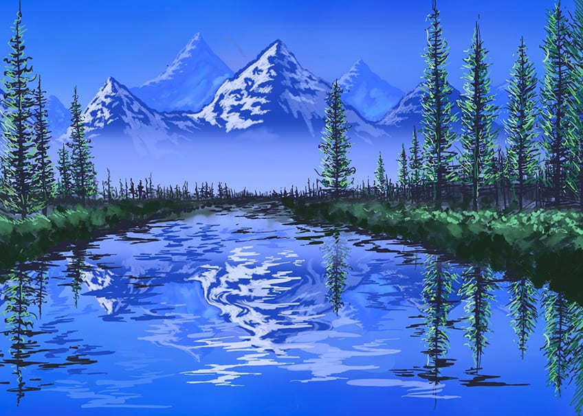
As we proceed with this process of integrating line work, we can enlarge these lines as we move toward the foreground. We can also make them much smaller as we shift toward the background.
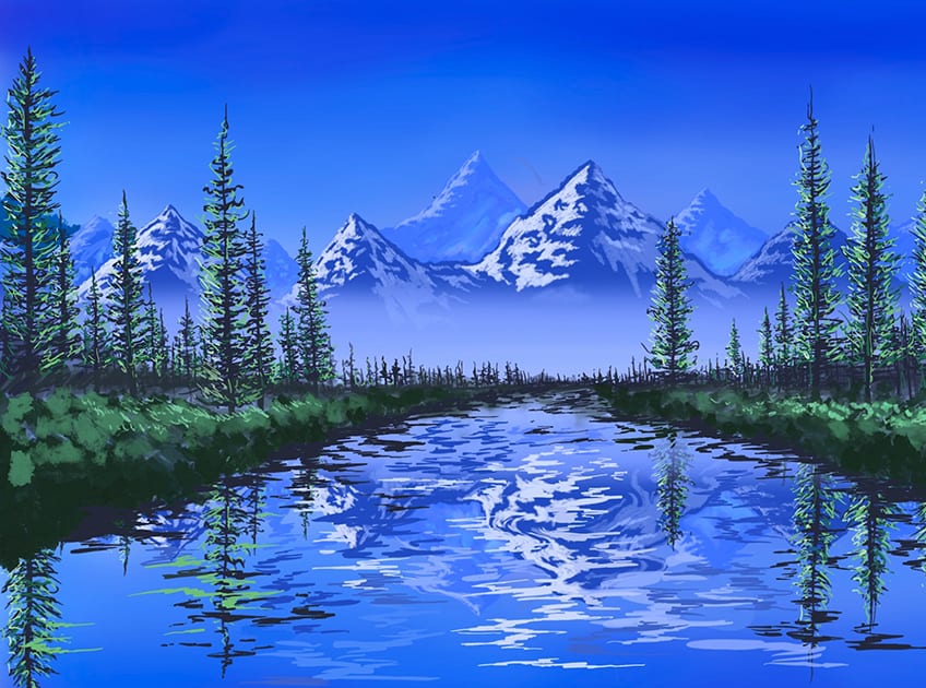
Make sure you take your time working in these ripples to give your water a realistic quality of movement. As you proceed with this process, you can also darken the edges of the embankments as these tend to cast darker shadows along the surface of the water.
Step 7: Adding Final Details
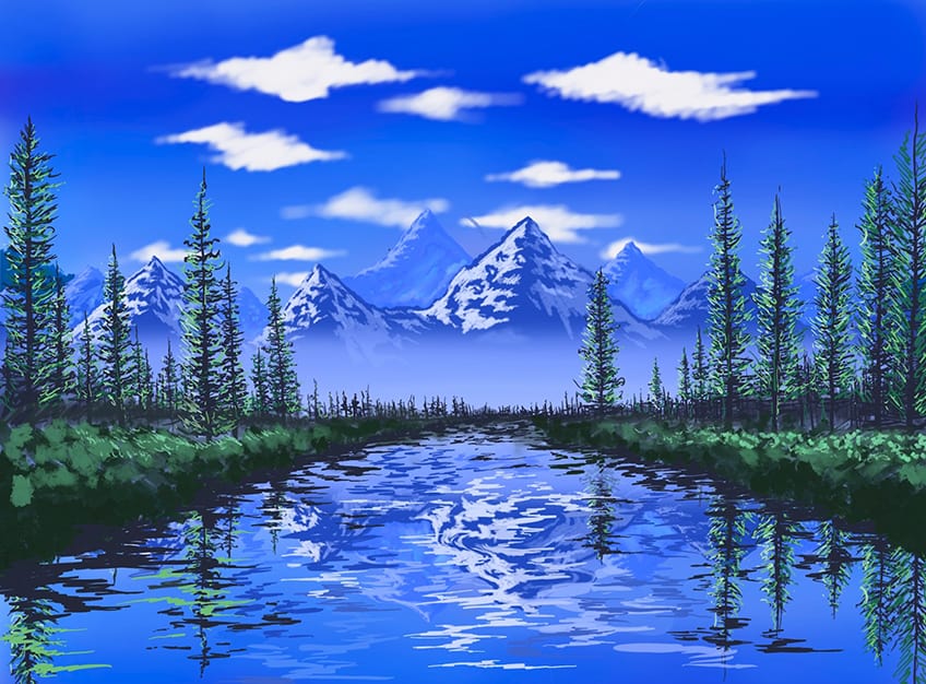
As long as you represent all the features reflected on the surface of the water and slightly distorted you can then start to work on some finishing details by integrating clouds into the sky or adding more highlights to the mountains and so on.
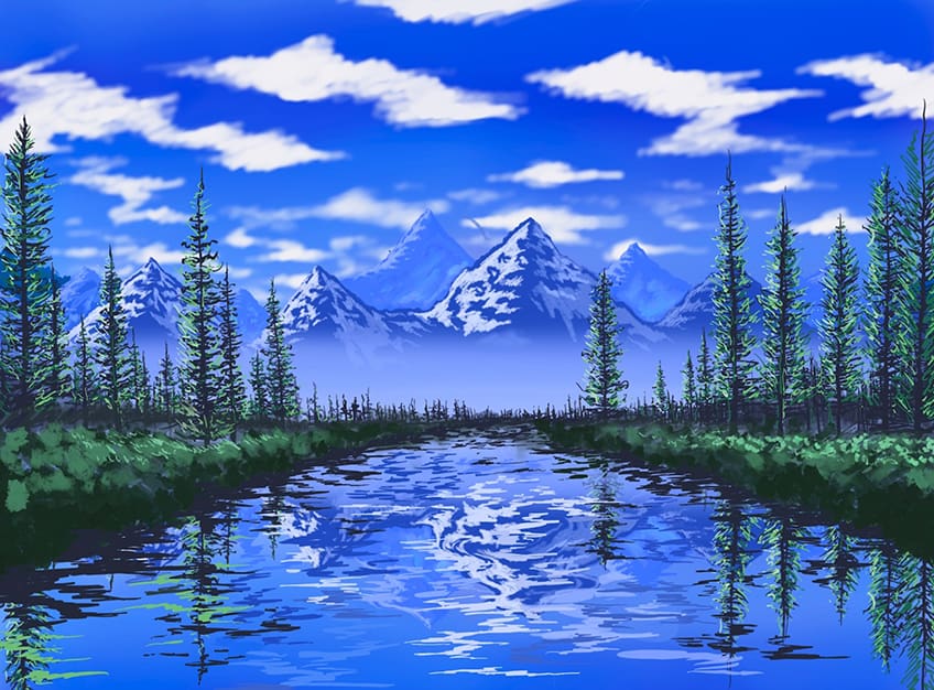
Make sure you spend your time working in various horizontal strokes into the water that represents the color scheme of the surrounding features. And remember to enlarge them as you move into the foreground.

Remember, the more time you take on various features the better the outcome will be. Most importantly, remember to keep the reflections as a mirrored representation of the surrounding features.
And there you have it – how to draw a river in a few simple steps! Learning how to draw a stream is quite simple once it is broken down into a few digestible steps.
Key Concepts to Consider
- Work from the background to the foreground. This way, we work our way into the foreground and establish features one at a time.
- Consider scale. The size of various features will enlarge as they shift toward the foreground.
- Consider the tonal values. We want to make sure details become fainter as they move into the distance.
- Work with horizontal strokes in the water. Water moves along a horizontal plane, so we want to maintain this quality by working with horizontal strokes.
Learning how to draw a stream or river can be done in so many ways, however, this tutorial demonstrates how to achieve this unique feature through the process of reflection. Working with the concept of reflection in a drawing of a river is a great way to capture realistic qualities in your river drawing!
Frequently Asked Questions
How to Draw Realistic Water in a River?
Water is a unique element because of its highly reflective and smooth surface, which allows the surrounding environment to often be reflected on its surface. In many ways, we can simply draw the surrounding environment into the water, remembering to turn them upside down to represent the qualities of reflection. Another way we can enhance this quality is by integrating line work that slightly distorted those features. The idea is to integrate some horizontal line work around the upside-down features and by doing so, we create a quality of ripples in the water. As we slowly draw the landscape into the water with some horizontal line work, we will start to see how it represents a realistic quality in the water.
How Do You Create Depth Within Your River Drawing?
The two main concepts you want to think about are tonal values and scale, as these two guiding concepts can help you to create a quality of depth. When creating a landscape with a river, you want to be conscious of the fact that the river shifts from the foreground to the background. As it does this, features become slightly smaller and less vivid in tonal values. We can simply make features lighter and smaller as they shift into the background. By doing this, we will achieve a sense of depth. We do this not only for the body of water but for all surrounding features in our river drawing. This way we keep a sense of context and how other features work with the size of the river itself.
Matthew Matthysen is an educated multidisciplinary artist and illustrator. He successfully completed his art degree at the University of Witwatersrand in South Africa, majoring in art history and contemporary drawing. The focus of his thesis was to explore the philosophical implications of the macro and micro-universe on the human experience. Matthew uses diverse media, such as written and hands-on components, to explore various approaches that are on the border between philosophy and science.
Matthew organized various exhibitions before and during his years as a student and is still passionate about doing so today. He currently works as a freelance artist and writer in various fields. He also has a permanent position at a renowned online gallery (ArtGazette) where he produces various works on commission. As a freelance artist, he creates several series and successfully sells them to galleries and collectors. He loves to use his work and skills in various fields of interest.
Matthew has been creating drawing and painting tutorials since the relaunch in 2020. Through his involvement with artincontext.org, he has been able to deepen his knowledge of various painting mediums. For example, watercolor techniques, calligraphy and lately digital drawing, which is becoming more and more popular.
Learn more about Matthew Matthysen and the Art in Context Team.


