Color Wheel – Free Online Color Wheel App and In-Depth Guide
Creating any form of art, whether painting on a canvas or manipulating graphics on a computer, requires some knowledge of color theory. In all cases, you will most probably use a color wheel and will have to understand and learn how to use this tool to blend colors. Our mission is to help you gain an understanding of color theory and how a color wheel chart works.
Table of Contents
The color wheel is the most helpful tool when it comes to color mixing. It shows you, which colors work well together. With our free online color wheel tool, you can select from a wide variety of color combination modes to help you create the best possible artwork.
If you would like to know more about the color theory itself, check out our color mixing article and also our free color mixer.
Are you missing any features? Feel free to contact us.
The Fundamentals of Color Theory
Understanding color theory will help you to use colors more effectively. There are some rules you need to follow so you can create visually appealing art. By doing this, you can improve the way you paint by producing depth and contrast. Colors can also be used to affect emotions or attract customers, which makes it important in the advertising industry.
Creating attractive websites also relies on the use of a color wheel. Interior designers utilize color theory to design and decorate rooms at home and for businesses. So, the more you can appreciate the complexities of color and learn to take advantage of this, the better your chances of successfully creating visually appealing art and graphics.
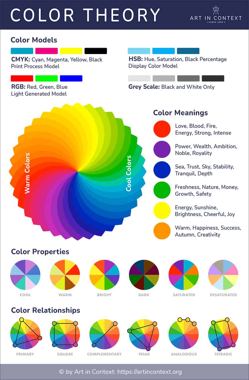
Let us start with the basics and slowly move on to understanding a color wheel chart.
Primary Colors
You should always start with a basic foundation of knowledge, so you can build up from there. Many of us already understand what primary colors are from school. You have three primary colors and include:
| Color Name | Color Hex Code | CMYK Color Code | RGB Color Code | Color |
| Blue | #0000ff | 100, 100, 0, 0 | 0, 0, 255 | |
| Yellow | #ffff00 | 0, 0, 100, 0 | 255, 255, 0 | |
| Red | #ff0000 | 0, 100, 100, 0 | 255, 0, 0 |
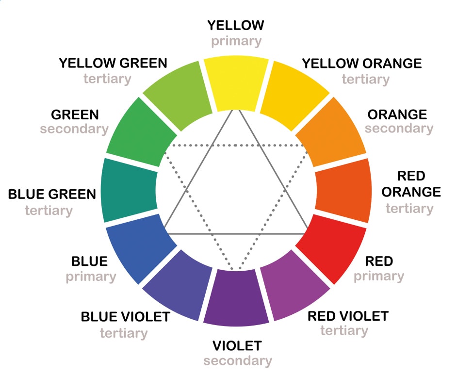
These colors are the foundation of all other colors, as well as the different shades, tints, and hues, which we will be getting into later. These colors cannot be produced by mixing any of the other colors. You use these primary colors to create your secondary colors.

Secondary Colors
Your secondary colors are easily created by combining your primary colors. You have three secondary colors including green, purple, and orange. To create these colors, you will combine two of the following primary colors.
| Color Name | Color Hex Code | CMYK Color Code | RGB Color Code | Color |
| Green | #00ff00 | 100, 0, 100, 0 | 0, 255, 0 | |
| Orange | #ffa500 | 0, 35, 100, 0 | 255, 165, 0 | |
| Purple | #a020f0 | 33, 87, 0, 6 | 160, 32, 240 |
These true colors are only created by using the purest form of the primary colors, meaning there is no tint, tone, or shade. These secondary colors are what you have when working with pigments and paint. When it comes to light, your primary colors are red, green, and blue, and your secondary colors are cyan, yellow, and magenta. We will be discussing this a little later on.

Tertiary Colors
This is a debatable subject; however, many refer to the combination of primary and secondary colors as tertiary colors. Others will say these are intermediate colors, while the tertiary colors are a combination of your secondary colors. We will be referring to these colors as intermediate.
The one rule to remember for tertiary colors, not every primary color can blend with every secondary color. For example, green and red because green contains yellow and blue. So, you will be combining all three primary colors, which will create a brownish color.
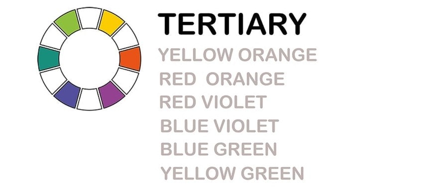
Intermediate colors are formed when a secondary color is mixed with a primary color that is located next to each other on the color wheel. Intermediary colors always come with the primary color first, followed by your secondary color. Each combination has been given a recognizable color name.
- Yellow-Orange, also known as amber
- Yellow-Green, known as chartreuse
- Blue-Purple, known as violet
- Blue-Green, known as teal
- Red-Purple, known as magenta
- Red-Orange, known as vermillion
| Color Name | Color Hex Code | CMYK Color Code | RGB Color Code | Color |
| Amber | #ffbf00 | 0, 25, 100, 0 | 255, 191, 0 | |
| Chartreuse | #dfff00 | 13, 0, 100, 0 | 223, 255, 0 | |
| Violet | #8f00ff | 44, 100, 0, 0 | 143, 0, 255 | |
| Teal | #008080 | 100, 0, 0, 50 | 0, 128, 128 | |
| Magenta | #ff00ff | 0, 100, 0, 0 | 255, 0, 255 | |
| Vermillion | #e34234 | 0, 71, 77, 11 | 227, 66, 52 |
What Is a Color Wheel?
Before moving on, we can now bring in the color wheel. Above are your basic colors, however, there are numerous shades, hues, tints, and tones in-between. This is what a color wheel is for and is used as a visual representation of the various colors. This tool is used as a color wheel mixing guide, helping you to see how each color relates to other colors.
Artists use the color wheel for mixing colors and even interior designers use the color wheel chart to guide them on how to design interiors.
Primary, secondary, tertiary, and intermediate colors are located on the color wheel. However, there are multitudes of different types of colors, each of which can be used to create various effects when painting and creating computer graphics. There are also many other industries, where the smallest variations in color can be produced.
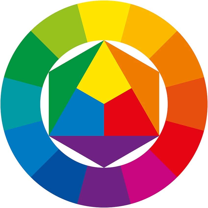
Many colors look good together and blend well and create color harmony. These cooperating colors are used to create art and designs that create a certain look. Creating color harmonies can be done by simply following some basic rules when it comes to the positions of the various colors within the color wheel.
Who first charted the color spectrum? It’s no surprise that it was Sir Isaac Newton during the 17th century. This led to the color wheel and the starting point of color theory. However, many have built onto color theory and there are a few versions including one by Johannes Itten, a Swiss artist in the late 19th century, who created the color wheel used by most of us today and is based on how the various colors mix.
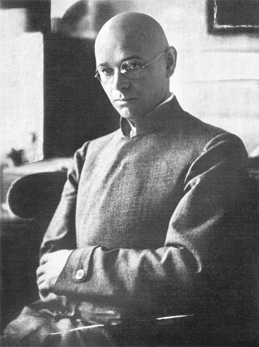
Then, you have Harald Liebedank Küppers, born in the early 20th century, who became involved with color printing technologies. He became a lecturer in color theory and wrote various books about it. He based his color theory on how we see color and instead of a color wheel circle, he developed a hexagon, where there are no primary, secondary and tertiary colors.
His color theory is between primary (primordial) colors of orange-red (R), green (G), violet-blue (B), and basic colors.
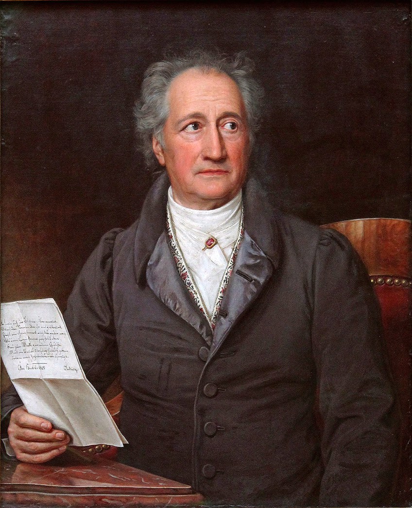
Finally, Johann Wolfgang von Goethe, who was born in the mid-18th century, was a poet, scientist, and much more. He developed his own theory on colors and associated it with how light and dark affected colors. Other names that are important in the development of color theory include Aristotle and Professor Albert Munsell, who is considered the father of color theory.
The most common color model used today is your RYB (red, yellow, and blue), which is used by many artists, which is the color wheel for mixing colors for artists and pigments. Then you have your RGB (red, green, and blue) color model that is used online when light is involved in the mixing of the various colors. Also, when it comes to printing, you have your CMYK (cyan, magenta, Yellow and Black) color model.
Let us now first look at what types of colors you can get in your basic color wheel.
Complementary Colors
A color wheel is exactly that, a circular image representing the many different colors. So, if you can find your primary colors red, blue, and yellow, then locate the colors sitting opposite of each, these will be your complementary colors. When placed close together, complementary colors will always accentuate each other, creating bold contrasts.
Complementary colors are not only for primary colors but any two colors on the color wheel that sit opposite each other.
When using complementary colors in a design, it is recommended that you use one of the colors as your base color and the complementary color as an accent. When using too many contrasting colors, it can become difficult to look at.
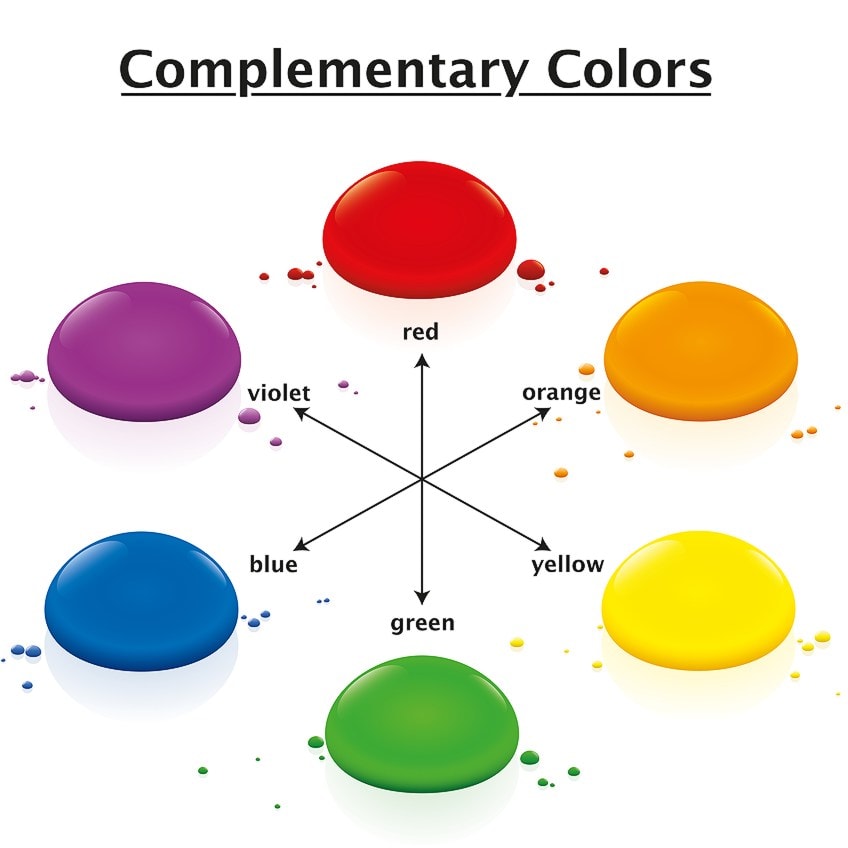
To add more variety and to tone down the vibrant contrasting colors, you might want to consider split complementary colors. This is almost the same as complementary colors, the difference being is that you have two colors opposite your main color. You still have contrast, but it is a little less eye-catching. The one main drawback is that it can be difficult to balance these colors in a color scheme as they still provide a contrast.
For example, if you take yellow as your main color, purple is its complementary color. So, the two colors next to purple would be your split complementary colors that lean either towards a cooler or warmer color of purple.
Monochromatic Colors
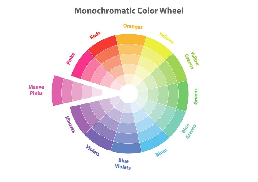
This type of color scheme takes a single color and then uses different shades or tints to create a consistent and uniform look. Unlike the contrasting colors which catch your eye, these colors are often soothing and create a nice clean look. For example, take blue and add some white, you get a pale blue. Make it darker by adding in a little black and get navy blue. So, your color scheme would be blue, pale blue, and navy blue.
Analogous Colors
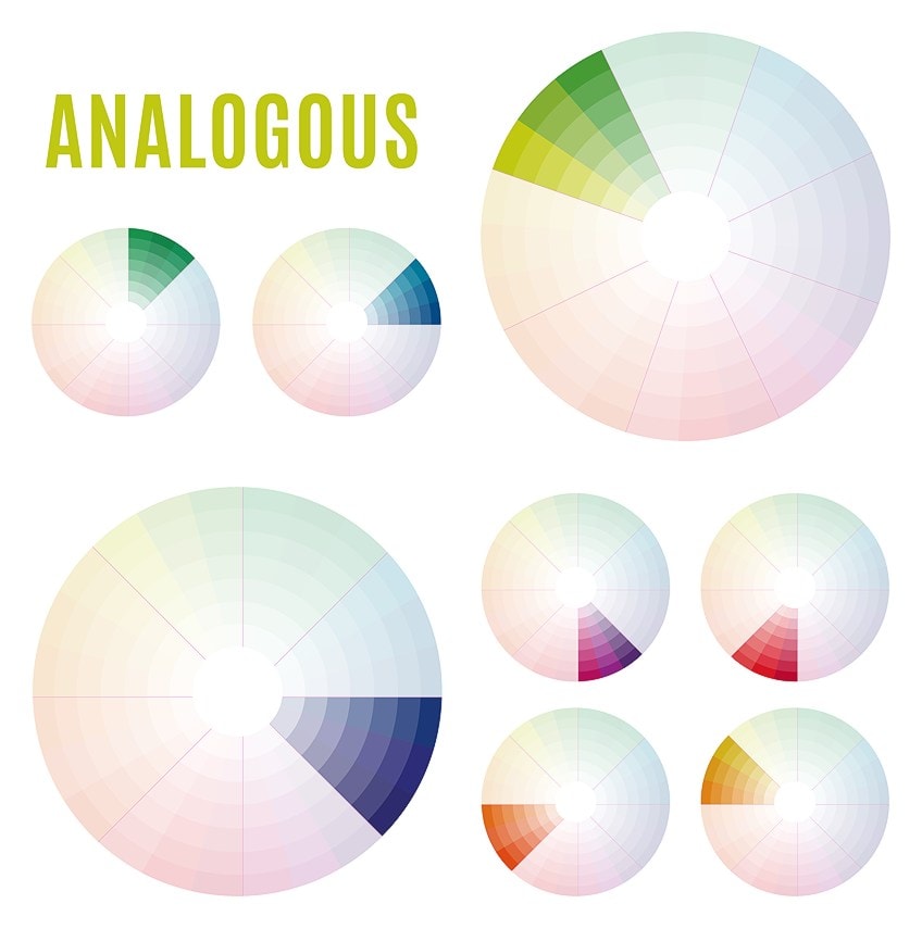
Take a look at a color wheel and choose a color, for example, red. Then check the color wheel and see which colors sit next to each side of the color red. So, you have three colors next to each other. These are your analogous colors. You can go even further and create a five-color scheme, which means you take the two colors that sit next to the first two colors. These colors are usually calming and easy to look at.
For example, orange, red-orange, and red. You will be able to create harmonious warm or cool color palettes with analogous colors.
Triadic Colors
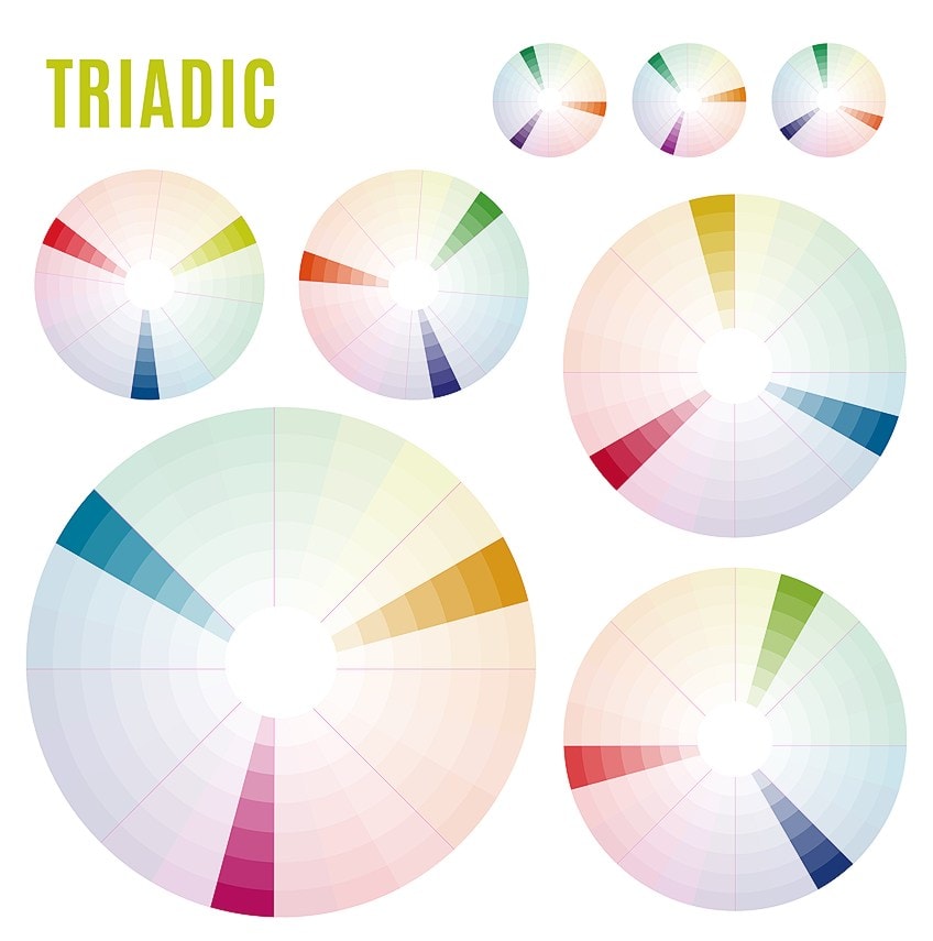
The name says it all, triadic meaning three colors. All three colors are equally situated when placed in line on the color wheel and will look like a triangle. These colors are usually contrasting, however, they each have the same tone. Since these colors are contrasting and dominant, it is best to use a single color as your base color, while the others are used as accents. You can also tone down two of the colors to create less of a contrast.
Tetradic Colors
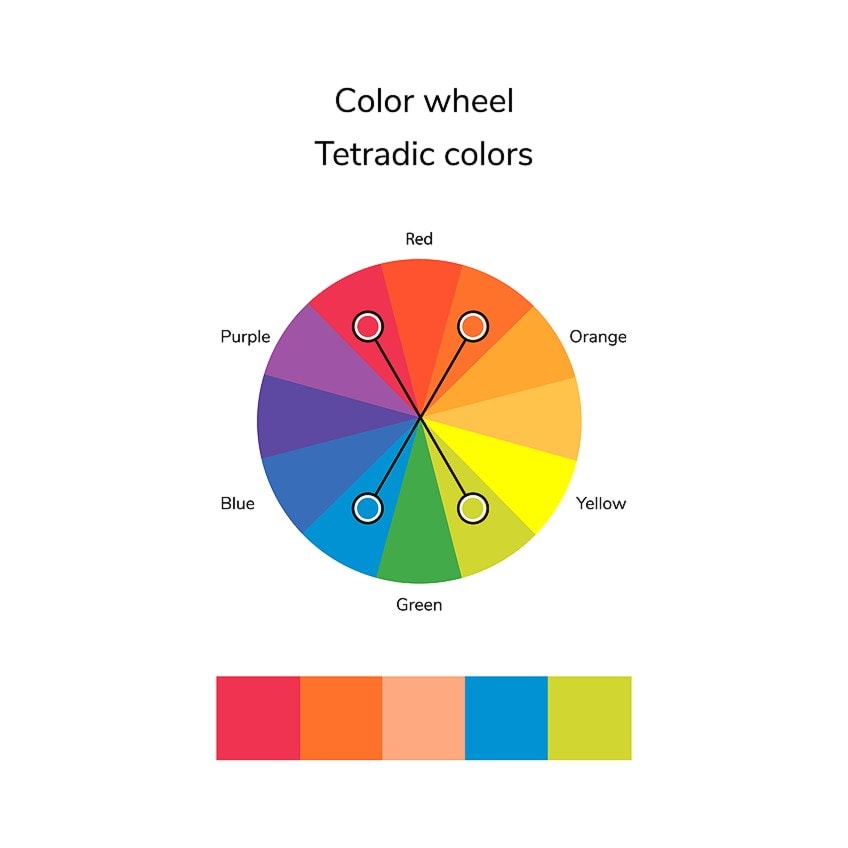
This means having four parts, so instead of the triangle above, you have a square or rectangle shape of four connected colors. The square connects four colors that are equal distances from each other. Again, these colors contrast each other. The rectangle is similar and also uses two sets of complementary colors.
The colors located on the shorter end of the rectangle are separated by one color. For example, red and yellow-green, and purple and blue-green. The more colors involved, the more challenging it is to harmonize or balance the colors. Again, it is a good idea to take only one dominant color and the rest of the colors can be placed as accents.
Warm and Cool Colors
You can easily determine warm and cool colors, as you can draw a straight line through the color wheel and each of these colors will be on opposite sides. Your warm colors inspire feelings of warmth and include reds, oranges, and yellows. Cooler colors inspire feelings of cool things such as water or forests and include green, blue, and purple.
Neutral colors like gray or white can also move towards warm or cool, depending on each color’s undertone. This also works with all colors, so you can also get cooler red tones and warmer blue tones.
Shades, Tints, Hues, and Tones
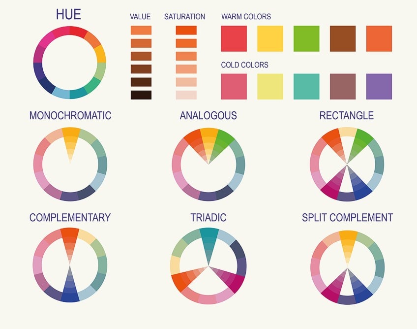
Each color you get can have different shades or tones, which makes it possible to create a myriad of colors. To understand these terms a bit more, below is a brief explanation of each. This is just another step in understanding the amazing diversity of colors.
Color Shades
When describing a shade, you are most probably thinking of a lighter and darker of the same hue. A color shade is describing the amount of black you include with another color. The different shades depend on the amount of black you use but maintain the same saturation of color.
Color Tints
A tint is the exact opposite of a color shade and is determined by how much white you add to a color. However, many use these terms interchangeably but there are many separate shades and tints of color available.
Color Hue
Hues are sometimes called colors and are seen as the same thing. However, color refers to all the different tints, shades, and tones. Even white and black can be seen as colors. A hue is referring to the pure or dominant colors. Black, white as well as gray are never described as a hue.
The hue of a color is important when mixing colors because a true color or hue contains the lowest number of other colors.
If you use, for example, a primary color with a shade, tint, or different tone, you are technically mixing more colors, and you might land up with a different color than you expected. The same occurs with a color of light, the hue is based on its dominant wavelength, with lightness and the intensity of the color not being taken into consideration.
Color Tone
So, a pure hue or color with the same saturation that has different degrees of lightness are your shades and tints. On the other hand, a color with a similar hue and lightness, which has different saturation is a color tone. Tones are made when a neutral gray is added and tones down the intensity of colors. You might also come across the term “color value”.
This is about how light and dark the colors are, or how close the color is towards white or black.
The color saturation is seen as how intense colors are. Is it bright or a softer pastel color? When gray is added the colors fade, while a less amount of gray creates more vibrant colors. This can easily be adjusted with computer graphics.
Computer Graphics and Color
Many do not realize the importance of color and how it can affect us. Even in movies, the various colors have been used to evoke certain emotions or differentiate various aspects of the movie. In advertising this is also extremely important, attracting the audience to look and purchase items. Today, we mostly deal with a lot of computer graphics and there are two systems that you should be aware of.

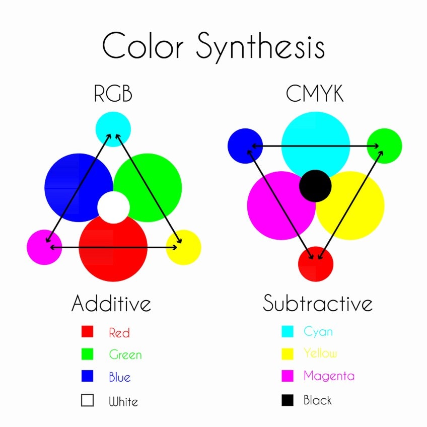
Subtractive Color System
This involves printing, so consider a white piece of paper, where you are going to be adding color. Technically, this means you are blocking the white of the paper. Print on the paper, then print on it again. You should notice that the print color then becomes darker and is closer to black.
This is known as the subtractive color system and is achieved by using four colors, namely cyan, magenta, yellow, and black.
When looking at the numbers from zero to 100, consider the colors as follows:
- If all colors CMYK are 100, then you have black
- When all colors are zero, then you have white
These numbers are usually given for each color and are written with the letters CMYK, followed by four numbers. For example, red will be CMYK with the numbers 0, 100, 100, 0.
Additive Color System
Online graphics involve light and use the RGB (red, green, and blue) model, which works as an additive color system. The color you add will move you closer to white. This is represented by numbers on a scale from zero to 255. For example, red will be RGB of 255, 0, 0, or white would be an RGB of 255, 255, and 255.
When working with online graphics, colors usually display both these RGB and CMYK color systems, followed by numbers.
However, some web design programs might only provide the RGB model, so it is best to have the hex code for a specific color you are looking for. The hex code is a set of numbers and or letters that indicate a specific color. The hexadecimal code represents the colors red, green, and blue in a specific color. The code always begins with a hashtag, which is then followed by a combination of six numbers and/or letters. The first two letters or numbers represent red, the next two letters are green, and then blue.
There are millions of color combinations out there, so there is sure to be a color that suits your needs.
How to Select a Color Scheme for Computer Graphics
When it comes to creating websites, online advertisements, even products, and packaging, you would preferably get a professional graphic designer to do the job. However, here are a few pointers if you want to try it for yourself. Let us have a look at a few simple ideas for web design.

Creating Your Initial Design
First, you should create your basic design, even if it is only in grayscale. You want to focus on user experience before you move on to colors and details. Everything needs to work properly, if you click on a link, it should go where you want it to. All your pages, contact, and opt-in options should be working. You could have the best color combinations and graphics, but if the website is not easy to navigate and certain links or buttons do not work, it will not be enough to keep customers or visitors coming back.
Choosing Color Combinations
One way to get inspiration is to look at nature. All colors in a natural environment always work well together. From different greens to blue and white. You might also want to go into the meaning of colors and how colors can affect emotion. It also depends on what you are selling, the type of service or product. You do not want to choose a stimulating color combination if you are offering relaxing spa services.
You might have to do some research to get the right choice of colors. There are many examples online you can also take inspiration from.
Be Careful of What Colors you Choose
This is particularly true if you want to create contrast. Contrasting colors can help to produce depth and attract attention. However, if used incorrectly, you can draw attention away from where you need it to go. You can also create something hard to look at or is too much for the eye, and people will simply move on.
Refer to a Color Wheel Chart
When selecting colors, choose various combinations from the types of colors we have described above. Try a monochrome combination, complementary colors, or triadic colors. Experiment with the colors to find out which one fits with what you want to achieve.
When you have chosen your colors, it is recommended that you use the 60-30-10 rule.
This means if you have chosen three colors, your main color will be 60 percent of your design, while your two other colors will be 30 percent and 10 percent. This is a general rule, but it does help to create balance in a design. This is especially true if you have more than one vibrant color, as you do not want the colors competing too much with each other.
Make use of Color Tools
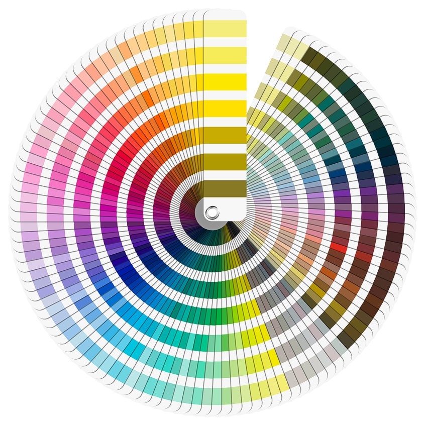
There are many tools and websites that can help you to choose the right color for your project. There are a variety of color wheels, where you can pick colors or design programs like adobe color that can help you. Many color tools also present various color palettes for you to choose from, so you do not have to do it yourself.
Color Wheel Mixing Guide
To get the right colors for your art, many artists create a color chart. This makes it easier to create specific colors anytime you need them. First, you need to familiarize yourself with color theory and get yourself a color wheel chart. There are many color wheel charts you can use online, or you can purchase one as well.
Color charts can be created for any medium, including watercolors, oil paints, acrylics, and pastels. To create your chart, draw a grid with as many columns as you have colors plus an extra column to add the color name and brand. The grid squares should be large enough to paint a small sample color in.
Maybe you want to know what a particular color will look like if you add white. You can get a variety of specific colors. So, to make it simple, let us choose a single color variety like Prussian blue, Cobalt blue, and Ultramarine blue.
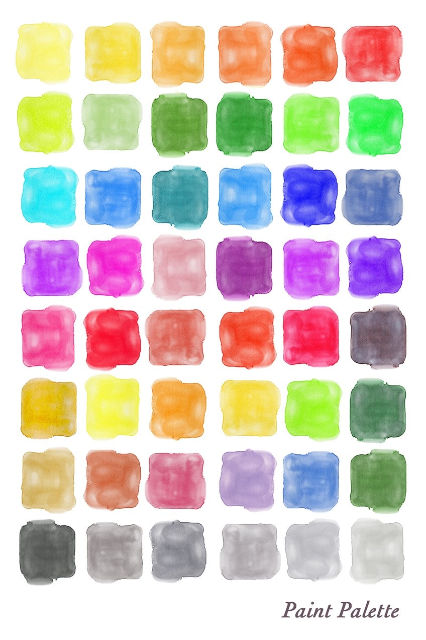
In your first column, start with the pure color of each paint and as you go, you can slowly add a little white to each type of blue. It is important to label the brands, as they might not all produce the same color. You can make your color chart more complicated by experimenting and using your color wheel to produce various colors. This will help build a record of the colors you will be using in your paintings.
You can even create a multitude of colors from your primary colors and include white and black.
Otherwise, you can purchase a specific color in a tube, where no mixing is needed. However, different brands manufacture their paints differently, which is why many artists prefer to mix their own colors from scratch.
Meaning of Colors
Over the years, the different colors have been given meaning as they have formed associations. An obvious example would be green, as it is in abundance all around us in nature. So, it is associated with growth and abundance.
Below are a few more popular colors and their common associations, which may differ according to each person. Going even further into the various shades of these different colors provides even more meaning. For example, red can be lightened to make pink, which represents friendship, love, and romance.
| Color | Meaning |
| Red | Energy, passion, adventure, but also danger and violence |
| Blue | Calming, confidence, trust, loyalty, and intelligence |
| Yellow | Happiness, warmth, enthusiasm, positivity |
| Purple | Luxury, ambition, power, spiritual, royalty |
| Orange | Joy, creativity, enthusiasm, warmth |
As you can see, colors are complex, and a lot is involved in creating the perfect colors you want. The color wheel is something you can use to assist you in using and finding the colors you want. Whether you are an artist, graphic, or interior designer, the color wheel will play an integral part in your design.
Take a look at our color wheel webstory here!
Frequently Asked Questions
What Is a Color Wheel?
A color wheel for artists color wheel art is a visual representation of color and how these colors interact with each other. The basic color wheel usually contains your primary, secondary, tertiary, complementary colors, with various shades and tints. According to color theory, you should be able to determine what colors work best together by studying the color wheel.
What Are Contrasting Colors?
When it comes to your traditional RYB (red, blue, and green) color model, the contrasting colors, or colors that make each other stand out, which are your complementary colors. These colors are placed opposite each other. For example, when looking at a color wheel, the complementary color of red is green.
What Are Monochromatic Color Schemes?
A monochromatic color scheme uses one color and creates different tones from this color. Choose a base color, for example, blue, then use a color wheel to select various shades, tints, and tones. You can choose many varying lighter and darker colors from this same base color. A monochromatic color wheel for artists color wheel art helps to create shadows, depth, and highlights in paintings.
What Do Analogous Colors Mean?
When looking at a color wheel, analogous colors are a group of three colors that can be found next to each other. Analogous colors usually have a main primary or secondary color, an accompanying secondary or tertiary color, and a third color. For example, red, orange, and red-orange. These can be used to create a vibrant monochromatic color scheme.
In 2005, Charlene completed her Wellness Diplomas in Therapeutic Aromatherapy and Reflexology from the International School of Reflexology and Meridian Therapy. She worked for a company offering corporate wellness programs for a couple of years, before opening up her own therapy practice. It was in 2015 that a friend, who was a digital marketer, asked her to join her company as a content creator, and this is where she found her excitement for writing.
Since joining the content writing world, she has gained a lot of experience over the years writing on a diverse selection of topics, from beauty, health, wellness, travel, and more. Due to various circumstances, she had to close her therapy practice and is now a full-time freelance writer. Being a creative person, she could not pass up the opportunity to contribute to the Art in Context team, where is was in her element, writing about a variety of art and craft topics. Contributing articles for over three years now, her knowledge in this area has grown, and she has gotten to explore her creativity and improve her research and writing skills.
Charlene Lewis has been working for artincontext.org since the relaunch in 2020. She is an experienced writer and mainly focuses on the topics of color theory, painting and drawing.
Learn more about Charlene Lewis and the Art in Context Team.
Cite this Article
Charlene, Lewis, “Color Wheel – Free Online Color Wheel App and In-Depth Guide.” Art in Context. November 15, 2021. URL: https://artincontext.org/color-wheel/
Lewis, C. (2021, 15 November). Color Wheel – Free Online Color Wheel App and In-Depth Guide. Art in Context. https://artincontext.org/color-wheel/
Lewis, Charlene. “Color Wheel – Free Online Color Wheel App and In-Depth Guide.” Art in Context, November 15, 2021. https://artincontext.org/color-wheel/.







What is the name of the color wheel app? I have found several in the App Store, but can’t figure out which is yours.
Hi Bobbie, you can directly use our color wheel app on this page, both on mobile and desktop.