How to Draw Shadow Letters – Learn Easy Shadowing Techniques
Learning how to shadow letters is a fun activity that can be utilized in all types of hand lettering Interests. Hand letter shading is one way to enhance the quality of a text that can transform it into artwork. Learning how to draw and place shadows on letters makes a text more dynamic as it provides the text with more dimensions. By doing this, we create a unique text with various shadowed letters. As you understand the process of letter shadowing you will find that once you understand the fundamental principles you can apply this technique and begin to shadow letters A to Z. Understanding how to shadow letters also provides you with an understanding of a three-dimensional concept. Shadows on letters are the result of light interacting with the text as an object. This is something we will find ourselves better understanding as we go through this tutorial on how to shadow letters.
Table of Contents
An Easy Guide to Applying Shadows to Letters
In this tutorial on how to shadow letters, we will go through some simple techniques as well as some slightly more intricate techniques. What is great about letter shadowing is that it is not difficult at all, and with a few shadowed letters our text can be turned into a beautiful work of art.
As we learn how to shadow words, we are also learning how to give letters depth and how to understand the concept of the light source.
Once we understand the concept of the light source, we will see that the process of placing shadows within any text becomes much simpler. We will break down simple techniques such as drop shadow letters, that fall under the text, to more unique forms of letter shadowing such as overlapping shadows. However, as long as we have the right materials for this tutorial, we will find the process of how to shadow letters to be very simple.
Necessary Materials
In this tutorial, we will work with a few materials to make the process of drawing shadow words simple for us. We want to have a light 2H pencil, to draw lines for demarcating areas around the text that our shadows will be placed in. We want to have three Copic markers, one of them should be a specific grey marker.
Try to have another two markers, such as red and blue, so that you can explore how different color texts can be transformed through the process of making them shadowed letters.
We will also want a micron pen for darker letter shadowing, we want a pen anywhere between 6 mm and 12 mm in thickness. We will also be drawing shadows on letters, which we will be doing with a simple ballpoint pen. Lastly, we will want some paper, you can use whichever paper is available to you, however, thicker paper is often best when working with Copic markers. Since this tutorial is about you practicing, don’t worry too much about any special paper. However, the essential items can be found through the links below:
- N4 Neutral Gray Copic Marker
- Blue Copic Marker
- Red Copic Marker
- Ballpoint pen
- Micron 12mm pen
- Pencil
- Paper (Any paper will do)
Step-by-Step Instructions on How to Shadow Letters
In this tutorial, we will go through three processes of shadowing letters, all three are very simple and easy to follow through the steps. We will then create a fourth text; this will be a combination of all three techniques.
By making a text with a combination of all three techniques, we will see how it makes the text more vivid and beautiful.
However, before we get into the three different letter shadowing techniques, we need to first understand the concept of light. By understanding the light source, we will understand where to place the shadows on letters. Now that we know what to expect, let us see how the concept of light works within our various shadowed letters.
Understanding Light
Before we go through the different steps, we first want to understand the concept of light. When we consider how light shines on an object, we fundamentally know that the light is on the opposite side of the shadow. If there is a shadow on one side of an object, we know that the light source is on the other side of that object. This is the same for shadowed letters, if we add shadows on the right side of a letter, this means that our light source is on the left side of the letter. We can see this concept within demarcated lines around the letter within the image below.
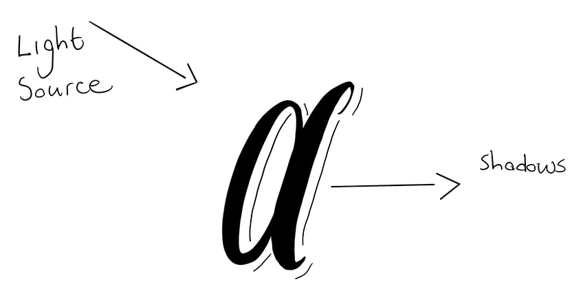
What we want to de is utilize the tools we have to give a more realistic rendition of the shadow. This is where we will utilize our tools, to better represent the shadowed letters. As long as we understand that the light source is on one side of a text, we know that the shadows will appear on the other side of that text. Below is another example to better illustrate this point.

Now that we are aware of this concept let us go through a few different techniques and see how we can achieve different shadows within our letters.
Basic Shadow
The basic shadow technique is very simple. This shadowing technique is a great way to give the text a lifting effect. Basic shadows also give the text a three-dimensional quality, which makes the text seem interesting and unique. Let us see how we achieve this basic shadow effect.
Step 1: Write Out a Word
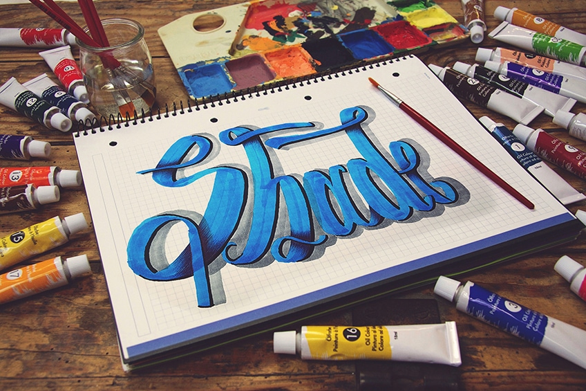
Let us begin by writing a word, for this exercise, let us write the word ‘shade’. You don’t have to write this word, but it might be helpful to write the same word as is shown in the tutorial. You can write this text in any kind of font or hand lettering style, however, try to keep it simple.

Step 2: Draw the Shadow Indicating Lines
Once we have our word written out, we want to now use the concept of the light source and proceed to draw shadow indicating lines on the side of our text that will have the shadows. We can use our pencils and proceed to draw indicative lines keeping them consistent on one side of the letters.
Remember, these lines would remain on the side of the letter opposite to the side that the light source would be present.
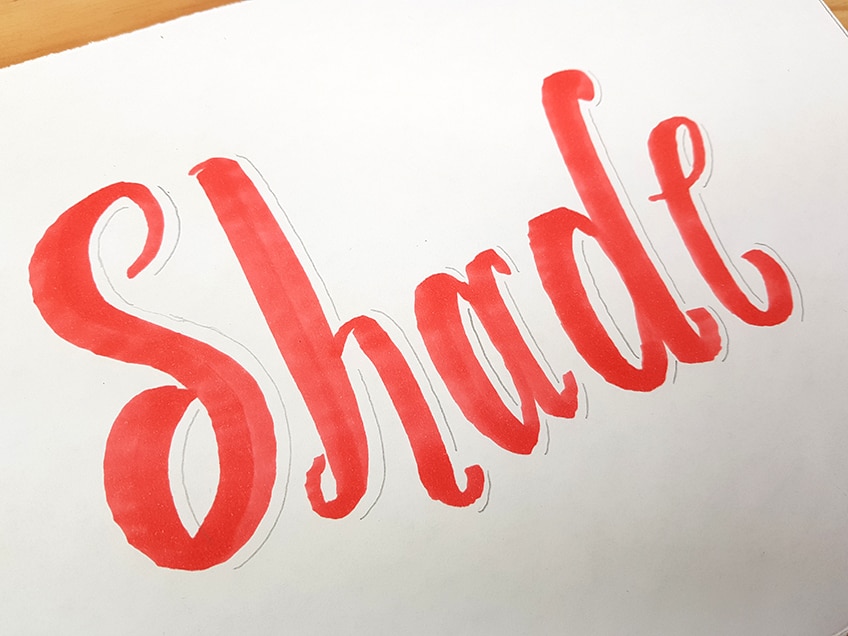
Step 3: Apply Shadowing to Letters
Once we have drawn the lines, indicating where we will place our shadows, we can proceed to do so with our neutral grey Copic markers. Remember, if your light source is at an angle slightly above your lettering on one side, this means that the shadowing will fade as it reaches the areas that are visible to the light.
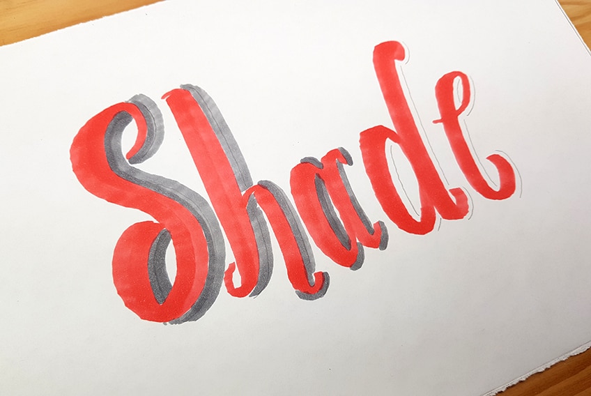
Take your time applying these grey marks around the letters. Remember, you can use both ends of your Copic marker to gauge the width of your shadowing around each letter. As long as the shadow is present on the opposite side you have chosen your light source to be then your shadowed letters will look effective.
There you have it – basic shadowing!
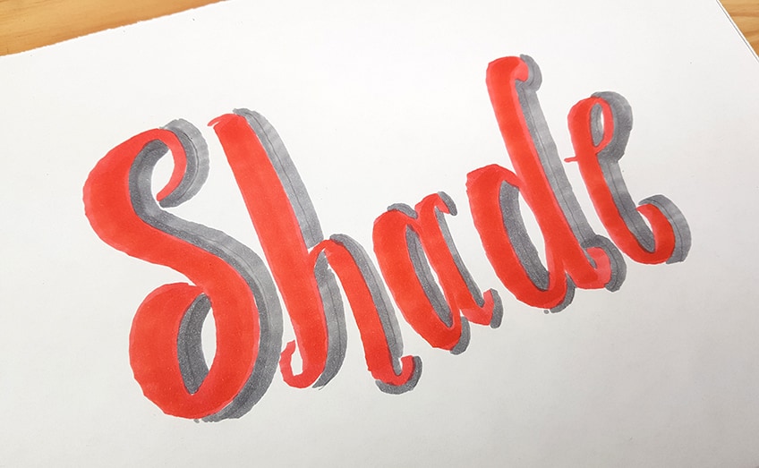
Vivid Shadowing and Compound Shadowing
This technique follows the same process as that of the basic shadow approach. However, this time we will use our micron pen to add a darker shadowing with the letters.
By doing this, we give more contrast to the text which gives both dimension and vivid quality that makes the letters pop.
Step 1: Write Out a Word
This time take a different color marker and proceed to write out a word. Again, just to make it easier, let us use the same word for this exercise. Another good suggestion is to keep your letter style simple, as the aim is to get used to the letter shadowed letters techniques.
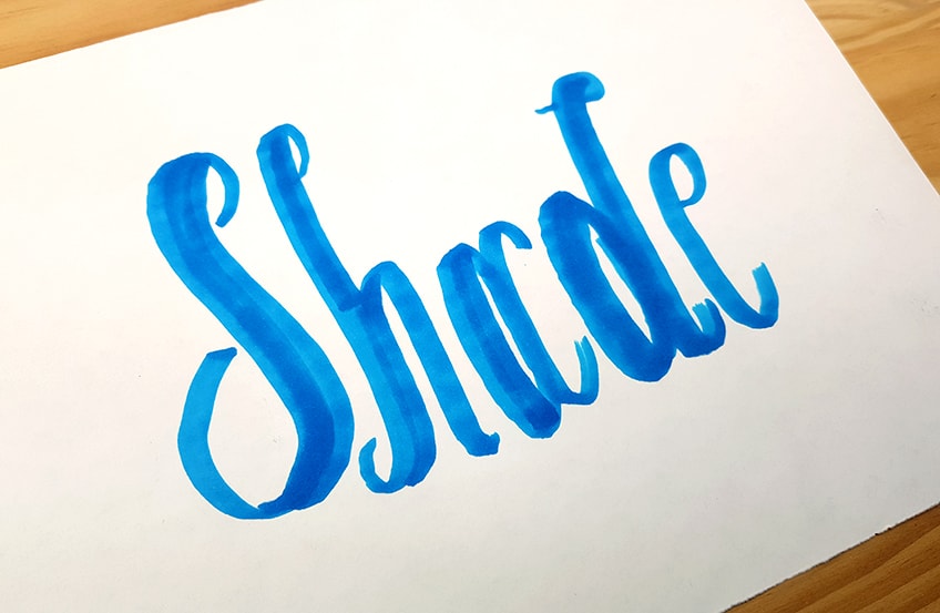
Step 2: Draw the Shadow Indicating Lines
Now that we understand how to place the pencil marks that indicate where our shadows will be we can proceed to draw them on the side of the letters that we choose. However, try drawing them on the other side of the letters, different from the side you drew them on in the first technique.
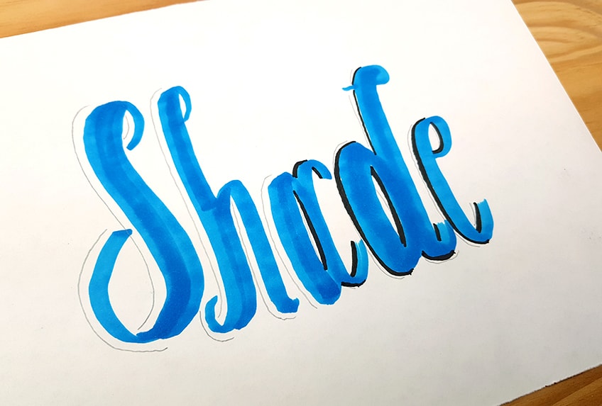
Step 3: Apply Shadowing to Letters
We can now proceed toad in the shadow lines using our micron pens. We want to try to stay along the ridge of each letter as we add in these dark pen marks.
Again, you can play around with how thick or thin you want your shadow lines to be, as long as they are on the same side of each letter.
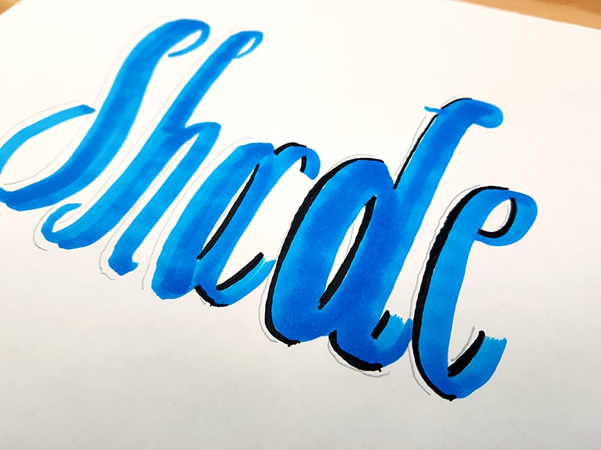
Proceed to do this with each letter. Again, remember that, if your light source is slightly raised on one side of the text, there will be slight shadowing that falls under each letter. This means that letter shadowing can wrap around the letters a little bit.
As long as the shadows are opposite to the side of the light source then it will look accurate.

Step 4: Compound Shadows
This is where we apply the process of the first technique to the current shadow’s technique for these letters. By doing this, we are creating more depth within the lettering, giving it more dimension. This additional shadowing makes the text pop.
We do this by taking our neutral gray Copic marker and proceeding to add shadows on the same side of the current shadows.
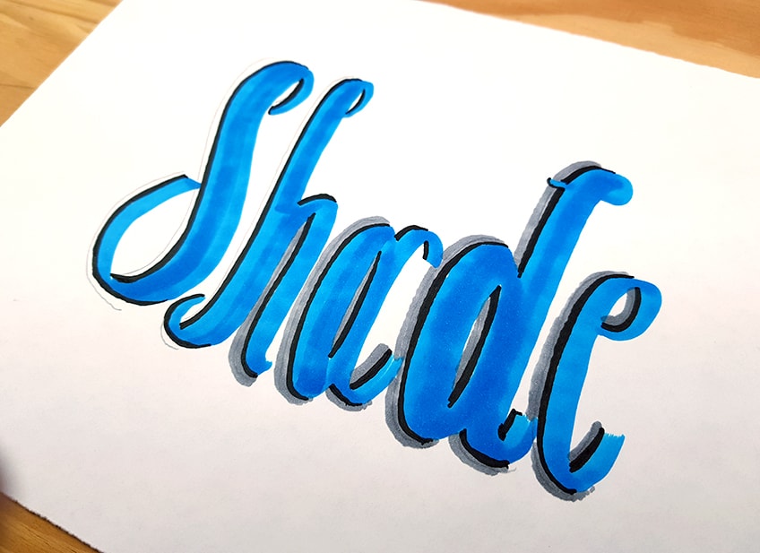
Remember, that you want to keep the grey and black shadows on one side of the text. You also want to try and make them flow into each other in the areas where the shadows end. Make sure you utilize both ends of your Copic marker to achieve an effective shadowing around the letters.
That’s how you add vivid and compound shadows.
Overlapping Shadows
This technique is a little more intricate as it requires, firstly, a text with overlapping features. Secondly, it is a shading process done with a ballpoint pen as opposed to lines drawn with a marker. However, the process is simple once you understand the concept of the cross-hatching method used to achieve the shadowing effect. Let us go through the few steps that explain it in further detail.
Step 1: Write Out a Word
This time we want to write out our word with some twirls within our letters. Think of it as writing out a word in cursive with your Copic marker. You can play around with different thicknesses within the various lines of each letter and the overlapping features. Use both sides of the Copic marker to make an interesting overlapping letter arrangement.
However, let’s try to use the same letter “shade” as seen in the tutorial. This perhaps might make it easier to follow.

Step 2: Draw the Shadow Indicating Lines
This time the lines we draw are going to be placed on the letters. We don’t need to worry about the light concept for this letter shadowing technique. What we want to do is draw a line along with all the areas where your letters overlap. This means we are drawing a pencil line that completes the overlapping feature within each letter.

We can also do this for any areas within letters that seem as if they are connected by two parts. This means that we can create overlapping qualities within certain letters if they seem to have separate components that they are made of.
For example, the letter “H” is made up of a line and an arch that can be distinguished by a pencil line.
Step 3: Apply Shadowing to Letters
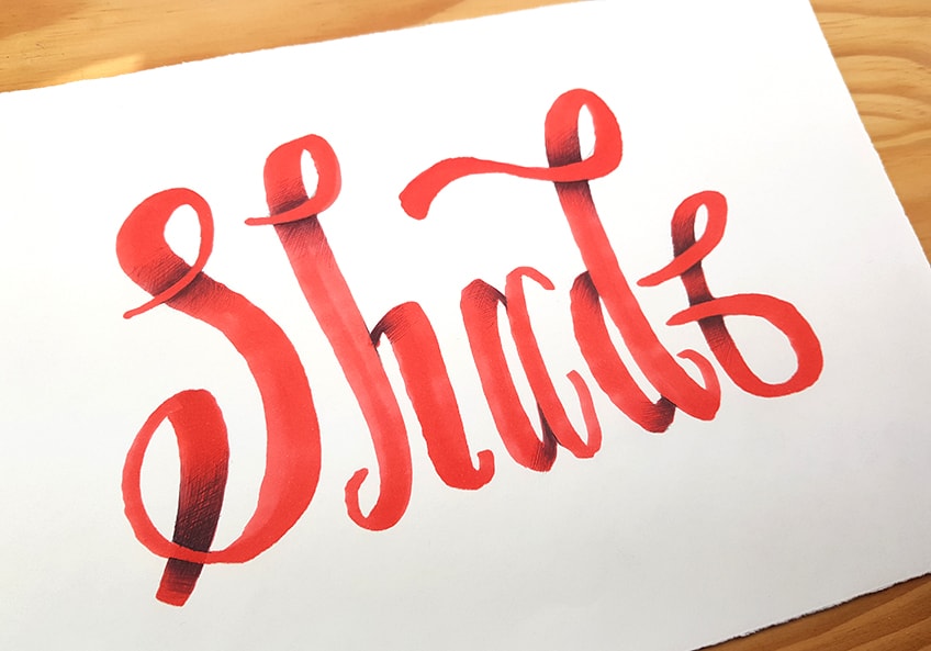
This time, how we will apply the shadowing to the letters is by shading from the pencil lines that define the overlapping features. We want to proceed to take our ballpoint pens and begin to shade in a gradient that flows outwardly from the pencil lines. We want the gradient to go from dark to light. We do this by paying attention to the pressures that we apply to the pen.
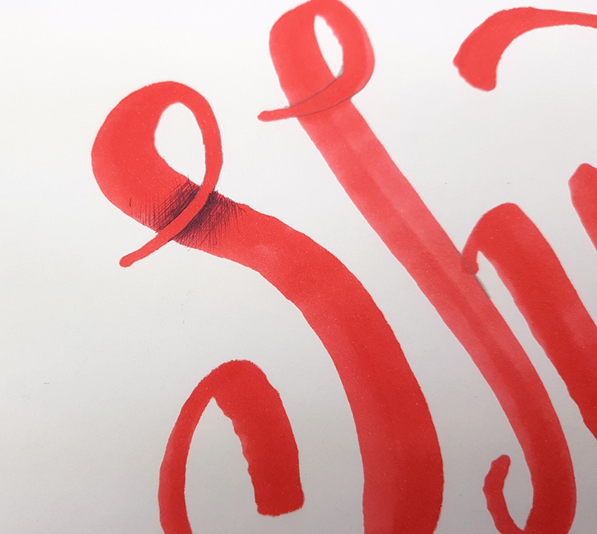
The aim is to create a gradient that goes from dark to light. The darkest parts are close to the pencil lines, giving the effect of a shadow underneath the overlapping feature within the letter. As we shade throughout the flow of the letter, we can lighten the gradient.
This will give the impression that the overlapping qualities within the letters are casting a shadow onto the letter itself.
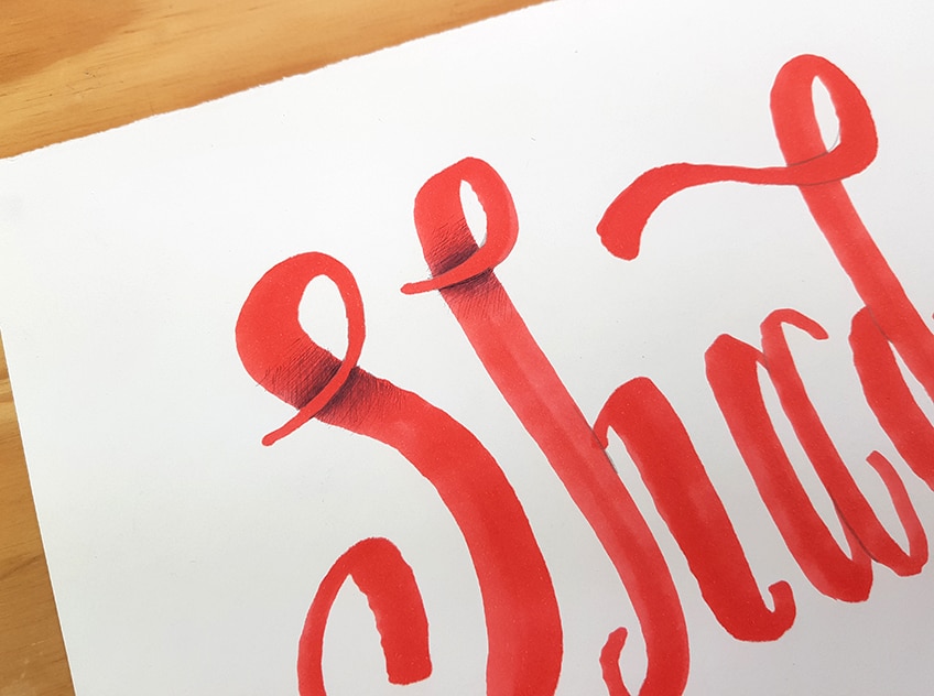
You can do carry on this process throughout each letter of the word. Remember, as your shade make sure you are shading from the overlapping features that flow over the letter. You want to make sure that the shadowing falls underneath the overlapping feature.
Take your time with this shading process and pay attention to the pressure that you apply to the pen whilst shading.
Carry on this process until you have gone through each letter of the word. You can also extend the shadow throughout the form of each letter as long as you want. The shadowing can be elongated or short, both will have a different visual quality. Play around with this technique, just remember that the aim is to make a gradient that flows from the overlapping feature.
Combination
Now that we know how the different shadowed letters techniques work, we can play around with them all in a single image. We will now proceed to make a new word where we utilize all the different techniques we have learned. Creating a text with a combination of the different shadow techniques is a great way to develop an art-styled text that can make the letters more interesting and unique.
Let us go through each step and see how we can transform a text using a combination of the different techniques.
Step 1: Write Out a Word
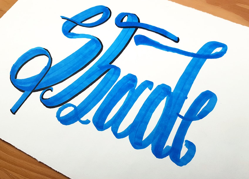
Since we will be using all the shadowing techniques for this word, we want to make sure we have twirls within our text again for the overlapping shadows. Again, you want to think of the twirls like cursive, where there are overlapping features within some letters. Write out the same word ‘shade’ using your Copic marker.
Step 2: Adding Darker Shadows
Once we have our word written out, let us begin with the darkest shadowing first. This is where we take our micron pen and proceed to add dark lining along one side of each feature. Remember to keep the concept of a light source in your mind when adding the shadows.
At this point, it is not necessary to add pencil lines that demarcate the shadowed side, however, you can if you need to.
Step 3: Adding Lighter Shadows
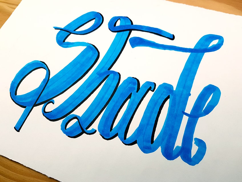
Once we have added our darkest shadows along the side of each letter, we can proceed to add the lighter shadowing with our neutral grey marker. Remember, that these shadows will be placed on the same side of the darker shadows. If you find a letter overlapping onto another letter allow the shadowing to go over that letter as well.
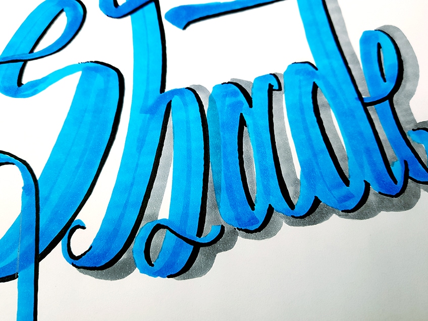
Remember that if your light source is placed slightly above on one side, there will also be slight shadowing that forms under the letters. Take your time with adding the lighter shadowing. Use both ends of your Copic marker, using the thinner side for capturing shadows in the small gaps in between letters.
Step 3: Adding Overlapping Shadows
Once we have completed the light shadowing within the letters, we can proceed to add the overlapping shadows within the letters. We do this by adding some line work in all the overlapping features with our pencils.
Remember, we want to use our pencils to define the features that overlap in each letter.
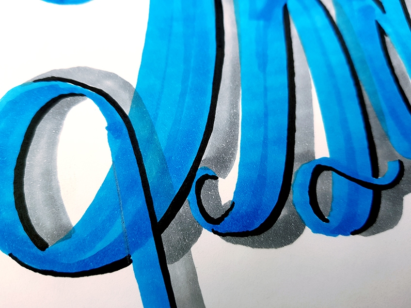
Once we have defined all of the overlapping areas with our pencils, we can proceed to shade in these areas with our ballpoint pens.
Remember, we want to create a gradient that fades from dark to light.
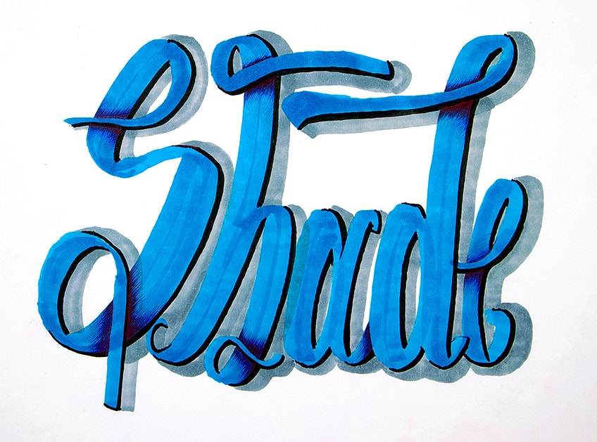
We do this by darkly shading in the areas closest to the overlapping feature, which we then proceed to lighten as we move through the rest of the letter. Use the pencil marks to guide your shading process, helping you know when to start shading from. You want to shade in the letter starting from the pencil marks, this way the darkest part of the gradient is close to the overlapping feature of each letter. As you shade, you can also extend the shading throughout each letter as much as you would like.
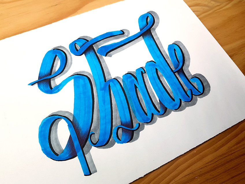
There you have it! A simple and easy tutorial on how to shadow letters! Once you understand the principle of each technique and how to achieve them using the concept of light to guide you, you will find that the process is quite simple.
Most importantly, remember to have fun experimenting with different techniques and combinations of shadowed letters.
Tips to Remember
- Get your text right first. Once you have your text drawn nicely, then you can proceed with adding shadow to the text.
- Take your time. When working with markers, once you make a mistake there is no going back. So, take your time.
- Shadows are always placed on the opposite side of the light source. Remember to add shadows on the other side of the text, not the same side of the light source.
- The shadows should be consistent on one side of a set of letters. The shadows should be placed on the right side of all letters or the left side of all letters for an accurate shadow effect.
- Use your pencil to demarcate the sides for shadowing. Using the pencil can help you to prevent any unwanted mistakes.
- Have fun. Explore combinations of letter shadowing and different styles of hand lettering for your shadowed letters techniques.
Learning how to shadow letters is so much fun! This is because it is quite easy once you understand the process of different letter shadowing techniques. This is a great addition to hand lettering artworks and projects and provides you with a unique perspective into giving letters a three-dimensional quality. There are a few ways to create shadows within a text, whether it be shadows on letters or drop shadow letters, this tutorial gives you a good foundation for both. Now that you have an understanding of how to shadow letters, you can take these skills and add shadowing to all kinds of texts, using the same steps you can confidently shadow letters A to Z.
Frequently Asked Questions
How Do You Shadow Letters With Markers?
Firstly, you want to make sure that you have the right markers. Using a set of Copic markers will help you achieve the best results. This is because the ink is high quality and the Copic markers have two sides, which means you have the option to make your shadows either thick or thin. When it comes to the color of the text, that is completely up to you, however, it is important to have a neutral grey marker for the shadows. Once you have the right tools, then you would begin by writing out your text with a colored marker. From there you will identify which side of the text the light source would be. Once you know this, you can proceed to add shadowing with your neutral grey marker on the side of the text opposite to that of the light source. From there it is simply a matter of finessing the shape of the shadows to fall alongside the text as accurately as possible.
Do Shadows in Letters Make Letters Three-Dimensional?
Learning how to shadow letters is another way of learning how to make letters three-dimensional. This is because as we add shadows on letters or create drop shadow letters, it gives the letter the appearance of lifting off the page slightly. This is because the shadow indicates that there is a small gap between the surface of the letter and the shadow. Thus, learning how to shadow letters gives you a good intuition for the concept of three-dimensional as well. Learning letter shading within shadowed letter techniques like overlapping shadows gives another unique three-dimensional quality to the text. In this tutorial, you learn a few ways of letter shadowing which gives the text more depth and dimension.
What Are the Different Ways to Shadow Letters?
The basic shadow approach is when you add some light grey undertones along one side of each letter within a text. This creates drop shadow letters, which means that it gives the effect of the shadows placed directly under the text. Another method of letter shadowing is by using a micron pen or a black marker to create darker, more harsh shadows. This is when we follow the same process of a basic shadow approach, however, we use a darker tool to give the text a heightened contrast between the text and shadow. Another approach is when you add shadowing within the letters, whenever you create a text with overlapping features. We do this by shading with a ballpoint pen near the areas of a text that overlap. We achieve this by shading a gradient from dark to light. The aim is to create a gradient that moves away from the overlapping areas as the shading lightens as it moves through the form of the letter. These are a few ways to add shadows on letters, and you can always combine techniques.
Matthew Matthysen is an educated multidisciplinary artist and illustrator. He successfully completed his art degree at the University of Witwatersrand in South Africa, majoring in art history and contemporary drawing. The focus of his thesis was to explore the philosophical implications of the macro and micro-universe on the human experience. Matthew uses diverse media, such as written and hands-on components, to explore various approaches that are on the border between philosophy and science.
Matthew organized various exhibitions before and during his years as a student and is still passionate about doing so today. He currently works as a freelance artist and writer in various fields. He also has a permanent position at a renowned online gallery (ArtGazette) where he produces various works on commission. As a freelance artist, he creates several series and successfully sells them to galleries and collectors. He loves to use his work and skills in various fields of interest.
Matthew has been creating drawing and painting tutorials since the relaunch in 2020. Through his involvement with artincontext.org, he has been able to deepen his knowledge of various painting mediums. For example, watercolor techniques, calligraphy and lately digital drawing, which is becoming more and more popular.
Learn more about Matthew Matthysen and the Art in Context Team.
Cite this Article
Matthew, Matthysen, “How to Draw Shadow Letters – Learn Easy Shadowing Techniques.” Art in Context. August 30, 2022. URL: https://artincontext.org/how-to-draw-shadow-letters/
Matthysen, M. (2022, 30 August). How to Draw Shadow Letters – Learn Easy Shadowing Techniques. Art in Context. https://artincontext.org/how-to-draw-shadow-letters/
Matthysen, Matthew. “How to Draw Shadow Letters – Learn Easy Shadowing Techniques.” Art in Context, August 30, 2022. https://artincontext.org/how-to-draw-shadow-letters/.


