Faux Calligraphy – How to Create Simple Calligraphy Letters
Learning how to draw faux calligraphy is a great introduction to the calligraphy genre. This is because faux calligraphy is somewhat fake calligraphy that is much more easily constructible than traditional calligraphy. Calligraphy is a great addition to your hand lettering repertoire, as it provides you with a classical and sophisticated addition to your hand lettering artworks. Learning how to draw faux calligraphy is a simpler calligraphy drawing process. This is because we build up letters by drawing strokes into an already existing text as opposed to writing out letters with traditional calligraphy strokes. We will find that in this tutorial, the process of this easy calligraphy method is digestible and can be a great addition to your hand lettering skills.
Table of Contents
An Easy Guide to Drawing Faux Calligraphy
Faux calligraphy is an easy calligraphy method that kind of cheats the traditional strokes of calligraphy by drawing them individually into letters. This is much easier than learning the process of traditional strokes, whereby you construct letters into a calligraphic style with a single stroke of the hand.
Faux calligraphy breaks down the basic strokes into a different assembly process than that of traditional calligraphy.
Necessary Materials
Since we will be drawing the different strokes into the letters with simple linework, we don’t need any fancy brush calligraphy tools. Rather, all we will need is simply a pen, pencil, paper, and a ruler. For the pen, we will want to use a good one, so preferably a micron pen is the better option for faux calligraphy.
We can use a simple HB pencil for the earlier stages when we sketch out our letters.
We will want to have an eraser for rectifying any silly mistakes along the way. The nice thing about faux calligraphy is that the required tools are simple and easily accessible. For all suggested materials, you can find them through the links below:
- Micron 12mm pen
- Pencil
- Eraser
- Ruler (any ruler will do)
- Paper (any paper will do )
Step-by-Step Instructions on Drawing Faux Calligraphy
In this tutorial, we will break down a few essential concepts to understand before going through a step-by-step process of drawing our faux calligraphy text. We want to understand the fundamentals of faux calligraphy before constructing our text. This means we want to look at a few things first such as the fundamental basic strokes that make up each letter.
We want to understand how faux calligraphy compares to brush calligraphy, and how we achieve the same brush calligraphy shaped-letters with the faux approach.
From there we want to understand how to construct letters, using the different strokes to assemble each letter. We will then look at creating grid lines to give our lettering consistency. Lastly, we can then create our faux calligraphy text.
Basic Strokes
Understanding how to draw faux calligraphy requires you to know the basic strokes that make up calligraphy-styled letters. The basic strokes are a variety of strokes that are used in all forms of calligraphy that make up each letter of the alphabet.
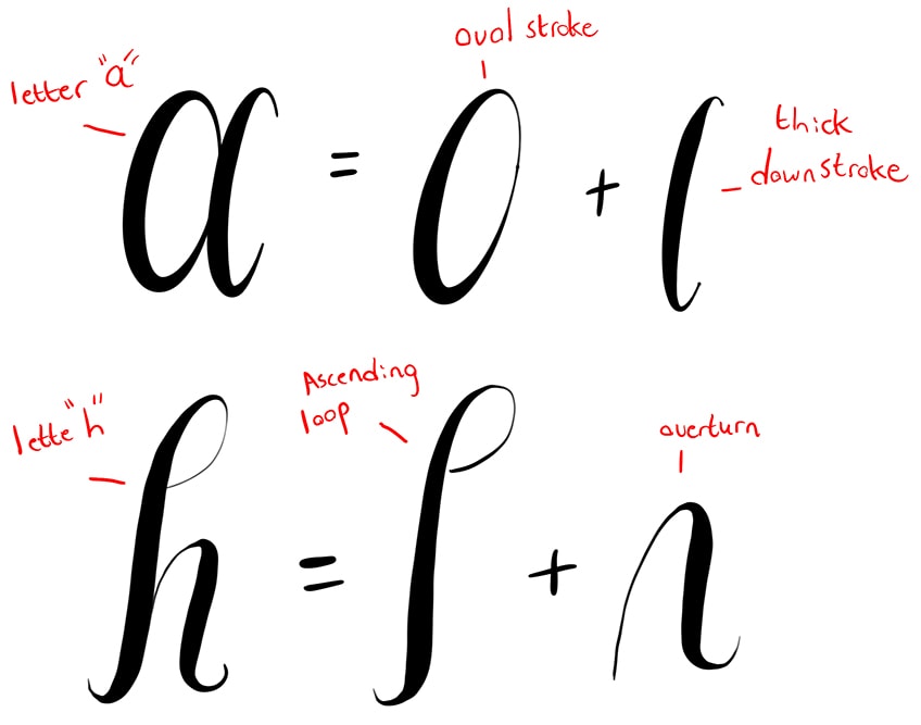
These strokes can be used to create any letter, once you understand the basic strokes you will then be able to practice assembling different letters.
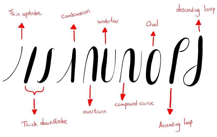
These thin and thick stroke combinations make up each letter of the alphabet and are the iconic feature of a calligraphy-style text.
Comparing Brush and Faux Calligraphy
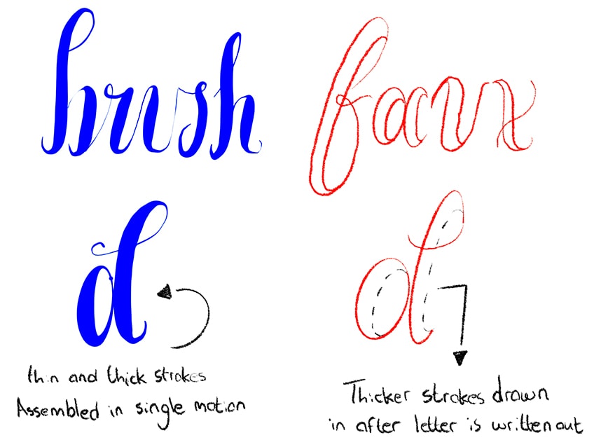
The next important concept that we want to understand is how we implement these basic strokes within the faux calligraphy style. We can begin by comparing traditional brush-style calligraphy to faux calligraphy. With brush calligraphy, there is a reliance on the brush and hand pressure to create seamless transitions between thin and thick strokes.
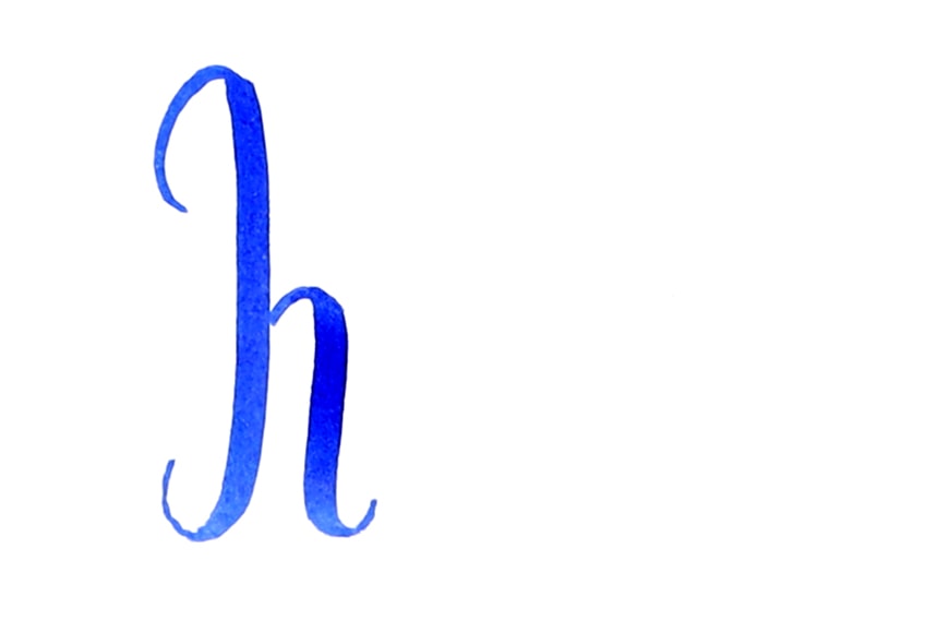
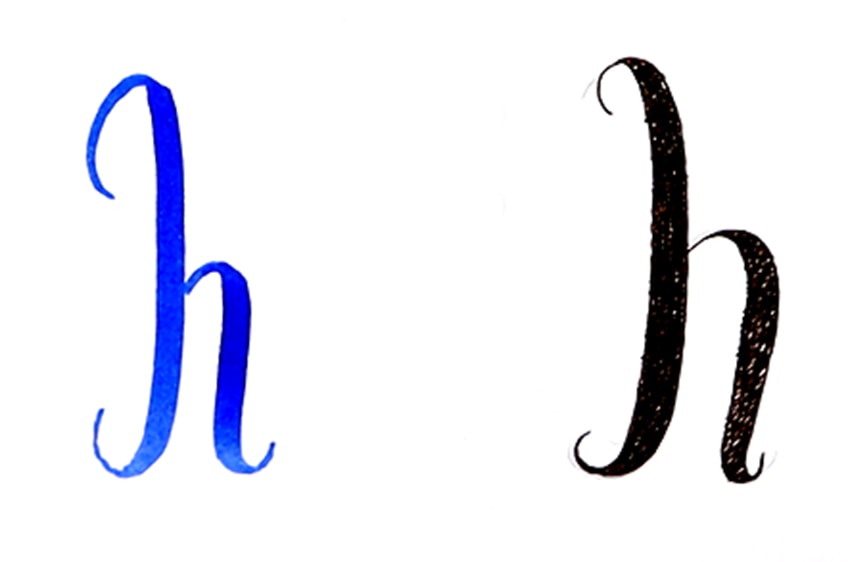
However, what you then will do is draw in the thicker strokes, where they should be placed in downstroke sections of a letter.
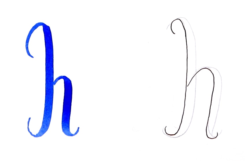
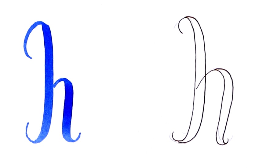
You can only know how to do this once you understand the basic strokes used to construct calligraphy-styled letters.
How Faux Letters Are Assembled
The aim is to imitate the same quality of thin and thick strokes found in traditional calligraphy letters. The way we assemble these letters using the faux method is to first draw the letter completely with your pen. Once the letter is drawn, you then can draw in the thicker qualities of the letter.
You want to just make sure that you assemble the letters using the traditional basic strokes.
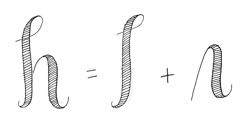
Rather than relying on creating seamless transitions between thick and thin strokes using the traditional calligraphy method, we can draw in the thicker strokes once our letter is written out.
Looking at Grid Lines for Consistency
Now that we understand the process of assembling letters using the faux method, we can now move on to using grid lines to create a seamless and professional-looking text. Drawing grid lines help guide your letter formation.
This is a great way to create formal-looking texts, by drawing within the gridlines we create a seamless and consistent-looking letter formation.

The point is to utilize the gridlines to keep your lettering the same in size and on the same axis.
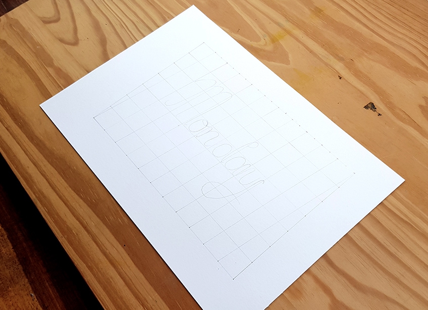
As per the normal process, once you have written out your letter, you can draw in the thicker lines.
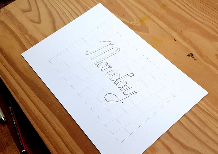
Now that you have a complete guide on the process of forming faux letters, let us write our faux calligraphy text.
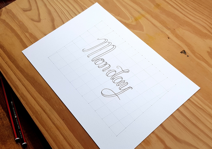
Creating Faux Calligraphy
Now that we understand the process of constructing a faux calligraphy text, let us proceed to draw our own faux calligraphy text step by step. We want to make sure we add a variety of letters to our text so a good idea would be to create a sentence. We also want to practice our letter formation, so let us use the grid method to create a formal and professional-looking text.
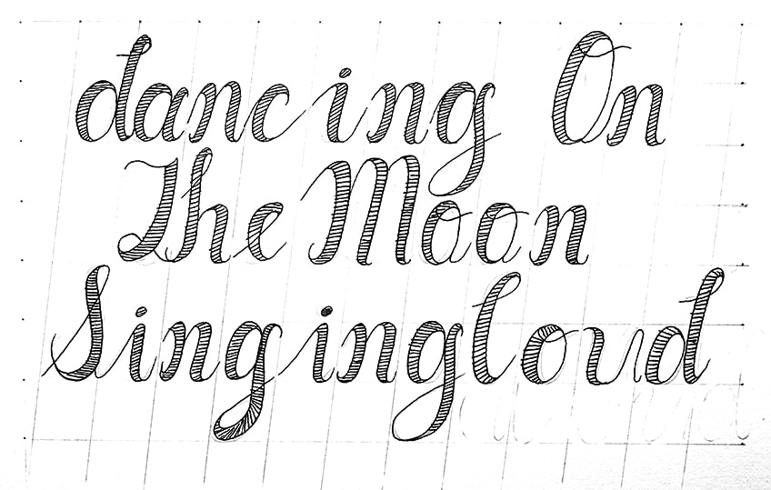
The sentence we will write is “dancing on the moon, singing loud”. This provides us with a variety of shapes to explore within each letter. That being said, let us get into its step-by-step process.
Step 1: Drawing a Grid
Let us begin by drawing a grid for our text. Drawing a grid is going to assist us in the formation of our text. We can proceed by taking our pencils and drawing a grid using a measurement that we would like for our lettering. However, because we will write out a sentence, we want to make sure we have space in the grid for at least three rows of words.
The size of the grid, however, is completely up to you, as long as you make the measurements equal for the Y- and X-axes.
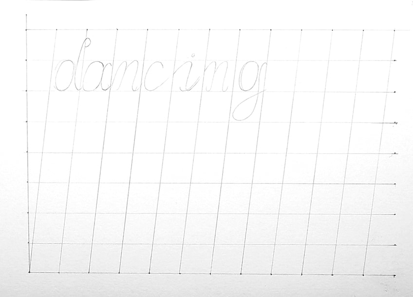
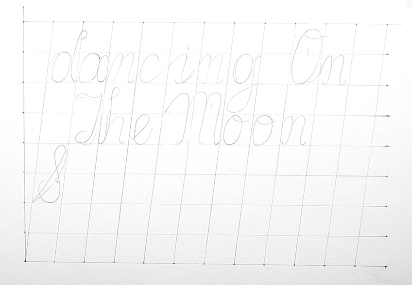
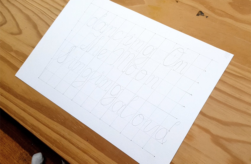
Step 2: Writing Out Our Words
Once you have drawn your grid, we can proceed to write out our sentence “dancing on the moon, singing loud”. As you proceed to write out each word within the grid, remember to consider spacing. This is where you can also be creative with your word positioning of each word.
We want to consider the form of the words and how they sit on the page together.
Step 3: Outlining the Text
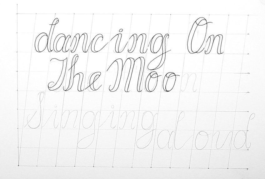
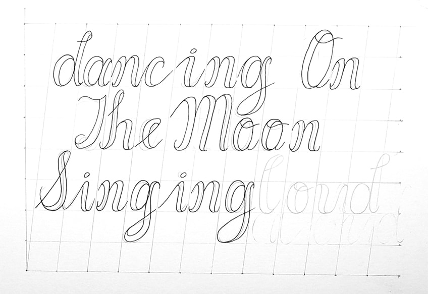
Once we have our words written within the grid, we can now take our micron pens and proceed to outline the letters. We want to go about doing so very cautiously, the process of outlining letters with the pen can be tricky.
Make sure you got through each letter as slowly and attentively as possible.
Step 4: Filling In the Text
Once you have completely outlined your text, you can add detailing to your text in any way you would like. A nice detail to add to faux calligraphy is lining; adding lines gives some texture to the lettering. You can do this with your pen once your letters are completely outlined.
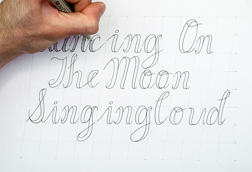
Once you have filled in your letters, we should then be left with our sentences in a faux calligraphy style.
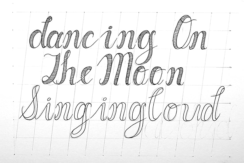
Once you know the basic strokes and how to draw in the thick and thin lines, you then can create any lettering style using the faux method!
Tips to Remember
- Make sure you learn the basic strokes. Once you understand the basic strokes, the process is much easier.
- Remember to use thin upstrokes and thick downstrokes. This rule always applies to every letter.
- Make sure that you practice with a pencil. Using a pencil to practice is a great way to prevent mistakes when writing in pen.
- Gridlines are used for consistency. Once you are skilled enough, you can then proceed to write on blank paper.
- Practice your alphabet. Practicing your faux calligraphy alphabet is a great way to refine your faux lettering.
- Most importantly, have fun! Faux calligraphy is a great addition to many different text-based creative projects.
Faux calligraphy is a great skill to learn as it can be utilized in so many different ways. Faux calligraphy is also much easier than traditional calligraphy styles. It is somewhat fake calligraphy which makes it a much simpler calligraphy style to learn. This is because we can draw in the thicker features of letters rather than writing them out using calligraphy-styled tools. This gives us a better chance to imitate the qualities of calligraphy by using a drawing process rather than a brush-styled writing process. A great way to keep your hand practiced is by working on your faux calligraphy alphabet constantly. This easy calligraphy style can also be applied to various hand lettering artworks, making it a great addition to your lettering repertoire.
Frequently Asked Questions
How Can I Improve My Faux Calligraphy?
Practice, practice, practice! The aim is to first understand the fundamental basic strokes that are used in traditional calligraphy. Once you understand these strokes, you can then apply them to your faux lettering. Secondly, you want to make sure that you keep consistency in your lettering. This means that thicker strokes should be the same, as well as keeping your letters in a straight line. This takes time and should be practiced; you can also use gridlines to assist you in your faux calligraphy drawings. Writing out an alphabet is another great way to practice writing each letter with the faux method. Most importantly is to put all of these exercises into practice as often as possible. This is an easy calligraphy technique, and if practiced daily, can transform your calligraphy skills from beginner to master.
What Is the Difference Between Faux and Traditional Calligraphy?
Traditionally styled calligraphy is a method of calligraphy that is achieved with calligraphy-styled tools, such as brush pens and calligraphy pens. These tools allow for each letter to be formed with single strokes which can transition seamlessly from thick to thin lines. This can be a more difficult form of calligraphy as it requires a penmanship skill that relies a lot on the pressure of the hand and how that in turn creates different thicknesses in different strokes. Faux calligraphy is an easy calligraphy method that mimics the thick and thin line qualities of traditional calligraphy. It does so by constructing the thicker sections of the letter by drawing them into the letter, rather than relying on a single stroke such as with brush pens or calligraphy pens. This makes the process much easier, as you draw in the thicker lines for each letter, allowing you to create a calligraphy-styled text with a slower and more cautious approach.
How to Master Faux Calligraphy?
Understanding the basic strokes is essential to mastering faux calligraphy because the letters are assembled with the same strokes. Knowing where to thicken letters or where to place the thinner lines in a letter requires you to know the basic strokes. From there, you want to put that into practice by writing out an assortment of different words, where you practice the process of drawing in the thicker lines within letters. Consistency is another great way to master your calligraphy skills. Keeping letters in a uniform aesthetic is a great skill to learn. Making sure the thicker sections within each letter are the same width will give the letters a more formal and professional quality. Keeping your letters in a straight line can also give the lettering a more professional quality. Practicing consistency is the last thing you will implement, once you understand the basic strokes and where to place the thicker lines within each letter.
Matthew Matthysen is an educated multidisciplinary artist and illustrator. He successfully completed his art degree at the University of Witwatersrand in South Africa, majoring in art history and contemporary drawing. The focus of his thesis was to explore the philosophical implications of the macro and micro-universe on the human experience. Matthew uses diverse media, such as written and hands-on components, to explore various approaches that are on the border between philosophy and science.
Matthew organized various exhibitions before and during his years as a student and is still passionate about doing so today. He currently works as a freelance artist and writer in various fields. He also has a permanent position at a renowned online gallery (ArtGazette) where he produces various works on commission. As a freelance artist, he creates several series and successfully sells them to galleries and collectors. He loves to use his work and skills in various fields of interest.
Matthew has been creating drawing and painting tutorials since the relaunch in 2020. Through his involvement with artincontext.org, he has been able to deepen his knowledge of various painting mediums. For example, watercolor techniques, calligraphy and lately digital drawing, which is becoming more and more popular.
Learn more about Matthew Matthysen and the Art in Context Team.
Cite this Article
Matthew, Matthysen, “Faux Calligraphy – How to Create Simple Calligraphy Letters.” Art in Context. August 1, 2022. URL: https://artincontext.org/faux-calligraphy/
Matthysen, M. (2022, 1 August). Faux Calligraphy – How to Create Simple Calligraphy Letters. Art in Context. https://artincontext.org/faux-calligraphy/
Matthysen, Matthew. “Faux Calligraphy – How to Create Simple Calligraphy Letters.” Art in Context, August 1, 2022. https://artincontext.org/faux-calligraphy/.


